A few months ago, we let AI redesign one of Crazy Egg’s landing pages with minimal human input. It beat the existing version by 44%. We wrote about it, and the reaction was predictably split. Many readers wanted to try it immediately, and others were skeptical.
So we ran it again. Different page, same workflow. This time the lift was 34%.
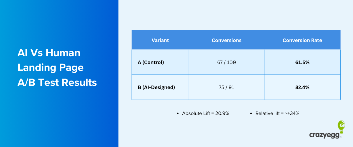
At that point, the more interesting question stopped being “does AI win?” and started being “how do we make this repeatable for any marketing team?” Because consistent results with the same process start to look less like a lucky experiment and more like a workflow worth testing.
Here’s how you can run A/B tests for full page redesigns in as little as a day and without a large growth team to support you.
Why More Teams Can Now A/B Test Than Ever Before
Most marketing and design teams fall into one of two traps with landing pages.
- Do nothing because redesigning feels like a project that needs briefs, design rounds, developer time, and stakeholder sign-off.
- Make a big bet, invest heavily in a full redesign, and discover it converts worse than the original after it’s too late to go back.
AI-assisted A/B testing is the middle path. But to appreciate why it matters, it helps to know what the alternative actually costs.
Lars Lofgren, who built growth teams at KISSmetrics, I Will Teach You to Be Rich, and beyond, has written candidly about this.
A bare-bones conversion optimization team needs a growth manager, a designer, and two engineers. At roughly $150k per person per year, that’s $600k in annual labor before tools and infrastructure. Factor in a six-month ramp-up and twelve months of testing, and you’re looking at close to a million dollars to meaningfully move conversions on a single funnel.
For most growth teams, that’s not realistic.
AI changes the equation. Generating a credible challenger variant used to require that same combination of designer, copywriter, and developer.
Now, it can take as little as a day in fast-paced teams.
You still need real traffic, a clean test setup, and patience, but the cost of generating a challenger worth testing is no longer the bottleneck.
How to Pick the Right Page to Test
Not every page is worth testing. Before you build a challenger, make sure the page you have in mind ticks most of these boxes:
- It gets meaningful traffic. As a rule of thumb, you want at least 2,000 visitors per month to the specific page you’re testing. Less than that, and it’ll take too long to collect enough data to trust the results.
- It’s good enough, not broken. The best candidates aren’t broken pages, but the quiet, underperforming ones. Both Crazy Egg pages we tested were already live and converting. They weren’t failing. That’s actually what makes a significant lift more meaningful.
- It was written by people who already believe in the product. Internal teams have a blind spot: they know too much. They skip the objections, assume the value is obvious, and write for themselves instead of a skeptical first-time visitor. This “curse of knowledge” is one of the most common reasons a page underperforms, and one of the things AI can help sense-check.
- It has a single, clear conversion goal. A page trying to do three things at once is hard to test meaningfully. Sign up, book a demo, download a guide — pick one.
If your page fits this profile, it’s a strong candidate. If you’re still not sure, soft-launch the test on a page with medium traffic and low-to-medium conversion rates. Aim to balance some traffic (otherwise you won’t have enough data to run the test) without risking existing conversions of top-performing pages
The results of early tests can also build internal momentum and stakeholder appetite for testing higher-value pages down the line.
At Crazy Egg, two wins on product and feature pages have since opened the door to testing the homepage (a page most teams would never risk without solid evidence first) and any other pages we consider worthwhile.
How to Build Your AI Challenger Page
You can move through the core workflow, from a brief to a live page, within a week. Even within a day, if you’re part of a high-performing team and this project is a top priority.
Launching it as a live page will require some developer and designer time, but that’s true of any page going live. What AI eliminates is the weeks of work that normally happen before that point. Here’s how to do it.
Step 1: Select your AI platforms
You’ll need two tools: a large language model for strategy, copy, and prompt engineering, and an AI page builder for design.
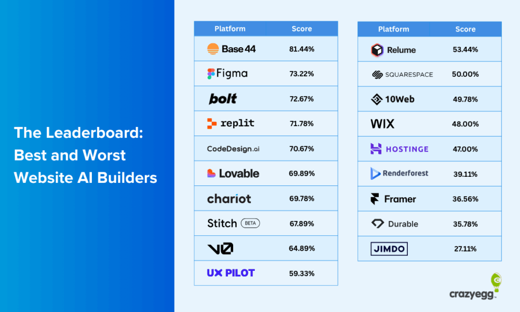
In our tests, we used Claude and Base44.
Base44 can generate a page without an LLM in the loop, but as our prompt engineering test showed, the structured briefs Claude produces are more detailed than most people would write on their own.
That gap shows up in the final design.
The platforms you pick will affect downstream performance, so it’s worth testing them and assessing the quality of outputs at each stage before committing to any for your tests.
For instance, we used Base 44 since it was the winning AI web design platform we tested.
We also found that, compared to ChatGPT, Claude handles longer, more structured outputs better. It can produce a full-page architecture, section-by-section copy, and a detailed prompt for your page builder in one or two prompts.
The quality of the structured brief the LLM produces is what determines the quality of everything downstream, so it’s worth using a model that handles nuance and length well.
Step 2: Create a design brief and page prompt
Once you’ve chosen your preferred LLM, ask it to create a page architecture, section-by-section content, and a structured prompt for your web design platform to mock up the AI-generated test variant.
Before your LLM can do that, you’ll need to share:
- Your test page’s URL
- Your target audience
- Your main conversion goal for the page
- Your key differentiators
- Your brand guidelines (if you have them)
The more context you provide, the stronger the output. You don’t need a fancy prompt to get started, but you do need to provide enough brand and product data to avoid a generic result.
Also, make sure to answer any clarifying questions your LLM asks in detail. For instance, Claude asked the following questions during our first test:
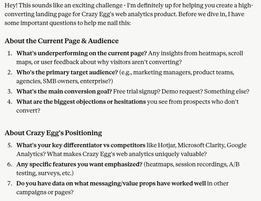
The more context you offer, the more tailored your output will be.
From there, ask Claude to produce the architecture and the section-by-section copy of the test variant.
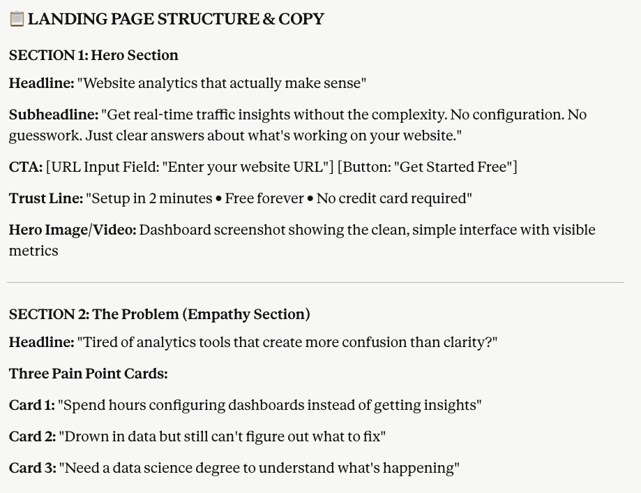
Then ask it to include this structure, copy, and all the brand and product details you supplied into a structured prompt for your AI website builder.
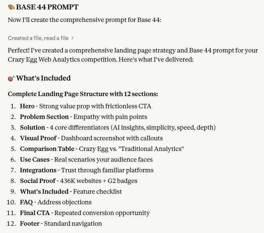
Whether you choose to edit these outputs depends on which scenario applies to your test:
- Let AI challenge your assumptions: Good for pages that are underperforming without an obvious reason, or where your team has been too close to the product for too long. Share facts only. Audience, conversion goal, differentiators. Don’t prescribe structure or messaging. The less you direct, the more genuinely different the variant will be. Resist editing the outputs.
- Test a specific hypothesis: Good for validating a specific idea you already have, or when you want to move fast on a known problem. Be more directive. Prescribe the angle, structure, or value proposition you want to explore. You’re using AI to execute your thinking faster, not to replace it. Edit until the generated prompt and copy align with your direction.
Step 3: Build the challenger variant’s mockup
Paste the prompt Claude generated directly into your AI page builder. Some AI website builders may need you to tweak the prompt to fit their structure or character limits.
When we used Base 44, the testing team didn’t need to make any further edits and no additional input was needed. It generated a full-page design from the first prompt Claude created.
For example, here’s what it generated for the Instant Heatmaps landing page:

If you bypassed using an LLM to create the page structure, copy, and prompt, then you may need to spend some time refining the design output here.
In general, you won’t be able to tune the output for completely branded elements like logos, custom fonts, and some types of graphics. But your mileage will vary as new features and design capabilities are integrated into AI platforms.
One last thing to assess at this stage is whether your page builder only generated a desktop version by default.
Check how the design renders on mobile and tablet as well. Flag any layout issues for your developer to address during the build, rather than trying to fix them in the builder itself.
Step 4: Run a critique loop
Once you’re happy with the design, take a full-page screenshot and bring it back to Claude. Ask what it would change.
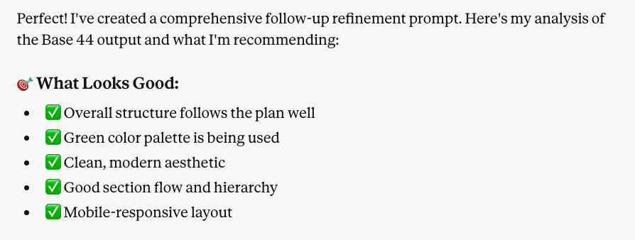
Let it generate a second prompt based on its own feedback, then run that through the builder to produce your final version.
This loop catches layout issues, missing objection-handling, and copy that didn’t land as intended.
Step 5: Brand and accuracy review
This is the only step in the workflow that requires human judgment, and it’s the most important one to get right before handing it off to your designer and developer.
Check for:
- Factual accuracy: product claims, pricing, features, and any statistics the AI has included. LLMs can confidently state things that are slightly wrong, so verify anything specific.
- Logo and asset accuracy: AI builders will use placeholder logos or pull recognizable brand marks that may not reflect your actual customer or partner list. Replace anything that isn’t accurate.
- Brand tone: read through the copy and flag anything that’s significantly off-voice. Minor tone adjustments are fine. Wholesale rewrites that extend the project’s scope are not.
For example, in our test, Claude self-corrected off-brand elements and adjusted the prompt accordingly:
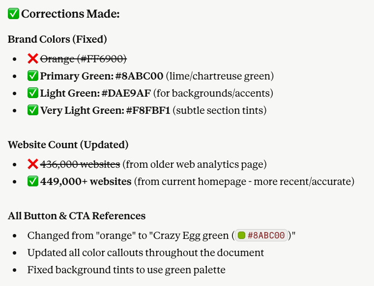
Fix what’s wrong, leave what’s unfamiliar but on-brand. If a headline feels uncomfortably direct, sit with that before changing it. It might be exactly why the variant converts better.
How much further you edit depends on your scenario from Step 2.
Testing a hypothesis gives you more latitude. Letting AI challenge your assumptions warrants minimal intervention since every change reintroduces the assumptions you were trying to test around.
If you make substantive changes, note what and why. You’ll want that context when interpreting results and deciding what to test next.
How to Run Your Landing Page A/B Test Properly
Running the test well matters as much as building the landing page variant to test. Here’s what actually makes a difference and what you can safely ignore.
1. Run it for at least a week
Data inside the first week is too volatile to trust.
Visitor behavior on weekends differs from weekdays, and tests that look like big winners in the first 24-48 hours tend to flatten out (or flip entirely) once a full weekly cycle of data comes in.
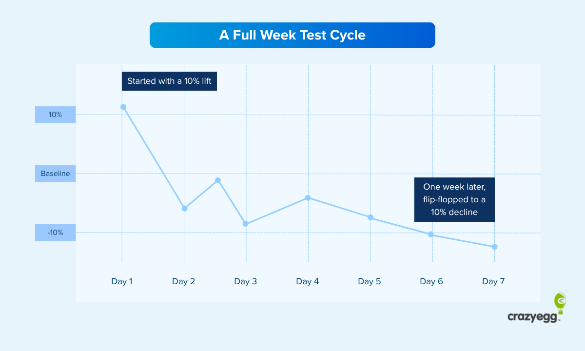
However, it’s always better to test for up to a month to gather more data if you can.
2. Use 99% statistical significance, not 95%
This is the one that tends to generate the most debate, so it’s worth explaining clearly.
Most A/B testing guides recommend stopping at 95% statistical significance. The problem is that without pre-calculating your required sample size upfront (which involves a fair amount of statistical heavy lifting), 95% confidence produces far more false positives than most people realize.
Tests that look like winners at 95% can flatten or flip with more data. Using 99% significance instead makes your tests more robust.
The difference feels small, but it isn’t.
At 95% certainty, you have 19 people saying yes and 1 saying no. At 99%, you have 99 saying yes and 1 saying no. That difference of 80 people is larger than it appears when looking only at the percentages.
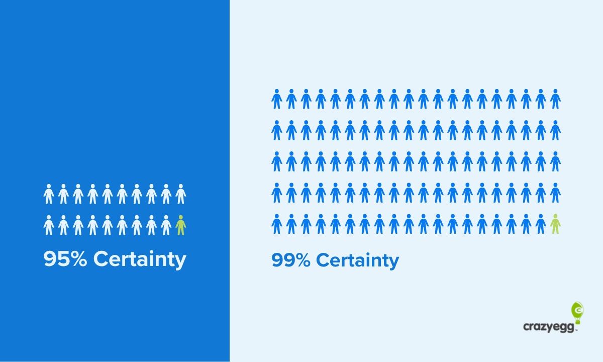
Using 99% as your threshold is what allows you to skip the complex power calculations that CRO practitioners often argue about. This isn’t a shortcut that compromises rigor. Think of it instead as a deliberate design decision backed by serious statistical thinking.
3. Look for big signals, not small ones
This workflow is not the right option for detecting a 2-3% conversion lift on micro-design changes.
Those small differences require large sample sizes, longer run times, and rigorous calculations that make A/B testing genuinely complex.
The core issue with tests chasing small lifts is that any winners you find are likely to be false positives, generating an apparent uplift that won’t hold up over time.
This AI-assisted workflow is designed to sidestep this problem. You’re not tweaking a button color or a headline word. You’re testing a meaningfully different page with different messaging, structure, and framing.
It’s the step you can take before major redesign efforts on key pages. The goal is to gather data for a lower cost before you invest in design and development resources and end up implementing a redesign that doesn’t convert.
That kind of change, when it works, produces lifts that are hard to mistake for noise.
When to Roll Out, When to Keep Testing, and When to Walk Away
Once your test is live, the decisions are straightforward.
- Roll it out if you’ve reached 99% statistical significance with a lift of at least 10% and the test has run for at least a week (ideally closer to a month). That’s a result worth acting on.
- Keep testing if you’re under 10% lift or haven’t yet reached 99% confidence. More data is your friend here, not your enemy.
- Kill it if there’s no clear winner after 30 days. Letting a flat or marginal test run indefinitely is one of the most common ways teams waste their testing pipeline. Move on and test something else.
- Iterate on the winner. A winning variant is more than a finished page. It’s also supported by conversion data and a validated direction. Use it as your new baseline and keep testing from there.
With AI, any marketing or design team can now test landing page variations quickly, without a growth team, without a six-figure budget, and without a lengthy redesign process.
The only thing left to do is to start.