Are you looking for landing page examples?
The landing page is probably one of the most important pages on your website.
A slight change in your conversion rate could mean a world of difference between struggling with payroll or sipping a mojito at the beach.
Yet… designing a high-converting landing page is tough.
There are so many elements to get right: the copy, the design, the images, the structure, and so on. It’s overwhelmingly tough.
The good news is — you don’t have to design landing pages from scratch.
You can actually model other people’s landing page examples. Find out what they did right, analyze what they can improve on and apply it to your own landing pages.
I’ve highlighted 30 different landing pages you can “steal” and get inspiration from.
Enjoy.
30 Landing Page Examples You Can Model Your Own Landing Pages After
1. VideoFruit

What’s Done Well
- Prospect targeting is clear. The headline and sub-headline are clearly targeted at beginners as most advanced marketers and entrepreneurs would know what an email list is.
- The benefit is clear – if you subscribe, he’ll teach you how to get your first 100 subscribers.
- The green CTA button contrasts against the blue background and makes it stand out.
- The social proof at the bottom works to establish trust — NBC News, ESPN, Lifehacker and Moz are huge, authoritative sites.
What Could Be Tested/Improved
- The words that convey the benefit “get your first 100 subscribers” is jarring and doesn’t show up well in the blue background.
- I would test a different headline along the lines of “Want to start your own business?” to see if it works better.
Expert Analysis
“The main headline copy is short and persuasive with the sub-head doing the heavy lifting (at the risk of sounding clickbaity). The color and font of the CTA feels right and there aren’t too many CTAs to distract the visitor. Social proof with logos is good but can extend it by adding testimonials from real users. The body text explains the benefits but can be broken down into sections to have a better flow. Finally, the difference between a good first impression and a great one boils down to subtler aspects. Use logos with better resolution!”
- Pradeep Palani, Director of Marketing, ReferralCandy
2. ConvertKit

What’s Done Well
- The promise “launch your first website in 30 days” is strong, bordering on slightly “unbelievable” but induces lots of curiosity.
- The word “free” is enticing. With an industry charging thousands of dollars for recycled information, a month-long free course is interesting.
What Could Be Tested/Improved
- I would possibly tell a better, more emotionally-packed story. The current story currently feels too “common” and “watered down” and doesn’t feel like it’s speaking directly to the audience.
Expert Analysis
“I like the usage of the ‘yes cascade’ in the first section beneath the hero unit. The third ask could be more effective. Instead of instigating a sense of uncertainty with ‘Dream of starting your own business, but not sure how to make that happen,’ ask ‘Ready to take charge of your career by starting a business of your own?'”
“The question of taking charge makes sense as a motivator for those struggling with their career direction.
“Bonus comment – there is a clear narrative that ‘we’ can help ‘you’ start your own business. I like that there is a lot of focus on the ‘you’ throughout the page. We could improve this further with the usage of ‘we’ to mean both the user and ConvertKit by about halfway through the page. It is a subtle reassurance that we are here for you and the user will feel the reassurance whether they are aware of it or not.”
- Wei Leen Ng, Co-Founder, LeanMetrics
3. Drip

What’s Done Well
- The word “free” is enticing. A $197 value course given away for free? Sign me up!
- I like the use of “$197.” This communicates to the prospect how much value he or she is expecting to receive when they sign up.
- “Double your leads in the next 90 days” is a good headline that conveys a clear benefit with good specificity.
- I love the way they clearly laid out what the prospect will get if they signed up. Fully transparent, no BS.
- Giving away the content without opting in is an interesting concept.
What Could Be Tested/Improved
- They could test removing the “Facebook Like” button right beside the Drip logo — so as to reduce the number of actions the users can take.
Expert Analysis
“‘Double Your Leads Over The Next 90 Days With This Complete Beginner’s Guide To Drip (A $197 Value, FREE)’ should appear above and over ‘Getting Started with Drip,’ and with heavier font weight. It relays more useful information about what Drip does and thus should catch the eye first to retain attention at user landing.
“I would also rephrase it to ‘FREE Complete Beginner’s Guide to Drip (worth $197),’ according to what would interest readers first and foremost.
“Breaking away from the traditional positioning would also enhance aesthetic novelty and grab attention further. For instance, placing the Drip logo under ‘Getting Started with’ – less words, more images, more novel placements.
“‘What You’ll Find Inside Your Course’ section is well-written, concise, but informative. The checklist format and highlighted keywords works very well to convey digestible chunks of information.

“For this section (picture above), the panels with icons and features is great. The point forms above, however, repeats information. It would be made better if the point-form texts were placed under the icon banners, just to break up the text-heavy visuals above.
“Under ‘Why We Created This 11-Part Course,’ the intention copy is fantastic, but if it were a chunk of text, it decreases readability.
“I would suggest breaking up the text with visuals – place quotes within quote box illustrations, maybe even have vector icons of human heads giving these testimonials.
“All in all, the copy is well-written, concise. The only recurring problem is too much text and too little visuals to encourage me to read on. Hope the above suggestions are helpful.”
- Weiqing Tan, Marketing & Persuasion Analyst, PlusMargin
4. Aura Dating Academy

What’s Done Well
- The yellow CTA button pops off the page.
- The word “free” is enticing.
- Good benefit – David knows his audience well and knows that they need help talking to women with confidence.
- Greatly detailed testimonial used to showcase David’s expertise.
What Could Be Tested/Improved
- I would test a video vs. no video. People are short on time, and may not want to watch a video before opting in.
- I would test a new set of headlines. The wording “effortlessly engaging” sounds more suited for a social media company than a company teaching dating skills.
Expert Analysis
“This type of page was made famous by Russell Brunson of ClickFunnels. It’s a page that serves one purpose – to make visitors click the big CTA in the middle of the screen and move them to the next step in the funnel.
“Converting visitors to Aura using an explainer video reinforced with social proof is a winning combo.
“All I would do to improve this page is add subtitles to the video to make it consumable on mobile without sound and adjust the font used for the testimonial to make it stand out against the white background.”
- Tom Osman, Founder, The Growth People
5. MeetEdgar

What’s Done Well
- Fantastic headline. MeetEdgar knows their prospects well, and understand that people are skeptical about the ROI of social media. It addresses their objections and describes their problem with one statement.
- I love the promise. “Saving time” is a great benefit that appeals to everyone.
- Red CTA button stands out from the blue background.
What Could Be Tested/Improved
- I would test having additional copy to lead into the CTA. It’s not obvious from the previous copy that signing up will get them to see how it works.
Expert Analysis
“All of the things I’m proposing here need to be tested. It’s hard to say without evaluating any existing data, but I’d have a few hypotheses:
“Typically, a landing page shouldn’t give access to the rest of the website. It’s a destination in its own right. The user gets what they need – whatever it may be – like a product demo or signing up for a webinar, an eBook, or in this case to learn ‘how it works’ in exchange for the visitor’s data (e.g., email address, etc.)
“The danger here is, that navigation links present the visitor with the opportunity to exit the landing page without them converting. Studies from ConversionXL suggest that removing navigation links from the middle of the funnel landing pages seeing 16% and 28% lift in conversions, while top of the funnel landing pages are seeing an insignificant 0-4% increase in conversion rates.
“Removing navigation links can improve the attention ratio, e.g. the number of things a visitor can do on a site vs. the number of things a visitor should do on a page.
“With that said, however, it’s okay to include navigation links if the primary goal is to keep the visitor engaged, to take them on a journey to discover your product and to optimise their experience.
“Here are some additional thoughts that came to mind:
“1. Use a sticky navigation bar: A ‘sticky’ navigation bar can help people explore ‘Edgar’ in a comfortable and controlled manner. People like to explore websites without them feeling that they are losing control. Even if they never use the navigation bar, it can still have a positive impact on the overall experience. Not having control can potentially trigger a feeling of stress which can cause people to leave the site and therefore increase bounce rates. (Think of the analogy of a GPS in your car)
“2. Add the primary CTA to the navigation bar: Depending on the primary goal for a visitor to take, Edgar can also add the primary call-to-action to the navigation bar and this should ideally be in a distinct color.
“3. I like how the website displays precise metrics on how Edgar brings in more views. I’d assume that they could further amplify this by showing these elements of their product’s interface to further convey this information to the visitor.
“4. I like the FAQ section. It’s good to always keep your persona in mind and what questions they might have in regards to the product. A FAQ section can be a great place to facilitate those, e.g.
– What is Edgar?
– What can I do with it?
– Anything new? How does it work?
– Is this a problem for companies/people like me?
– Do I need this?
– What else do I need?
– What services do you offer that solve my problem?
– Can you show me the solution in action?
– How are you better?
– Who is it for?
– Who is using it?
– Can I try it?
– Is my data safe?
– What do experts say about your brand?
– Can you show me evidence?
– How does it compare?
– Do I get any deals?
– What is my impact on my reputation to use you
“These are typical questions a visitor or B2B buyer might have in mind and that Edgar could try to address.
“Although very much discovery oriented (which can be very effective as a Call-to-Action), I don’t like the ‘See How It Works.’ Am I really going to give my email address in exchange to learn more how Edgar works? What about a ‘Free Trial’ instead or the content offer ‘Secret Blogging Formula.’ Always keep in mind that it’s a value exchange!
“I’ve tested the form and got redirected to another page where I can now watch a 12-minute video in poor audio quality that runs me through the product. I can see additional testimonials. Not a great experience or WOW factor.
“Additionally, on this page, there are two different call to actions which is confusing and causes friction (Get Started & Get Our Free Ebook). I’d suggest changing the navigation CTA to ‘Get Started’ instead.”
- Carsten Pleiser, Founder & Director, Founders and Creators
6. MotleyFool

What’s Done Well
- Simple, clean and focused landing page helps in driving up conversions.
- The word “free” is emphasized. It is also further emphasized with “you’ve got nothing to lose,” making it a no-brainer for prospects to sign up.
- The words “no Wall Street jargon” helps ease prospects’ worries that investing is too difficult to understand.
What Could Be Tested/Improved
- I would test replacing the word “ensure” to “secure” to add more emotional punch.
Expert Analysis
A landing page best practice “What ‘The Fool’ website uses is ensure the landing page is clear and void of distractions.
“However, when it comes to the copy, I would change the CTA text. It says ‘Continue’ which alludes to the reader there are more steps than this.
“For many users, this will be a turn-off. So I would A/B test the word ‘Continue’ with a different phrase like ‘Give me the tools’ or ‘I want in.’”
- Jordie Black, CEO, WeAreFrame
7. LandingFolio

What’s Done Well
- Headline targets a pain point.
- Subhead conveys benefit that solves prospects’ problems.
- Featured logos show social proof, creating trust.
- Big green CTA button pops off the page.
What Could Be Tested/Improved
- I would check this landing page through again for errors. There are a few grammatical errors that make reading it jarring.
- I would test the copy on the button – choosing either “order your copy” or “get more conversions.”
- I would test removing the “view example headlines” beside the CTA button – it distracts users from clicking the button.
Expert Analysis
“I’ll start with the honey. The page follows a solid persuasion structure, which is more important than most people realize. They also do a good job at giving a simple, understandable explanation of what they are getting. Finally, the page itself looks trustworthy and easy to read. As a reader, I understand what’s going on.
“Now, for the vinegar. Starting with the headline, if creating headlines was a waste of time, why do I need this product at all? And why write headlines at all in the first place? Do their customers really say to themselves (in their owns heads), ‘this is a waste of time?’ Probably not. They say something more like ‘I don’t want to do this,’ ‘I suck at this,’ or ‘I hate writing.’ Big difference. They attempted to call out a problem, but in this case there’s a big disconnect and it’s negative for no real reason. Instead, if they want to call out a problem, they need to pick one that the market connects to.
“Another massive problem is that there are hundreds of free blog posts with thousands of free headlines that all claim to convert and published by trusted sources in the copywriting/CRO community. There’s nothing special about this offer that I couldn’t already get for free with a quick google search. In other words, this offer needs a USP. Without it, there’s literally zero reason why I would want this over all the free stuff I could get from sites/authors I trust.
“Next, there is too much copy about them compared to the copy for the customer and that story doesn’t do anything to increase confidence in the quality of the product. In fact, it sounds like they did what everyone else does to create a free blog post, but they decided to charge money just for the hell of it. If they are such CRO experts, why not talk about finding the solution as curating the best 200+ headlines they’ve used for clients that helped boost conversion rates in the real-world? That’s just one of many angles they could go.
“Moving on, the lack of proof. There is only 1 split-test. The rest is where they’ve been featured in, a way too quick explanation of their experience, and 2 testimonials. Long story short, they need more significant results-related proof, which includes split-tests/case studies, but also how “real” number of people saving time, being more productive…etc.
“And finally, the biggest problem. The offer. Basically, it’s not very compelling. $29 for 200+ headlines? That doesn’t sound like a great deal to me, especially considering there is no USP or any serious proof to make me want to pick this over all the free stuff online. Start by pushing the features & benefits of each part of the package.
Don’t bundle them until after you’ve talked about every part of the package. Think how infomercials do it. Every part of the product needs its own mini-sales pitch. Then, give me bonuses. Restate the amazing guarantee. Show me the great deal I’d be a complete idiot to pass on if I purchase today.
Make me dream about how much better my life would be with this product and how horrible it would still suck if I didn’t order today. There is more you can improve, but I believe those to be the biggest things.”
- Danavir Sarria, Founder, CopyMonk
8. IDoneThis

What’s Done Well
- Using the words “more than 160,000 people” conveys social proof – many people use it, so you should too!
- Headline conveys an easy-to-understand benefit.
- Subheadline makes the product easy to understand.
- Sign up with Google makes it easier for people to sign up.
What Could Be Tested/Improved
- Adding some specific tasks to the image on the right will make the product even easier to remember.
Expert Analysis
“The intro copy is fine. I’d have it in 2 shorter sentences. Maybe the CTA could be more involving.
“The checklist/tasklist on the right is unclear to me. I kinda got the idea of what they do, but the list doesn’t help that much. Maybe testing with some actual text and example tasks?
“Design-wise I like the choice of colors, not so much the watercolor animal visuals. It doesn’t feel all that right and aligned with the copy. But that’s just me 🙂 .
“The copy for the benefits/features section is clear and to the point. Maybe testing with some more emphasis on the benefits? Like ‘helps you develop a more collaborative and accountable business culture’ or ‘be always informed. Remove roadblocks/bottlenecks easily.’”
“Also, ‘Management 2.0’ has the 2.0 in a different font? Don’t know if that’s on purpose, but it’s distracting.
“At the end, again, I prefer stronger CTAs (anything rather than ‘sign-up’).”
- Luka Zuparic, Growth Strategist and Copywriter, Future Marketing
9. OutskirtsPress

What’s Done Well
- Promise is great – solves a huge problem for their prospects
- Having the logos make it easy to see where authors can publish their books
- Bulleted points make it easy to glance for benefits
What Could Be Tested/Improved
- The CTA should say “get free ebook” instead of “get free details”
- They should shift the part where it says “discover how to take the mystery and the work out of self-publishing with this free e-book” up to emphasize the ebook download
Expert Analysis
- “I look for landing pages to nail the ‘what’ and ‘why’ of a product/service. This site does convey that what ‘publish your book’ and why ‘keep 100% of profits’ but I wouldn’t be clear on how the what delivers the why. So I might expect something like ‘Helping you to self-publish your book AND retain 100% of your profits!’
- “Black copy on blue doesn’t contrast well enough and instead causes a slight delay for someone to skim read – remember you have very little time to convince someone that this page is worthy of their time. Considering using a 5-second test to analyze further.
- “I watched a few seconds of the video but the graphics were really not great so didn’t watch further. People do judge sites by their cover, so I’d upgrade the video design, simplify the animation and try focus on the message better.
- “On my first pass, I actually missed the logos near the top. Then going back, I didn’t actually know why the logos were there – social proof works when connected, so I’d add a title like ‘As featured on’ or whatever is relevant.Also consider using the brand colors – believe it or not the mind connects the color before the form – so seeing the McDonalds arches, the yellow hits your retained memory faster than the shape…
- “The first CTA is very unclear. Make the CTA a hint as to what they’re getting like ‘Get my free PDF guide’ and make it stand out. It helps draw the eye towards your most important goal.
“There are more areas of improvement and overall I’d find it hard to trust a site that uses designs which are not the norm, color contrasts that don’t work and CTAs that don’t make sense.
“As a quick hack, what I advocate is playing around with the look and feel using browser plugins like Chrome’s built-in Inspect tool. In a few minutes I created a design which whilst far from perfect, would create a much better first impression to a new visitor:”

- Depesh Mandalia, Founder & CEO, SM Commerce
10. KlientBoost

What’s Done Well
- The Halloween theme is done well to capture attention and make the landing page fun.
- Specially-designed images for the landing page makes it stand out.
- The PDF logo clearly indicates what the audience would be getting.
- Good headline that conveys a benefit.
- Copy conveys immediate practicality, something the audience can benefit from.
What Could Be Tested/Improved
- I would re-look at the word “monstrous.” While it is in line with the Halloween theme, it doesn’t specifically say anything about the ebook.
Expert Analysis
“Aesthetic: On the frontend wise, the Halloween themed landing page is extremely appealing and aligned with the ‘spooky’ season. Graphical imagery creates a more refreshing look as compared most landing pages that use stock images.
“Layout: CTA button at the top and bottom of the landing page makes it convenient for a website visitor to complete the desired actions. In additions, single field form minimises friction from form filling to submission.
“Content: Great headline. List style headline provides clear value to site visitors. In addition, information like the number of pages gives an impression that the content is loaded with tons of value and time investment estimate assure them that it only takes minimal investment (time) from their end. Testimonial provides a concrete social proof which gives your site visitor the confidence before they feel save to pass you their email address.
“Loading speed: There is room for improvement when it comes to the loading speed. Based on GT Metrics, loading time stands at 2.4s which is considered speedy. However, for those who are obsessed with the loading speed, they can consider lossless compressing the images for some speed bump.
“Critical Issues: Duplicated Google Analytics Tag and Remarketing Tag are found, which will result in inflated data. There are two set of Facebook pixel found. If possible, unify and use one set of pixel to avoid loading the page with too much JavaScript.
Google tag management will be a great tool to use so that all pixel can be better managed and helps to reduce the JavaScript loading time.”
- Ian Ong, Co-Founder & CEO, Roots Digital Media
11. GKIC

What’s Done Well
- Dan Kennedy is a huge brand name in that space (plus a multi-best selling author), so it helps with social proof.
- Great offer – $1 for a free book is a killer deal for many.
- Limited time helps create urgency.
- The word “shipping included” adds on and makes the “good deal” stands out even more.
What Could Be Tested/Improved
- The image resolution could be better.
- 2 CTAs together is overkill. Consider removing one.
- Consider removing the menu at the top, and focus on getting more conversions.
Expert Analysis
“The Good:
“The only good thing I have to say about this landing page is at least it exists. Many people never take the steps to get their product online, so the fact that this page has been made is a great first step, and can be improved through split testing over time.
“The Bad:
“This landing page is only appropriate for prospects who are hot and ready to take action on the offer. The first impression above the fold assumes that you are already well acquainted with Dan Kennedy’s world, and would already want his book.
Anyone outside of this audience will get no meaning from anything above the fold, and will likely exit the page, aside from opportunists who will jump because it’s a book for $1.
“Aside from these fundamental problems, the page is chock full of design issues. The header bar takes up 1/4 of the screen with the GKIC logo, which has no meaning to anyone who isn’t already well acquainted with Dan Kennedy’s world.
The book graphic is oversized and in poor quality, and the text lacks accents in its formatting, making it hard to read. While ‘ugly design’ can work with a hot audience, poor design like this page only stands to hurt its credibility.
“The content and design issues are pretty bad, but there are also several fatal technical issues, such as the logo and privacy policy leading to Leadpages.”
- Morgan Crozier, Founder, morgancrozier.com
12. Ryan Levesque

What’s Done Well
- The use of media logos convey social proof and build trust.
- Great headline combines social proof, specificity and curiosity.
- Subheadline presents the customer as a “hero” and tells them they can do it too.
- Testimonial by a bestselling author indicates more social proof.
- Good use of the arrow to indicate where to get the book.
What Could Be Tested/Improved
- The design of the page could be better.
- Too many social proof elements might be overkill.
Expert Analysis
“One of the things they did well is having a lot of social proof, reviews and testimonials. (Maybe a bit too much??)
“We noticed a whole list of things which they can improve or test but most importantly the look and (as a result of the) feel of the site. Seeing the testimonials/reviews I guess that it’s good book to have.
“Visually it’s just not telling me this at all. Actually, it’s the opposite and this is taking away from the book.
“A lot is happening on this page, text in various font types, styles and colors. Both bold, bigger and smaller font sizes. I counted 3 different font types, 14 different font sizes either normal, italic, bold, black and red. No wonder it feels hectic instead.
Also, psychology tells us that the better something looks or the easier something is to process the more we trust it. So if I would have to name one thing it would be to start with the look and feel of it.
“I read the book description on Amazon. I was completely amazed to find out that this book is about something different than the value proposition currently says at the top of the page. How to generate 52,000 email subscribers a day. Imagine my surprise 🙂
Mobile
“The experience on mobile is completely different that the one on the desktop. It immediately starts with the Call to Action. No value proposition, no reminder why you want a free copy. It feels like someone is forcing you to say yes, I want… to which my immediate reaction is, no.. I didn’t say I wanted this.. I don’t even know if I want it yet.
“I’m missing the part of what it is, who it’s for and if (and why) I need this book. So, I would test by changing the order of the blocks here. Explain first and then show the Call to Action.
Copy, Transitions and Structure
“People tend to scan a page to get a sense of what the story and page is about. When I scanned the page I thought the outline was hard to follow.
“With dividers, sections and titles you can separate the various parts from each other. This visually guides people through the story and makes it easier to process. Using bold only to highlight certain parts for increased scanability will also help here.
“Removing (or decreasing) the reviews on the right-hand side (people tend to ignore what’s on the right) will lower the amount of copy a person sees when scanning the page, increasing the chance they will read the main copy.
“So in short, I would test with bringing more structure in both the story (copy) and the various sections.
Value Propositions
“On the various places on the page I think these can get rewritten to be more powerful.
“I.e. Underneath the 1st Yes! I want My Free Copy of “Ask” you could change the copy to “Retailers sell it for $12.99, today It’s FREE for you”
Call to Actions
“Currently, the call to actions just stand on their own. Nowhere does it tell me why I should click on this. Adding something like ‘Do you want to achieve XYZ?’ above it and changing the copy of the button to ‘Get your FREE copy now!’ might help.
Value
“People get a lot of additional value when they buy this book. They are essentially giving away a book which costs $12.99 and only asking publishing and shipping costs. They also added a lot of bonuses (maybe too much) on top of it.
“What I’m missing is a summary or overview of all I’m getting!
Scarcity
“When using scarcity or uncertainty, it’s good to amplify it, making the scarcity/uncertainty bigger or more prominent. Use a timer, set a date, set a limit on how many books left. Mention this from the beginning and remind them of this. Also, offer a way for them to solve this easily.. so add a call to action near the place you do this.
Bonuses
“The bonuses visuals don’t tell me a lot. I have to read it. They could better put the text in a title and use a real visual or even better an icon that enhances the title.
“Also more bonuses, I kind of get confused of all the bonuses. Try to take the reader by the hand and guide them how they should read the website (arrows help).
“Use good titles that explain why they should continue reading.
“Money-back guarantee is very strong. At the moment it looks like a certificate. This could be placed somewhere above the fold in a better design.
“So, you might be wondering…” for all the bullets you can add a title. You should be able to scan it and know why you giving the book away for free.”
- Omar Lovert, Conversion & Growth Specialist, NightMonkey
13. Jimmy Daly

What’s Done Well
- Good use of social proof – 4,600+ subscribers make the newsletter look popular.
- The use of big brand names like Google, Apple and Spotify makes you feel like you belong to an exclusive club.
- Every Friday morning makes it clear to the reader when they will receive an email.
What Could Be Tested/Improved
- I would re-test the copy. “Want more from their work” is vague and does not specifically convey any benefit.
Expert Analysis
“This newsletter signup page from Jimmy Daly has a lot going for it, but a few big opportunities for improvement too.
“On the plus side the design is super-stripped down with a heavy focus on readability.
“The subhead above the email box uses social proof with it’s ‘Join 4,600+ Subscribers’ call to action – always a strong pull and the idea of a community is a powerful one.
“The secondary call to action ‘Subscribe below to receive a dose of inspiration every Friday morning.’ is nice, giving you the idea that this isn’t going to be a barrage of sales emails and that the writer is organized enough to stick to a schedule.
“Where it could do with some tightening up though is the overall proposition of the newsletter.
“The meta title proclaims ‘The Best Marketing Newsletter in the World.’ The page title calls it the ‘Swipe File Newsletter,’ then it promises creativity and productivity.
“I’m a bit confused now. Is this going to help my creativity, my productivity or my marketing?
“My first recommendation would be to test a few headlines and see which of these your customers really want and stick to it like glue.
“The next would be to test a page with a very specific benefit like ‘5 tips that will gain you 45 minutes a day,’ or ‘3 ways creative professionals practice thinking differently.'”
“Raising the bar on how specific you are about your offer, or promise, to your prospects nearly always raises conversion, and this can be the difference between a landing page that is driven by warm traffic (blog posts on the same site) and cold, paid traffic which will really let you scale up.
“After I submitted my email there’s an alert to check your inbox for a double opt-in, but this goes to a bog standard drip confirmation page.
“This is a dead end in the relationship and a missed opportunity to keep the momentum going.
“Some curated content from previous newsletters or a more substantial piece of content would help cement the relationship from the reader who hasn’t actually had any benefit from Jimmy yet. There’s a free email course linked in the menu which would be a good start, or other ideas would be to get readers to consume content from you in other channels.
“I did get a follow-on email, a few minutes later, but this could easily have been missed in a busy inbox. The Thank-You page is wasted real estate for a lot of companies.
“The email itself is really worthwhile and comes at a time of the week when most people are more receptive to new ideas.
“A few tweaks and some testing and Jimmy could grow this list quite radically.”
- Stephen Pratley, Founder, The Conversion Co.
14. James Clear

What’s Done Well
- Value proposition is great. By signing up to his free newsletter, you get 2 free books.
- Good use of social proof – a large and specific number makes the newsletter look really popular.
- Copy is clear and transparent – do this and get that
What Could Be Tested/Improved
- “Get updates” doesn’t actually mean much. I would test something related to the ebooks instead, like “Download your free eBooks!”
- I would test having a recaptcha vs no recaptcha.
Expert Analysis
“Overall the page does an excellent job of maintaining congruency with the rest of the site. The minimal design will ensure that the people who do sign up will be relevant to the subject of the emails.
“I would assume that the page accomplishes its goal of gaining subscribers, however, I’d like to see some aspects in place to segment the people who sign up for specific interests.
“I would test 3 things on this page:
- Removing the free book offer – the site has a lot of posts where these books could be offered individually to help segment the list, I would perhaps try offering one book and keeping the list to a specific subject, making it easier to sell the eventual product.
- Explain what the benefits are – I would try having a separate page to signup for each book and explain some of what is contained or will be learned in the individual books.
- Even more minimal – I would assume that people landing on this page have already read some of James’ content, I would experiment with removing a lot from the page, perhaps using just a simple sign-up form with a “get updates” message.”
- Dan Maverick Ray, Founder, DanRay.me
15. LinkInfluencer

What’s Done Well
- Great use of social proof. A quote from one of the top business publication makes it stand out.
- Specific names, pictures and testimonials create social proof and build trust.
- Headline immediately touches on a pertinent problem.
- Subheadline makes the prospect the “hero” – they will receive the same blueprint that will make them $1.3 million.
- Yellow CTA button makes it pop out.
What Could Be Tested/Improved
- I would test the wording of “scholarship” as it is not entirely clear what it is referring to.
Expert Analysis
“There’s more bad than good about this page unfortunately. As soon as you load it, you have a clear headline, which leads into a clear description, and a call to action. Great. However, the video lacks subtitles, and there’s no way to see how long it is. It’s not a particularly exciting and engaging video, it doesn’t tell me too much about what I’ll get, it’s more about them.
“This theme continues through the whole page really. There’s loads of information about why they are so great, their achievements etc.
“You’ve got the testimonials just below the fold which is great, and this leads into a pretty strong section about prospect pain points, but…there is then no call to action at the end of this section.
“Unfortunately, it then leads into a long, text heavy section all about the founder, with no value to the reader, and then flows into a very long list of goals and milestones, very few of which provide any value to the reader. There are a few good social proof pieces, but most of them are simply ‘me me me’. It reads more like a CV or an investor deck than a landing page for prospects.
“The next sections about what’s included, and what’s involved are generally pretty good, but should be way further up the page, giving me value.
My one copy comment here is on the 12 month action plan which hypes up by talking about Virgin, and then brings you crashing down with ‘well that’s not us, but trust us we’re pretty good as well’. I get what they’re trying to do here, but really the result was the opposite for me.
“Bonuses are good, but the re-seller policy potentially opens them up to people buying the course solely for the purpose of ripping it off and re-selling it.
“The case study section is good, but then I found the scholarship section quite strange. It’s a good idea, but this is the first time the cost of the program is hinted at, and it’s huge. It’s also labelled as the ‘value of our program’ but really they mean price.
“Overall, for such a high ticket price program, there’s surprisingly little value on the page for the reader. The smallest sections describe the program itself, while the longest sections by far almost exclusively talk about the founders and the company.”
- Will Laurenson, Head of Marketing, Marketing Consultant
16. SimplyMeasured

What’s Done Well
- Landing page is focused, with only one CTA.
- Copy clearly conveys what the prospect will receive.
What Could Be Tested/Improved
- Headline is unclear – what does faster social marketing decisions mean?
- Too many form fields might deter prospects from signing up
Expert Analysis
“The first thought I have when landing on this page is that I do NOT want to fill out all those form fields. Why? Because it’s not worth my time and I definitely don’t want to be contacted by a salesperson this early on in the buying cycle. That’s before I even know what the offer is.
“Now, let’s talk about that offer. What exactly would I be getting here? How is this ‘guide’ presented? Is it an infographic? A video? An entire book? The deliverable is not clear and the image doesn’t help.
“The headline doesn’t call anyone out. I don’t know if this material is for me or not. I’m also not sure what type of social media decisions this guide will help me to make, why I need to make them faster or how this thing, whatever it is, is going to do any of that.
They should be testing:
“1. Better, more detailed, headline calling out the exact target market and specific benefit. (how much time and why is that important?)
“2. Use a form with only first name and email fields.”
- Christopher Gaudreau, Founder, Funnel Architects
17. Louder Online

What’s Done Well
- Great value proposition. Instead of giving away an ebook like everyone else in the industry, Louder Online offers a free analysis tool.
- Big blue buttons clearly convey what the agency offers.
- Headline clearly conveys the benefit.
- Huge brand names help provide social proof.
What Could Be Tested/Improved
- Instead of talking about themselves, they could test a subheadline that talks about the prospect.
Expert Analysis
“1st – I believe the 1st page should be about the visitor – Turn We into YOU statements. ie Are You… Do YOU versus We…
“2nd – Instead of an Image of Aaron Aguis and Neil Patel – utilize a video. 30 secs or less.
“3rd – Love the aesthetics, visuals, and credibility.
“Compliments would have been #1, BUT the site started with WE. Readers what to know HOW you help, then who you are.”
- Rod Ferrier, Direct Response Marketing Advisor, Create More Business Now
18. Unsettle

What’s Done Well
- Sarah knows her audience well – the subheadline directly talks about the “future” her audience desires.
- The word “free” makes it enticing.
- The copy in the brackets help handle a huge objection for her target audience.
What Could Be Tested/Improved
- I would test a new headline. The headline “Take action today” seems premature before the promise is talked about.
Expert Analysis
“The highest converting landing pages are usually focused on a single conversion behavior. One page, one offer. You have little or no distraction. That is something this landing page has managed to achieved. I would split test having a footer and completely removing it to see if that would bump up your conversion.
“Another thing you should try out is moving the phrase ‘take action today’ a little lower. A better heading would be, ‘Ready to build the financial…’ As always, test, test and test 🙂 .
“Lastly, the lead magnet lacks specificity. No one wants another set of tools and tips to help them get to their end goal. If the benefits are listed out in a format like, ‘the exact tools I used to take my business from point A to point B’ etc, You would be able to convert more visitors into leads.”
- Oyekunle Damola, Digital Marketing Consultant, DPTrax
19. Infusionsoft

What’s Done Well
- Good use of a testimonial to highlight the power of Infusionsoft.
- Bulleted copy makes it easy to convey benefits.
What Could Be Tested/Improved
- Too many form fields may deter prospects from signing up.
- I would test a new headline as In The Pipeline doesn’t say much about what the audience will expect to receive.
Expert Analysis
“The Infusionsoft landing page does a few things right, such as the image, the core message and the call to action, but the page could be much more compelling.
“Let’s focus on one of the most essential features of landing page: The Headline.
“The headline tries, but it doesn’t inspire anyone to take action. The one thing it does do right is the word ‘free’. Apart from that, there is room for improvement. For example, what results could this guide produce? Or, What are the benefits of using this guide? A rough example could be something like:
“Free Guide Reveals The Exact Steps To Close More Leads In Less Time Through Automation or Free Guide Shows You How To Use Automation To Take The Effort Out Of Closing Leads.
“In other words, the headline is your first (and sometimes only) chance to get your potential lead to enter their details, so make the most of it and load it up.“
- Sam Pealing, Copy Overlord & Funnel Wizard, Do You Need Copy?
20. Noah Kagan

What’s Done Well
- Minimalist landing page helps prospect focus on taking the only action available – signing up.
- Green CTA button pops off the page.
- Copy conveys benefits and tells prospects exactly what they expect to learn.
- Good use of testimonial from a big name for social proof.
What Could Be Tested/Improved
- It’s unclear what does 85% of my hottest business hacks mean.
- I would test another CTA instead of “spice me up”.
Expert Analysis
“The site has a clear messaging and an easy to understand CTA. The font and kerning on the paragraph ‘You’ll learn exactly…’ could be clearer/wider apart so that it’s easier to read. Nice clear likeable image of Noah and a harmonious colour scheme makes the website clear with main elements easy to pick up on.”
- Eleanor Tay, Marketing Manager, CandyBar
21. Andrew Chen

What’s Done Well
- Minimalist landing page makes CTA focused.
- Copy is transparent about what prospect will get.
- Good use of social proof featuring places like the New York Times and Fortune.
- Testimonials convey social proof.
- Feature image conveys social proof that he works in a prestigious startup (Uber).
What Could Be Tested/Improved
- Instead of @andrewchen, he could test something more enticing with a proper benefit-oriented headline.
Expert Analysis
“Andrew Chen’s site is minimalist in nature; he knows the focus of the site is on content, social proof, and of course to get people to sign up for his newsletter which is the main conversion goal. However, the layout is not making use of the real estate above the fold as it should be. Elements like narrow text margin, a lack of vertical alignment, unclear <h2>’s, and misuse of whitespace can harm conversion rates if used incorrectly.”
- Natalie Lazo, Director of Design, Ladder.io
22. StubGroup
What’s Done Well
- Good headline – immediately conveys what the prospect should get.
- The use of “$500” immediately conveys the amount of value the prospect is getting for free.
- Use of client testimonials enhance social proof.
What Could Be Tested/Improved
- Text is too small and can be difficult to read.
- I would test removing the phone number and see if it improves conversion.
Expert Analysis
“Things I like:
- Good headline
- Subheadline doesn’t have the word ‘Learn.’
- Questions and opens with education.
- Like the intro.
- Call to actions are all there which is good including detailed outline.
“Suggested changes:
- Tweak headline to ‘Discover How To Get Your Free Facebook Ads Evaluation Today’
- Make subheadline bigger and tighter: ‘Uncover Where You’re Wasting Ad Spend, While Finding Your Profitable Audiences, And Ultimately Receive An Audit Worth $500 For Free…’
- I’d put the video and the 7 steps at the top, then the StubGroup and then the testimonials.”
- Adil Amarsi, Founder & Copywriter, adilamarsi.com
23. GrowthLab

What’s Done Well
- Headline immediately captures attention and addresses prospect pain points.
- Copy addresses an objection many prospects have.
What Could Be Tested/Improved
- I would test giving away a lead magnet instead of getting updates.
Expert Analysis
“Depending on the objective, this landing page may or may not get the job done.
“It’s direct and in just a few words, it tells you the punchline. That’s good, but the problem is that the call to action is rather weak.
“For a landing page that talks about copy, I felt like it needed a stronger call-to-action than what they had. And as far as the design goes, it lacks just a little bit of color to break pattern. The menu nav is already black, and then all text below is black, with only a tiny light blue button as the only different color.
“Having something to break pattern and stronger colored buttons (possibly bigger opt-in as well), can do wonders for them.
“Overall, the landing page is OK when it comes to copy and flow — can be improved but it’s fine. The biggest room for improvement are the call-to-actions, including the button and opt-in bars. It needs to stand out and make me desperately want to put my details in.”
- Nix Eniego, Head of Marketing, Sprout Solutions
24. Sol Orwell

What’s Done Well
- The headline calls out a particular kind of prospect.
- Green CTA button pops off the page.
- Good use of his background to indicate social proof.
What Could Be Tested/Improved
- It’s not obvious what the prospect is signing up for. I would test giving away some kind of value or lead in copy.
Expert Analysis
- “Love the clean design, no distracting navigations that is going to lead the user elsewhere other than its two main call-to-action.
- The message in the copy stands out because it steers away from what everyone in the marketplace is shouting. The subtext, however, can be broken down further or be ‘iconalized’ for easier reading.
- The recent posts look a little squeezed and bunched up, would help by having a little spacing in between each post. Also it would be great to have a call-to-action after each posts like ‘read more…’ but I’m guessing it goes against the brand’s ‘clean look’ approach so I guess it’s optional.
- Overall an extremely simple landing page with a clear call-to-action and a unique ‘no bullshit’ positioning makes this a really strong landing page to have.”
- Joshua Ng, Facebook Customer Acquisition Dude
25. GrowthSupply

What’s Done Well
- Logos from well-known media companies provide social proof.
- Testimonials from well-known people in the industry provide even more social proof.
- The call-to-action of “Join 52,134 people” demonstrates specificity and makes the newsletter look popular.
What Could Be Tested/Improved
- It is not clear what is meant by get smarter at growing startups.
- It is not clear what it is meant by most cluttered marketplace in history.
Expert Analysis
“What they did well:
- social proof logos
- social proof testimonials with headshots
- social proof on CTA button
What they can improve (test):
- first line (I don’t know who Ali is so means nothing to me, using that name will only work for a warm audience who know Ali)
- headline could be stronger (i’d use a headline that matches Ali’s top article headline and give that away as the first essay)
- description line does not give tangible benefit people will get right now (i’d describe the #1 benefit of reading Ali’s top startup growth article)”
- Chris von Wilpert, Founder, Rocketship Agency
26. HubSpot
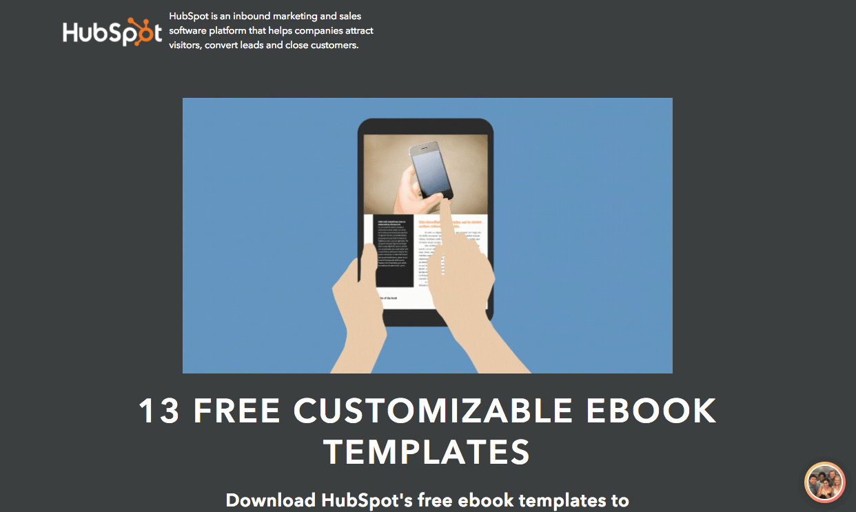
What’s Done Well
- The word free is enticing.
- The subheadline conveys a benefit.
- Blue CTA button pops off the page.
- Bullets convey easy-to-consume benefits.
What Could Be Tested/Improved
- I would test offering the download immediately as a 2-step popup, as compared to simply “continue.”
- I would test removing the checkbox to see if conversions increase.
Expert Analysis
“I think it’s great that the moment we come to this landing page we immediately know what HubSpot is offering. Both the H1 and the H2 are bolded which is a bit distracting. When viewing the landing page on iPhone the main header text comes up perfectly right under the top gif, which looks really clean. Overall the content does a great job showcasing why we would want these ebook templates. The biggest problems right now is I can’t read the orange text on the FAQ’s, the ebook examples are blurry, and the image behind the form at the bottom distracts from the CTA button. I’d worry people would have a hard time finding that CTA button. I’d also worry that people would not be able to see the arrows to navigate the example ebooks and like to test having less blurry example ebooks. I also think it would be worth testing not having sharing buttons on the landing page, as that could also distract visitors.”
- Daniel Wallock, Vice President (Agency Services), BlitzMetrics
27. Email1K

What’s Done Well
- Headline conveys a strong benefit.
- Lead capture form is obvious and eye catching.
- Countdown timer indicates urgency.
- Use of expert contributions communicate credibility.
What Could Be Tested/Improved
- I’ll add a little more description to what the entire course entails.
Expert Analysis
“Thoughts on what I would test on Email1k, for me there is no ‘finished’ landing page, there is always room to test and improve.
“Testing needs to happen on all devices to ensure the benefits are clear and the user can take action easily on every device. For example, on mobile the page loads the the form in view so the user does not see ‘A free 30 day course to DOUBLE YOUR EMAIL LIST,’ an important message that gives the user a reason to enter their email address.
“It’s clear that the goal on this page is to get someone to leave their email address, but there is a lot to distract them, the very first link is to ‘Powered by SumoMe’ at the very top of the page, the social share icons are an overlay that appears after page load. You need to test all these, how many people click these, how many social shares do you get from the share widget, how valuable is the evidence that many people have shared the page – is it worth the distraction. How many people click SumoMe and don’t complete the form – testing will tell you all of this.
“I can see that ‘Meet the Email Marketing Experts’ is designed to give gravity to the course, are these names your audience has heard of and respect? If not, what purpose do they serve? If the course had comments from Seth Godin it’s a name I’m going to value, over someone I’ve never heard of.
Test company logos your experts have worked with, or even better testimonials from people who’ve downloaded the document as there is there is less need for these to be recognisible names.
“So. Test every device, are key messages clear and visible. Reduce distractions that take people away from your primary goal and ensure evidence of quality resonates the the audience, test some other proof here.”
- Daniel Lennox, Head of Digital Marketing, Riverford
28. Masala Body

What’s Done Well
- Before and after pictures demonstrate proof that she knows what she is talking about – and has helped both herself and her clients get results.
- The word free is enticing.
- The idea of losing weight using spices creates a lot of curiosity.
- Handles objections well by showing that prospects can still eat their favorite foods.
- Good use of logos to indicate social proof.
- Testimonials help further indicate social proof.
What Could Be Tested/Improved
- I would test sticking to one offer instead of having two.
Expert Analysis
“Once you open this particular website, the owner doesn’t waste any time getting right to the point. The immediate benefit of fast weight lost is very evident. The brand and recipes mentioned are immediately backed by extensive social proof showing that Nagina has been featured in the likes of Forbes, Huffington post and Time.
“One item that stands out from the rest of the landing page is the header. While the rest of the landing page gives off a premium feel, the header feels like it didn’t get enough attention. Although it’s not something that will immediately affect conversions or bounce rate it would be something to keep in mind for the future.
“Moving further downward, the 3 spices that have been ‘scientifically proven’ to burn fat are shown. Although it’s not a necessity, a quote from a nutritional expert or a doctor would reinforce the validity of Nagina and her brand.
“Moving on the before and after images show Nagina’s recent success with other participants. Highlighting their success in a different colour would draw the reader’s attention to the results that they can expect even more. The landing page finishes with a very good summary of the Nagina and more testimonials.
“Masala Body has a very engaging and direct landing page. An industry often associated with scams or amateurs getting the right message across has never been more crucial. With some more (optional) tweaks it could be optimised even further, yielding higher conversion rates.”
- Moritz van Contzen, Founder & CEO, Avenik
29. Impact

What’s Done Well
- The offer is great – 10 free ebooks for one email address.
- Good use of the arrow to point to CTA
What Could Be Tested/Improved
- Too many form fields might deter prospects from signing up.
- I would test removing the social share buttons to reduce confusion.
Expert Analysis
“Marketers tend to overcomplicate their landing pages with fancy design & lengthy copy (violating the KISS principle), but not this landing page. The simple & minimalist design allows visitors to focus what matters most: the offer.
“As marketing is a broad discipline, I’d package the offer for a specific audience (e.g. inbound marketers) or order the offers into a learning journey to reduce inundation; the current message is too broad.
“Adding a few testimonials will definitely help to instill trust and improve conversion. The no. of form fields should commensurate with the value, which is justified in this case.”
- Alvin Lim, Digital Marketing Consultant
30. Athlean-X

What’s Done Well
- The word free is enticing.
- “Building biceps that turn heads” is a good benefit that draws prospects in.
What Could Be Tested/Improved
- I would test focusing the landing page by removing the other elements from the website.
- it is unclear what does Biceps Black Book mean.
Expert Analysis
“The landing page has a great video and a clear Call-To-Action. They also has HTTPS in front of their URL to make the visitors feel safe. But, there are some easy ways to make this landing page convert like hell.
- Add social proof – testimonials and reviews from people that already used the book.
- Try to remove distractions as much as possible. For example, the footer is too massive for a landing page and takes too much focus from the main CTA. The top menu is too ‘crowded’ and under the main CTA there is another one asking to sign up for the newsletter. Try to stay with just 1 Call-To-Action.
- Use exit-intent overlay to capture more visitors that abandon the page without signing up.
- Change the title HTML tag of the page from “free gift” to “Get ‘The Biceps Black Book’ for free.”
- If you leave your page long, make sure to repeat the CTA or add a floating “sign up” button that will follow the visitors when they scroll.”
- Tomer Aharon, Co-Founder, Poptin
Steal the Best Landing Page Examples in 2018 – Don’t Start From Scratch
You don’t have to create your landing pages from a blank slate.
Look at the above landing page samples and model the winning elements. Then, look at what the experts say, and systemically test, tweak and analyze different ways of improving your own.
And then watch your conversion rate skyrocket.
About the Author: Ong Si Quan is the Content Marketing Manager at CandyBar, a digital loyalty card app. Use CandyBar to run an entire loyalty program from your own device, and get insights into who your best customers are. Try CandyBar free for 30 days here today.