A UX mistake is anything that gets between the user and what they came to do. It could be:
- A button that’s too small to tap on mobile
- A checkout flow that asks 12 unnecessary questions
- A design that looks beautiful but is harder to navigate than a corn maze
UX mistakes matter because if your website, app, or software interface is littered with them, users leave fast and lose trust in your brand. They can also cost you. Bad UX means higher customer support costs—and fewer conversions.
Now, we’ve all made UX mistakes before. But knowing what they are is the first step to avoiding them.
So without further ado, here are the top 7 UX mistakes to avoid for a smooth user experience.
1. Designing for Yourself Instead of For Your User
You may know your product inside and out, but your users don’t. If you design with your own preferences in mind, your UX will almost definitely be unintuitive for others.
Take Monday.com, for instance.
Every time I look at a Monday board, I want to scream. The UI feels like a color-coded spreadsheet had a midlife crisis. It’s overstimulating and cluttered even without any real projects going on.
It throws so many buttons, animations, and views at you that finding what you actually need takes forever.
The screenshot below is what Monday looks like right after you set up your first workspace.

How is there already so much going on?
I don’t know and I don’t like it.
Instead of being intuitive for the average user, Monday’s UI looks like it was built to impress internal stakeholders. Or maybe project management pros that design overly organized Excel spreadsheets on weekends for fun.
Yet Monday’s supposed to work for personal projects, work teams, and everything in between. Not just project management gurus.
The end result is a tool that forces you to adapt to its noisy, over-engineered interface instead of adapting to your needs.
Here’s a list of UI cons from a Reddit thread titled, “What Are Your Biggest Frustrations with Monday.com?”:
- “Building attendance boards takes 2 minutes on Excel, and 45 on Monday.”
- “You can’t simply ‘undo.’ That’s hilarious.”
- “The stupid skinny scrollbar that I can never seem to grab.”
- “The extremely long subject lines when I add a notification automation.”
- “It gets to a point where you just see a blurry mess of colors.”
One user put it beautifully when they said, “Monday should make workflows faster and improve project management, not be yet another thing that takes time away from actual project completion because of the pain of logging/building/monitoring.”
Clearly, I’m not alone in my dislike of Monday’s UI.
So, can you truly avoid designing something that fits your preferences instead of your users’?
Yes!
Here’s the fix: Run quick usability tests with at least 3-5 people outside of your team. Don’t provide any instruction as you watch them navigate your software, because your users won’t have you there either. Take notes on everything that frustrates your usability testers, and then change those things to be more intuitive.
2. Hiding Important Actions Behind Icons
Imagine you’re looking for something crucial, like a pricing page. A “cancel subscription” button. A way to save your work before exiting a software platform.
But you can’t easily find it until finally, finally, you find it hidden behind a hamburger menu or gear icon.
Sounds frustrating, right?
And it is.
The most important actions in your interface should be immediately visible, clearly labeled, and easy to access. No decoding icons or opening hidden menus required.
If someone has to hunt for a core feature, your design needs updating.
Case in point? Gmail. I’ve used Gmail and other Google Workspace products for years, and while I like them fine, I do not love the over-reliance on icons.
If I want to sign out of an account, I first have to click the red “L.” Only then will I see an option to sign in or out of one of my Gmail accounts.
Which is why, even after more than a decade of using Gmail, I still struggle to find the sign-out button.

Here’s the fix: Figure out what your user is trying to do on each screen, and make that action impossible to miss. Use clear labels (not just icons), visible buttons (not hidden menus), and visual hierarchy like size or color to guide them straight to it. If they have to pause and think, it’s not obvious enough. Bring in usability testers from outside your company and ask two key questions:
- What do you think the primary action is on this page?
- How easy was it to find and complete?
Take their feedback to heart and make adjustments accordingly.
3. Stuffing Your UX with Word Salad
Good copywriting makes for easy reading. Bad copywriting makes your interface feel like a thesaurus threw up all over the user’s screen.
Users don’t want to “synchronize onboarding modules to optimize stakeholder alignment.”
They want to get started.
See how much easier that is to read?
When you fill your product with jargon, fluff, or corporate filler, you don’t sound smart.
You sound like you’re stuffing a bunch of words onto the page to try to sound smart. But what’s really happening is users are working harder than they should to understand your page.
This leads to frustration and lower conversion rates.
The best UX writing is invisible yet informative. It’s not too short and vague to make sense, or too long and wordy to be readable.
(Looking at you, United States Internal Revenue Service website. I mean, this sentence alone is wild: “If you fail to remain an eligible individual during the testing period, for reasons other than death or becoming disabled, you will have to include in income the total contributions made to your HSA that wouldn’t have been made except for the last-month rule.”)

Here’s the fix: Write like a human. Use plain language that’s specific, helpful, and action-oriented. Replace vague CTAs like “Submit” with “Send Message” or “Create Account.” When you write copy, avoid the temptation to make a heaping bowl of word salad.
Finally, test your copy by asking someone outside your team to explain what each line or button means. If they hesitate even for a moment, rewrite and refine.
4. Assuming Everyone Can Use a Mouse
Accessibility isn’t optional. It’s foundational to good UX—and to making sure your website or product follows accessibility laws.
A common mistake we see is when people design an interface that only works if you’re using a mouse. Or worse, interfaces that break if you’re using a keyboard, screen reader, or voice commands to navigate.
Common UX mistakes in this department include:
- Buttons without accessible labels. If your button doesn’t have an aria-label, screen readers may not be able to interpret what the button does.
- Menus that trap keyboard users. Nothing’s worse than a menu that you can tab into but not out of unless you use a mouse or refresh the page. Make sure everything is navigable using keyboard buttons alone.
- Color-coded information. Charts that rely only on colors to distinguish meaning are a nightmare for colorblind users. Use different shapes and clear labels to make the distinctions easy for everyone to understand.

These are just a few of the many struggles the millions of people who use assistive technology face every day. When your interface ignores these users, it violates basic usability—and, potentially, legal standards as well.
Here’s the fix: Make sure your website follows the most current World Wide Web Consortium Accessibility Guidelines (WCAG). Use strong color contrast for text and UI elements, use semantic HTML so it’s easy for assistive tech to interpret your layout, and test your interface with browser-based screen readers.
5. Skipping Success Feedback Cues
You click a button to submit a questionnaire, place an order, subscribe to an email list…and…nothing happens.
Did your button-click work? Yes? No? How can you possibly know?
Without visual confirmation that an action was successful—or failed—you can’t know. And this is a problem, because in the UX world, silence equals confusion.
Even when I signed up for TCG Player’s newsletter—TCG Player being a trading card marketplace I frequent because I have an 8-year-old kid who loves collecting Pokémon cards—I got a small note of confirmation.

Always give users feedback on whether the action they completed was successful or not.
Here’s the fix: Build in clear, immediate feedback for every user action, especially ones that matter. Use visual cues like loading spinners, success messages, and confirmation pop-ups to reassure the user that something actually happened.
If an action fails, say so—and tell your users what to do next. No one should be left guessing.
6. Not Trusting the Scroll
Back in the olden days, circa 2005, people didn’t spend nearly as much time scrolling on their phones.
Megahits like the iPhone hadn’t even been released yet. So it made sense to stuff all the content above the fold, or at the very top of a webpage or dashboard, because you might not have another chance to show web visitors All The Things.
Nowadays, scrolling is as natural and expected as drinking water or breathing air. People scroll, and you’ve got to trust them.

The IRS’s Electronic Federal Tax Payment System is a classic example of above-the-fold clutter.
Here’s the fix: Instead of designing panicked, overwhelming pages, design with hierarchy in mind. Put the most important actions or items at the top, and give users a reason to keep scrolling down.
- Lead with what matters: Put the most important content or action near the top—but not everything. Leave room for mystery, and trust that readers will look for ways to solve it.
- Use visual cues to guide the flow: Headings, subheadings, spacing, and contrast help users scan the page and move downward.
- Design intentionally below the fold: Let part of the next section peek up to encourage scrolling.
- Create a visual rhythm: Use different content types, like text, images, and buttons, to keep users engaged with your page.
- Avoid cramming: Give your content room to breathe—white space is your friend here.
- End the page with a value point: Include a strong closer, like related links, a CTA, or useful information. That way, there’s a payoff. The scrolling feels worthwhile.
7. Using Patterns Designed to Trap or Trick Users
Have you ever tried canceling a subscription and ended up in UX hell?
I have—too many times. And it never fails to leave me frustrated. There’s nothing worse than needing to cancel a subscription, hunting to find the right button on my phone, only to see a message saying I can’t cancel on an app and must use my laptop instead, only to find that I actually have to send an email to the support team or—shudder—call to cancel the subscription.
This mazelike purgatory is intentional, and it’s bad UX.
Here’s the thing: subscribers often unsubscribe when money’s tight or they don’t need to use a service. But there’s a good chance they’ll be back, as long as it’s not impossible to unsubscribe.
Case in point: I once had a subscription to the San Antonio Express-News’ mobile newspaper. It was, of course, super easy to sign up for the service. But to unsubscribe, I had to call the Texas office and explain why I wasn’t continuing my subscription, and say “no” to about 5 different upsells.
Needless to say, I won’t be back.

Even worse is when you do get a message to unsubscribe easily, but it frames your options like this:
- Option 1: “Keep working with us!”
- Option 2: “No thanks, I’d rather fail.”
This is called confirm shaming, and it undermines user trust in your product. No one wants to use a service that’s so desperate it comes off as manipulative instead of helpful.
Here’s the fix: Leave users with a smooth and respectful experience, and they may just come back. Their wallets will get plump again, or they’ll need your service again, and if they unsubscribe with happy feelings instead of frustrated ones, they’ll return.
I can’t tell you how often I subscribe and unsubscribe from services like Netflix, CoSchedule, and even Ahrefs.
It’s just part of life in a subscription-heavy world. No one can afford—and no one wants—all the subscriptions, all the time.
How to Audit and Identify UX Mistakes
The easiest way to keep UX mistakes from getting past your pre-release product is to catch them before your users do.
So, run usability tests. You don’t have to go wild with expensive tests, either. According to Jakob Nielsen of Nielsen Norman Group, 5 users can reveal 85% of issues. You should run these tests well before the quality assessment phase of a product.
The earlier, the better.
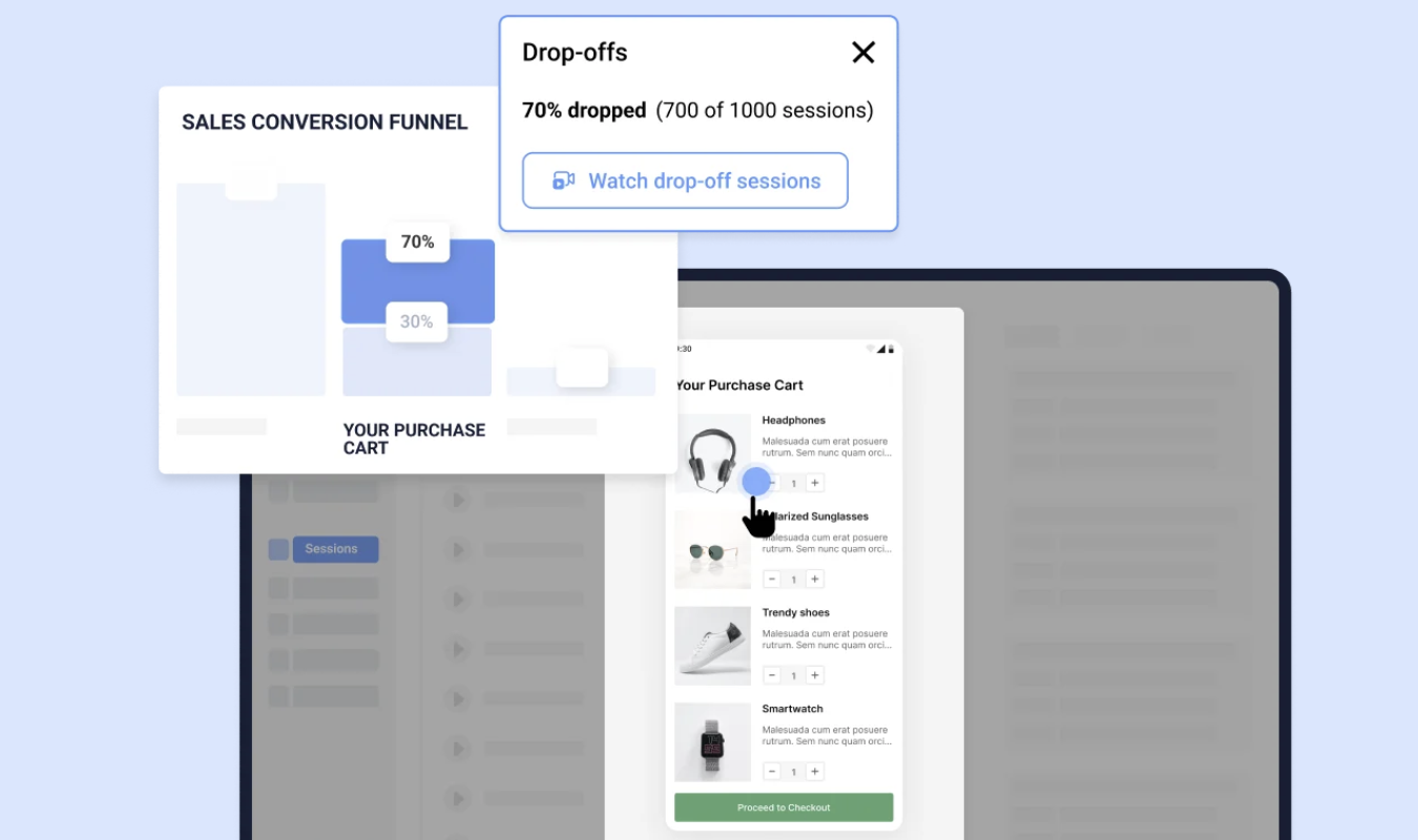
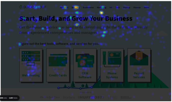
You can also use heat map tools to spot rage clicks, dead ends, and scroll drop-off points. Studying user behavior goes a long way.
Finally, consider asking someone without deep tech experience, like your mom or grandpa, to test out your product.
If they don’t get it, your users won’t either.
The Cost of Poor UX
Bad UX isn’t just annoying. It’s expensive.
Here’s where it can cost you:
- Lost signups
- Abandoned carts
- Costly support systems to constantly slap band-aids on bad UX
- Damaged trust (aka subscribers who get so frustrated they put you on a blacklist)
UX goes way beyond color and style choices. You don’t lose users because your button is the wrong shade of blue.
You lose them because they don’t understand what to do next.
The Most Overrated UX “Best Practices”
Some advice just doesn’t hold up. These top three overrated UX best practices should stop being preached from the rooftops, IMO:
- “Users don’t scroll.” Yes, they do. It’s not the 2000s or 2010s. Just make sure the scroll is worth it.
- “Minimal is always better.” Too much white space is just as bad as not enough. Overly minimalistic UX makes for confusing, bare-bones user experiences.
- “Put everything in a hamburger menu.” To that, I’ll reply with this: Out of sight, out of mind. Sure, you can put extras in the hamburger menu. But keep the most important stuff visible at all times.
Instead of following best practices to the letter, allow your users’ opinions and lived experiences to guide you.
UX Mistakes Beginners Make (and Pros Avoid)
Everyone starts somewhere, and most UX beginners are bound to make mistakes. But if you know what the most common snafus are, you can avoid them.
Here are a few rookie traps:
- Designing without doing any research into who your customers are and how they prefer to navigate a webpage or dashboard
- Relying on trends (looking at you, minimalism!), and not goals for what you want your UX to accomplish
- Focusing only on aesthetics (looking at you again, minimalism)
- Ignoring mobile or accessibility (for the love of everything everywhere, please let us unsubscribe from the mobile app)
- Overcomplicating flows, because no one wants to spend time in a maze if it’s not Halloween time
What separates pros from the rest? Iteration. UX professionals test, learn, and fix issues quickly. If you do the same, you’ll be ahead of your peers when it comes to delivering an excellent user experience.