If you’ve done enough A/B split tests to determine that your site converts best with a sidebar, you’ll want to know how to maximize that space for more conversions. The good news is that, when done right, a sidebar can be an attractive addition that compels visitors to act. Here are five conversion elements that have been shown to increase conversions – and are worth testing on your website.
1) Create a Short but Precise Form for Better Lead Generation
Including a short form in your sidebar with specific questions can help you not only generate leads, but qualify them as well. By asking specific questions rather than just a name and email address, you’ll also cut back on pure freebie-seekers.
For example, Hubspot’s Website Assessment form asks a heap of pertinent questions to better qualify their leads, including who you primarily sell to, your type of business, your biggest marketing challenge and more. This in turn helps them craft relevant content that matches their prospects’ interests.
The important thing to keep in mind about sidebar forms (particularly if they’re more than a few basic questions) is that in many cases, the more you ask, the less inclined people will be to complete the process. They’re looking for an avenue that’s quick, easy and rewarding. The reward needs to be compelling enough to get them over that initial effort to complete the task.
Hubspot’s Lead Generation Form asks specific questions to help them filter out pure freebie-seekers
2) Make Your Credentials More Noticeable
This strategy works well for She-conomy.com, which showcases its top rankings in Forbes predominantly on its sidebar. You can also do this with testimonials from well-known clients or companies, newsworthy sites you’ve been featured on and more.
Showing your best credentials helps build authority and expertise in your industry
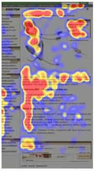
Putting your best credentials “above the fold” (in the first 1/3rd of the user’s screen space) will immediately attract their attention, since our eyes tend to naturally follow an “F” pattern when browsing a new site.
The “F” Pattern heatmap from Jakob Nielsen’s 2006 Eye-tracking Study
And, if you guest blog for well-known sites in your industry, don’t forget to include links to your articles featured on these sites as well. Featuring your best moments in the digital spotlight prominently on your sidebar can even open up new opportunities for future work, it certainly has for me.
3) Go Beyond the “Latest Posts”
Many sidebars, particularly in blogs, feature the “Latest Posts” or “Latest Comments” widget. This by itself is fine – but may not garner as much attention as a combination of your latest posts with images and social proof.
The Huffington Post, one of the most popular blogs on the web, uses every possible advantage to maximize its sidebar posts. In addition to displaying the latest topics, it also adds an attention-getting photo and a quick note of the number of Facebook likes a particular article has gotten. This one-two sidebar punch also includes numerous social sharing buttons – including ones for popular smartphones like the iPhone, Android and Blackberry.
Huffington Post combines photo appeal and social proof in their sidebar articles
WordPress users can add a similar type of functionality by using the “Use Image as Thumbnail” feature whenever you upload an image to a post. Blogger users can add a Gadget which does something similar.
If you sell products, the sidebar is the perfect place to highlight additional accessories – such as what Amazon does for its Kindle page. Showcasing the accessories could be improved even more by putting the starred reviews and the number of reviewers beside each one.
4) Make the Most of Your Archives
By default in WordPress, archives are separated by month and year. Unfortunately, that doesn’t tell readers much of anything. Instead, you could follow Cracked.com’s lead and do a “Flashback” segment of a few noteworthy posts or articles worth reading (again). If you’ve got a good deal of “evergreen content” on your blog, or even if you’ve freshened up a post from last year, highlight it again to catch both new and regular visitors.
Cracked’s Flashbacks showcase some of their evergreen content from years past
Copyblogger also does this by highlighting their most popular articles based on the number of comments. Some of them, such as “Five Grammatical Errors that Make You Look Dumb” and “How to Be Interesting” are the kinds of topics that are always fresh and worth a click.
5) Invite Visitors to Participate
Here is a sorely underused feature that should be included on more sites – specifically sites that encourage a community to grow. Darren Rowse’s Digital-Photography-School.com does a brilliant job of this by not only showcasing his reader’s latest photos, but hosting a weekly assignment to improve their photography skills – all right from the sidebar. Once you click on an assignment, you can read more about it in the community forum, as well as see the winners.
The sidebar on Darren Rowse’s Digital-Photography-School.com encourages user participation with weekly assignments
Many blogs have ways for readers to comment, subscribe, or download a freebie – but few of them motivate the user to actually think about participating through a weekly assignment of sorts.
Now it’s your turn. Have you tried any particular elements or widgets in your sidebar that boosted conversion rates? What kind of results did you get?


