Did you know that 55 percent of visitors spend less than 15 seconds on a website?
Regardless of your industry, product, service, etc., you’re dealing with an extremely small window of time before your visitors bolt.
First impressions are huge, and studies have shown that the first 10 seconds are crucial for your visitors’ decision to stay or go.
This graph from Nielsen Norman Group illustrates this well.

So what can you do to ensure that you make a positive impression and get the maximum percentage of visitors to hang around and check out your content?
It starts by answering some basic questions and satiating the curiosity of your average visitor.
At the end of the day, you want to make sure that you cover all of the bases and that you don’t make your visitors work too hard.
With that being said, here are eight specific questions every visitor wants answered in 10 seconds.
1. What Are You Selling?
First and foremost, they’ll want to immediately know what product/service you’re offering.
The instant they land on your website, this should be abundantly clear, and there should be absolutely no guesswork involved.
Here’s a good example from Moz.

With just a few lines of copy, you instantly know that Moz is selling online marketing software.
Furthermore, it’s clear that this software is designed to help your brand increase its exposure and simplify your campaign.
You don’t have to scroll halfway down the page to understand this. The information is presented above the fold, so that in a matter of seconds you get the gist of what’s going on.
The point I’m trying to make here is that your first priority should be to explain who you are and what product/service is being provided.
Here’s proof.

Failure to clarify this information or forcing visitors to browse through your site to figure it out is just setting yourself up for disaster.
2. Why Should They Care?
After establishing what your offer entails, your visitors will have an even more pressing concern.
How will it improve their lives and solve whatever pain points they’re experiencing?
In other words, what’s in it for them and why should they care?
This is where you need to communicate your value proposition, which basically means why they should do business with you.
I think that Moz explains this well on their homepage by simply saying, “Online marketing is complicated. Moz software makes it easy.”
By reading this, visitors know that using this tool can simplify their lives and take out some of the stress that comes along with online marketing.
It’s short, sweet and concise.
Here’s a bit more about a value proposition.

The bottom line here is that you need to promote your product/service in a way that it inspires consumers to buy.
I recommend doing some brainstorming to identify what the top reasons are why someone would want to buy. Then make this abundantly clear on your website.
3. What’s the Cost?
Let’s say that you’ve piqued a visitor’s interest by explaining what your product/service is and what the benefits of using it are.
At that point, they’re invariably going to want to know how much it costs.
While you don’t necessarily need to slap up the price on your homepage, you should make sure that your visitors can find pricing information with a single click.
Making them jump through hoops is only going to frustrate them, and many will leave before checking out your deal in further detail.
I know that I’ve personally had experiences where I was sold on a product but couldn’t find any concrete pricing.
It’s incredibly annoying, and I’m usually tempted to take my business elsewhere when this happens.
Here’s a good example of how to approach pricing from HubSpot’s website.

Notice how it’s clearly marked on the top tab.
With just one click, you land on their pricing page where you can instantly see which options are available.
4. What Differentiates Your Brand From Others?
Let’s be honest. Most industries are saturated with competitors vying for the attention of a finite demographic.
Even small niches may easily have 10 or more top companies all battling for their slice of the pie.
Quite frankly, the differences from one company to another may be minuscule.
Nonetheless, many consumers want to know a little about your company’s story, history, team members, values and so on.
That’s why it’s important to quickly differentiate yourself from other competitors and establish a unique brand identity.
Although it just wouldn’t be practical to put long-winded details on your homepage (this is usually reserved for your “about” page), it’s smart to show what makes you special.
I think that TOMS Shoes does this extremely well on their website.

Here they quickly point out their policy of giving away a pair of shoes to someone in need for every pair that’s purchased.
If you’re in a highly saturated industry and still have trouble differentiating yourself, you might want to read this post.
5. Can I Navigate Your Site With Ease?
Your average online shopper has the attention span of a gnat.
When it comes to navigation, it needs to be intuitive, and visitors should be able to get their bearings within a matter of seconds — not minutes.
In fact, “after reaching a company’s website via a referral site, 50 percent of visitors will use the navigation menu to orient themselves.”
If your site’s navigation is overly complex or arduous, it’s not going to do you any favors.
That’s why I always make it a point to make the navigation of my websites as straightforward and painless as possible.
Take Quick Sprout for example.

As you can see, visitors can find what they’re looking for without having to do a lot of thinking.
There are also minimal choices to prevent “cognitive overload,” which basically paralyzes visitors when there are too many options to choose from.
The key with navigation is to keep it as simple as possible so that visitors can move their way seamlessly through your site without expending too much mental energy.
6. Who Else is Using It?
Social proof is a “psychology hack” that’s huge these days.
Consumers want validation of a product/service before they spend their hard-earned money on it.
I know I do.
If you’re able to establish other notable customers/clients who are using it, you’re probably going to put a visitor’s mind at ease.
They’re also more likely to keep exploring, which can increase your chances of ultimately making a conversion.
But how can you establish social proof?
One of my personal favorites is to simply incorporate the logos of some brands you’ve done business with.
Here’s what I mean.

Some other effective techniques include the following:
- Testimonials
- Reviews
- Influencer endorsements
For more on social proof and how to build leverage with it, I suggest checking out this post from Kissmetrics.
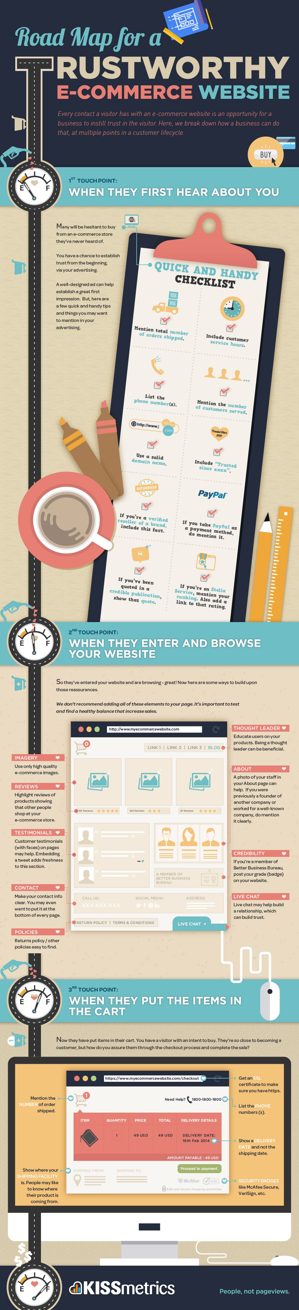
7. Can I Trust You?
Trust is huge.
With many shoppers having a healthy level of skepticism these days, it’s critical that you’re able to establish at least a baseline level of trust right off the bat.
This is especially true if you’re a relatively new company who has yet to build any significant brand equity.
If there’s even a hint of doubt about your credentials and reputability, you can pretty much bet that the bulk of visitors are going to leave.
But how can you instantly gain their trust?
Here are a few options:
- Include the physical address of your company
- List your phone number
- Include badges from the Better Business Bureau or similar institutions
- Place a link to your policies
- Provide basic product return information
I also recommend doing whatever it takes to make sure that your website looks professional with a visually appealing design, high-quality images, etc.
You definitely don’t want to have your site looking like an old Geocities or Angelfire site. That just screams sketchiness.
This infographic from Kissmetrics offers a lot of other helpful information on this topic.
8. How Can I Contact You?
I know that I find it frustrating when I need to reach out to a company but struggle to find their contact information.
KoMarketing even found that “51 percent of people think ‘thorough contact information’ is the most important element missing from many company websites.”
Considering the fact that most of today’s shoppers are Internet savvy, you’ll want to include a “Contact” section in a conspicuous area that requires very little effort to find.
Forget placing it all the way at the bottom beneath the fold.
Instead, place it in plain sight above the fold. You may even want to include a chat box that automatically pops up.
Conclusion
It’s important to remember that you’ve only got so much time to impress website visitors and persuade them to take a closer look at your product/service.
Understanding the most common questions that arise in visitors’ minds is essential for creating a positive experience.
Communicating your value proposition and addressing other key factors should keep you on the right track when creating the design, layout and overall functionality of your site.
The long-term impact?
Higher engagement, a lower bounce rate and increased conversions.
Which website visitor questions do you think are the most vital to address?
