Nominal data is descriptive information wherein rank and order don’t matter.
Still confused? It helps to contrast nominal data with the other three main types of statistical data: ordinal, discrete, and continuous.
Here’s a quick rundown:
- Nominal: Unordered data—for instance, hair color, eye color, favorite brands, and purchase information—in which the order of the answers does not matter. One group (blue eyes) is not higher or lower on a scale than another (green eyes).
- Ordinal: Ordered data with a natural rank, like customer satisfaction scales, income brackets, and age ranges. On a customer satisfaction scale, for example, “highly satisfied” ranks above “dissatisfied.”
- Discrete: Data that can only be counted in whole numbers. It cannot be expressed in fraction or decimal form. For instance, if you have 16 people in a restaurant, you have 16 people. Not 15.5, or 16.1—it would be impossible to divide one person into pieces like that.
- Continuous: The opposite of discrete data, continuous data is information that can take on any value, including fractions and decimals. Things like height, weight, temperature, speed, and time are all examples continuous data.
Discrete and continuous data are quantitative, while nominal and ordinal data are qualitative. (See a recap of the difference between these in our guide to qualitative vs. quantitative data.)
But while nominal and ordinal data are both qualitative, nominal data is not ordered in a particular way. Ordinal data is.
Why Nominal Data Matters
At this point, you might be wondering why nominal data even matters if it’s not something that can be ranked.
Is it just some overly pedantic, academic concept to make statistics even more confusing than it already is?
Let’s bring it down to simpler terms. I like to describe nominal data as descriptive information that all has the same value.
It’s important for two big reasons.
1. Nominal Data Helps You Understand Your Research
One of the most helpful things about nominal data is it helps you get more out of your research results. This is true whether you work in marketing, healthcare, education, business, or public policy.
Let’s say you’re a café that sells mainly espresso, along with a random assortment of bottled juices and teas. You want to learn more about your customers’ drink preferences so you can improve your offerings.
You also want to create marketing campaigns that speak directly to your customers.
So you decide to run a survey to ask your existing customers which type of drink is their favorite: espresso, drip coffee, tea, high-end bottled juice, soda, or sparkling water.
A total of 175 customers answers your survey. Here’s the breakdown of their preferred drink:
- Espresso: 25.71%
- Drip Coffee: 17.14%
- Tea: 11.43%
- High-End Bottled Juice: 11.43%
- Soda: 14.29%
- Sparkling Water: 20.00%
There’s no rank or order here. You want to know how many of your customers prefer each item, not whether one is more popular than another. As part of the survey, you collect another type of nominal data: your customers’ email addresses.
With the information from this survey, you can now send targeted offers to your espresso lovers, tea drinkers, drip coffee adherents, sparkling water fans, and so on.
You can also expand your sparkling water line since you know it’s popular—and avoid stocking a bunch of tea and juice most people aren’t really going to buy.
Long story short? Gathering, sorting, and paying attention to nominal data makes it easier to understand whatever topic you’re researching.
2. Without Nominal Data, There’s No Statistical Foundation to Build On
In the world of statistics, nominal data is considered the foundation for statistical analysis.
Statistical analysis simply refers to the process of collecting, organizing, and interpreting information. Nominal data forms the base for statistical analysis because it represents the simplest, most basic type of data classification.
In other words, it’s the easiest starting point for any complex statistical calculations that follow.
Specifically, nominal data helps researchers identify three core building blocks:
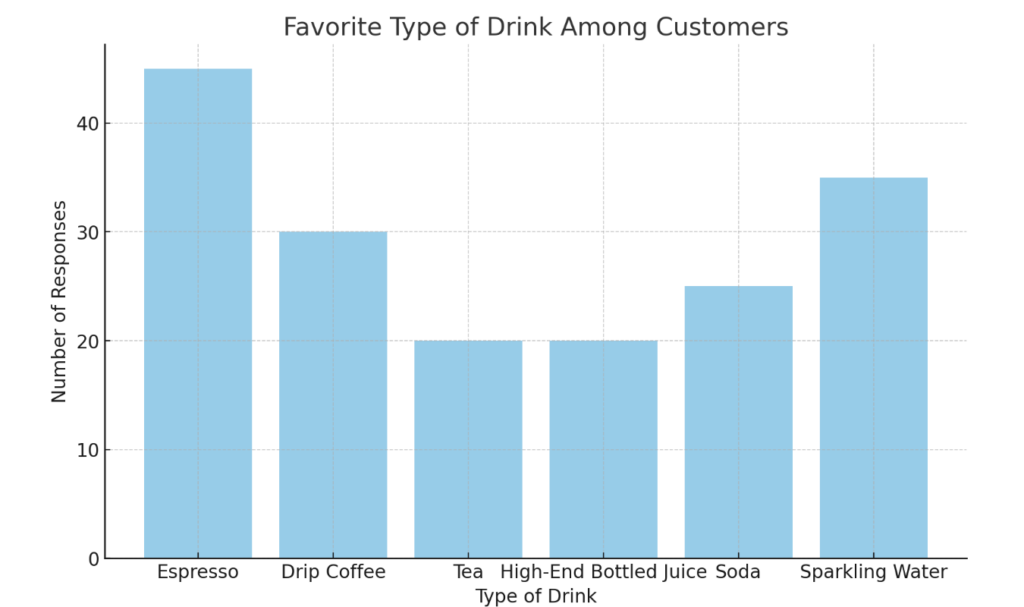
- Frequencies: The number of times a particular category appears in a dataset. For example, in a survey asking people their favorite drink, the frequency would tell us how many respondents chose espresso, tea, or soda. We’ll say that out of 100 respondents, 45 chose espresso, 20 chose tea, and 35 picked soda.
- Percentages: A way of expressing the frequency of a category as a proportion of the total number of responses, multiplied by 100. For our drink survey, we might see percentages like this: 45% prefer espresso, 20% go for tea, and 35% like soda.
- Modes: The mode is the category in a dataset with the highest frequency. For our mock survey, the mode would be espresso, because 45 people chose it as their favorite drink.
With this base information, you can move into the more complicated stuff.
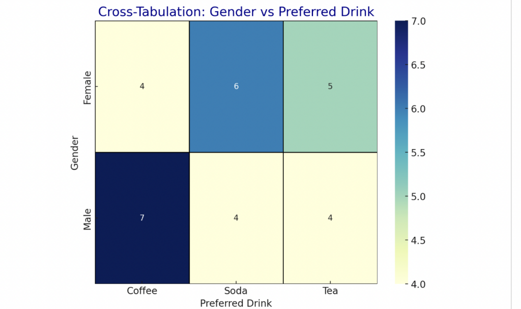
Like cross-tabulation, which is where you create a matrix that shows the frequency of categories across different groups. The goal? To study the relationship between two or more nominal variables, like how drink preferences vary across gender and age.
Or chi-squared tests of independence, which help you find out if there’s a meaningful connection between two categories. These tests show you whether the two categories are linked or not. You can use chi-squared tests of independence to find out if drink preference is connected to gender, for example.
Or ANOVA (analysis of variance), a method that helps you analyze if there’s a meaningful difference between the averages of three separate categories. You could use ANOVA to compare average satisfaction scores across espresso, tea, and soda drinkers.
We could go on and on about how nominal data helps inform even more statistical analysis tools, like propensity score matching and cluster analysis and MANOVA (multivariate analysis of variance), which often rope in different types of data along with nominal—including ordinal, discrete, and continuous data.
But these are topics for another day.
The bottom line is this: you can’t do any of these advanced tasks without your trusty ol’ nominal data.
When You Should Seek Nominal Data
Okay, so we’ve convinced you that nominal data is important.
But maybe it’s a little confusing to figure out when, exactly, you should gather it.
Here’s a quick breakdown of the cases where you should prioritize collecting nominal data—and why.
Gather nominal data when you want to:
- Analyze demographic information. Categorizing participants based on demographic factors like occupation, gender, nationality, and ethnicity help you segment your audience—and compare how different demographic groups respond to the same questions.
- Segment your target market. By grouping your broader audience according to things like favorite products and purchasing locations, you can create highly specific target audience segments for more effective and efficient marketing.
- Survey or poll an audience. Collecting information about your audience’s preferences—for things like political candidates, for instance—can give you tons of insights into the opinions and behaviors of the people you’re studying.
- Carry out quality control or product testing. Keeping track of which products are and aren’t defective is nominal data at its most utilitarian, and it’s absolutely essential to making your brand shine.
No matter what field you’re in, nominal data is essential. It’s also comparatively simple.
So anytime you’re beginning a research effort, start by seeking out nominal data. Use it to identify frequencies, percentages, and modes, and then launch into the more complex parts of your statistical analysis.
When Nominal Data Should Be Avoided
Nominal data is great for a lot of things. You don’t necessarily need to avoid it—it is a building block, after all—but at some point in your research process, it’ll be time to move forward from it.
Move on from nominal data when you need:
- Numbers. Do you need to calculate averages or totals or perform any mathematical operations whatsoever? Nominal data won’t help you—it doesn’t give numerical values. Discrete data is your BFF if you’re just working with whole numbers. If you need those in-between numbers like fractions and decimals, you’ll want continuous data.
- Order. Nominal data is the opposite of ordinal data. So if you need to rank or order items—like income brackets or satisfaction levels—don’t look for nominal data to help you. Go with ordinal information.
- Exact measurements. If you want to measure things like temperature, speed, or weight, continuous data is what you need to gather. Not nominal data.
- Identify trends. Nominal data doesn’t show progression, so it won’t help you spot trends or changes over time. Go with continuous, ordinal, and (sometimes) discrete data.
- Detailed statistical comparisons. Nominal data is trusty and sturdy, but it isn’t particularly deep. For detailed comparisons, go with continuous, ordinal, and discrete data to help you get meaningful insights.
Remember: if you need un-ordered, qualitative insights, nominal data can deliver.
If you want ordered, qualitative information, ordinal data is your best bet.
For quantitative information, collect discrete or continuous data, depending on your needs.
The Best Ways to Analyze Nominal Data
Since nominal data is purely about labels or categories, you can’t average or rank it. But there are still four powerful ways to make sense of it.
We touched on these methods of analysis earlier, but in this section, we’ll show you how to use them to study your nominal data:
First, there’s frequency analysis. This is a popular method for analyzing nominal data because it’s so easy, yet it delivers a lot of interesting information. All you have to do is count how many times each category appears.
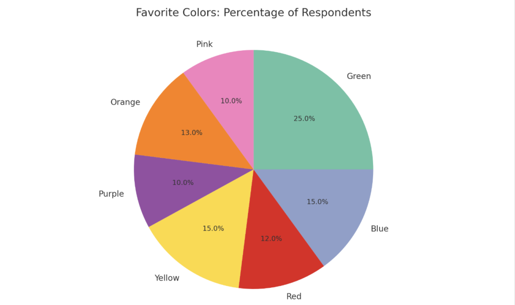
For example, if you’re looking at a survey asking people their favorite color, you’d just count up how many picked red, blue, green, and so on.
That’s frequency analysis in a nutshell.
Once you have the frequencies, calculating percentages is the next step. Percentages help you understand the relative popularity of each category in relation to the whole.
For instance, if 50 out of 200 people say green is their favorite color, that’s 25% of your respondents.
Percentages make it easier to compare categories. They also help you communicate the importance of your findings—like when you need to show your team which categories are dominant (green!) and which are rare (pink).
Don’t skip this step, because honestly, we all love percentages. What’s more interesting to you?
- An unexpected number of people chose green as their favorite color.
- A whopping 25% of respondents named green as their favorite color.
There’s power in that specificity, right?
Next, find the mode. The mode is the category in your data that occurs most frequently. Knowing green is 25% of respondents’ favorite color—a higher percentage than any other color—means it would pay off to incorporate the color into your product or service.
Finally, you can use cross-tabulation to dive deeper into the relationships between your categories.
Say you want to explore the relationship between gender and favorite drink. All you need to do is create a matrix, or table, that shows the frequencies in each combination of categories.
For example, you would see how many males prefer coffee, how many females prefer tea, and so on. Laying the results out in table form helps you easily spot patterns and compare groups.
With these four methods—frequency analysis, calculating the percentage, finding the mode, and cross-tabulation—you can make your nominal data work for you.