They started out as a social media experiment and then suddenly everyone wanted a piece.
A couple years back, if you dropped the word ‘Infographic’ or ‘Dataviz’ in a conversation, you would have been greeted by a good number of confused looks even if you were among other web designers.
Today, so many infographics have gone viral that it’s practically impossible to ignore them. You’ll find them tweeted by your friends who want to share an interesting new find, promoted by companies eager to display their growth trends and utilized by even the White House for its progress reports.
No matter what you are searching for online, whether employment statistics or endangered animals, you are sure to find an infographic for it. If you, miraculously, aren’t able to recall any that you have seen, take a look at this list of the 10 best infographics of 2011 via Nowsourcing to catch up.
Infographics spice up ‘boring’ data
Infographics are useful because they turn historically lengthy and tedious bulks of data in to something that’s much more interesting: a visual.
As a society heading into the new decade, we want to read less and see more. While this doesn’t bode too well for book publishers, it’s opened a whole new creative area for designers.
An increasing number of companies and clients are recognizing the benefits of infographics and want their data jazzed up and dressed for the prom. They know that their assiduously compiled information has a far better chance of being read, appreciated, shared and widely circulated if it looks less like an annual report and more like the next big meme. And if you aren’t convinced yet, here’s an infographic on why you should use infographics.
You will need your existing skills. And more.
While the graphics used in infographics have become more eye-catching and sophisticated, they are not too different in purpose from the charts and graphs we used to make in high school. After all, the objective is still to present data in a more visually engaging and accessible way.
However, print and web designers are having a hard time transferring their existing skills to infographics because, as the many aspiring infographics designers will tell you, designing good infographics isn’t as simple as it looks. Sure, you still need the same essential aesthetic and technical skills but you should also be able to effectively translate data into visuals. Most importantly, you need to ensure that the infographic acts as an informative tool and not as a visual distraction.
The 7 rules of great infographic design
Whether you have just been asked by a client to create your very first infographic or you have been struggling with making good ones for a while, here are the 7 things you should know about designing great infographics:
1. Plan and sketch
Take some time- even half an hour is enough- to plan the infographic before you start copying the data on to your canvas. Think about the best way to visualize the information in front of you and how you should go about it.
2. Know when to go all the way out – and when to keep it simple
When infographics first exploded on the Internet, designers got a bit carried away. Everyone started competing with each other on who could come up with the most vibrant, ‘creative’ and convoluted piece of data visualization possible.
Why go for a bar graph if you can show the same stats through readings on a barometer, right?
WRONG.
While the infographics produced as a result of this ill-directed movement proved effective for link baiting and viral purposes, they did not fulfill their real purpose. They had become more about form than function and the data was lost somewhere between the lurid typography, the over-the-top artwork and the esoteric representations. Data had become secondary even though infographics, by definition, are one half information and one half graphics.
You should not go for a ‘great’ visual just for the sake of it if it obscures the data in any way. If your client insists on seeing unnecessary prodigious artwork, you should at least let them know why you think it does the data a disservice instead of a favor.
Having said that, it’s important to note that extreme ‘minimalism’ doesn’t have a place in infographics either. You should allow the data to come to the surface but you should never be afraid to put on a show. Infographics are a great creatively challenging outlet that let you put your creative skills to a test by pitting them against your analytical ones. And we all love to see beautifully designed infographics that act as a great showcase for data. So yes, there is definitely room to go all out at times!


3. Tell a story through organization
A good infographic is like a good story.
There’s a hook, a focal point and a major-takeaway. You want to capture attention, expand it to what you want to say and make sure the reader gets something from it. To establish this narrative you need to understand what makes the data compelling and important, and how it was collected.
Find the most important ideas that need to be expressed and how you can make them more engaging. For instance, if you were creating an infographic on the biggest trending topics on twitter, you could start by asking yourself questions like:
- What caused that trend?
- What’s different, interesting or impressive about the person/event behind that trend?
- How does it compare to similar trends in the past?
Organization wise, the title-body-conclusion sequence applies to infographics too. The infographic should progress logically and visually lead the reader through the information to the end/conclusion.
For most infographics, there is usually one section which is the most important piece of the data and you will need to build the entire graphic around it. Through your layout, artwork and organization make sure that this piece is the best designed and most emphasized component in the infographic.
This infographic by Coleen Corcoran and Joe Prichard uses an engaging and progressive structure to tell the story of motoring in the US over the last 100 years.

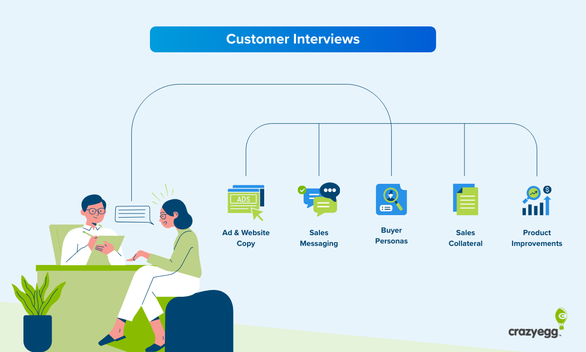
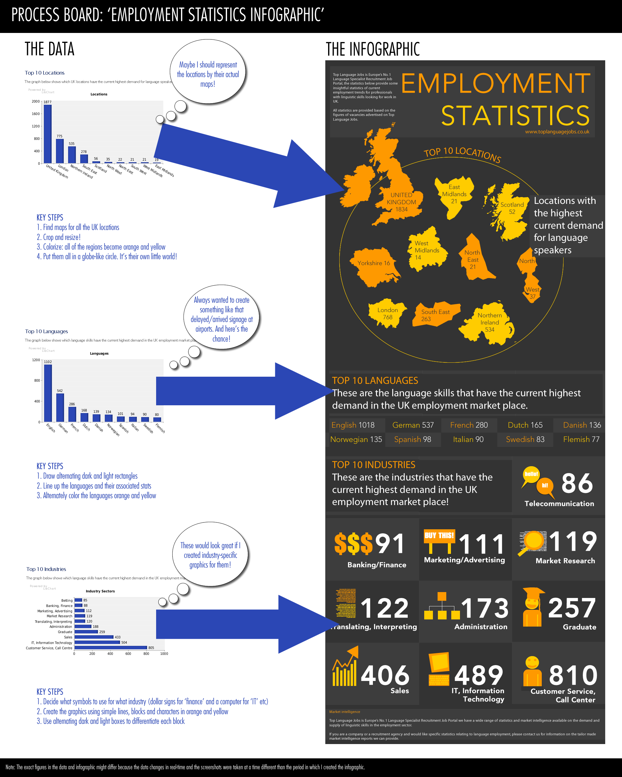
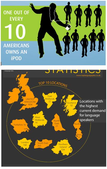
4. Build your personal list of easy and reliable visual associations
A good tip for becoming more efficient with infographic design (by spending less time on brainstorming the next great dataviz idea) is by developing a visual strategy for common types of data. For instance, if you need to show the number of people who do something as opposed to those who do not, or the variation in certain statistics for different geographic locations. In cases like these, reliable visualizations include silhouettes and maps, respectively.
This is not to say that you should stop being creative. By all means, if you find you can visualize your people or country data in a more compelling, effective and creative way, go for it. However, there’s nothing wrong with having a back-up plan!
In the cut-outs below, you can see silhouettes representing the number of Americans who own iPods and maps displaying the employment statistics for different regions in Great Britain. Clearly you could use silhouettes just as well for people who own cars and maps for GDP amounts of all the African countries.
Take a look at these five visual associations that can be incorporated into your infographics.

5. Be clever and humorous. But make sure you succeed.
Designing infographics becomes an even bigger challenge if you have to come up with clever copy and analogies. If you are not good at wordplay or drawing interesting associations, it is best to leave them to a copywriter or a marketing expert.
If, however, you are asked to produce your own analogies and humor for the infographic, start by viewing the infographic as the target audience would and think about how they would connect more to it.
Can a comparison make a certain statistic more accessible or appealing?
“The number of Facebook users is equal to the entire population of the US”.
Would the infographic benefit from a humorous pop culture reference?
“We had our factories thoroughly cleaned 6 times this year. That’s more times than Lindsay Lohan’s been to rehab”.
Asking questions like this can help you in designing the verbal aspect of your infographic. But as you can probably tell, coming up with associations and jokes for infographics is a tricky business. Don’t attempt them unless you are sure they work.
Here is some historical/political humor in an infographic about cats.

6. Keep the purpose and tone in mind
We all want infographics to be visually arresting eye-candy but there are certain aesthetic restrictions you will need to consider depending on the purpose and target audience.
If you are designing an infographic on the history of the Disney brand, bright cartoonish illustrations are to be expected. However, if you are designing an infographic highlighting corporate successes in the past fiscal year for distribution to potential investors, you should resist neon colors and inappropriate humor.
Cartoon illustrations and bright colors are appropriate for this Disney VS Marvel infographic.

BP’s infographic about Relief Wells and Subsea containment uses a sombre black and blue palette.

Similarly, you will need to design your infographic according to how and where it will be displayed.
That includes things like the dimensions (so that it fits in on the website) and background color of the infographic. You should avoid white background as most websites use it as well and your infographic will seem to have no start and end points when displayed.
7. Typography is a lazy substitute for graphics
I love good typography.
There’s nothing you can say that can’t be said better with the right typeface. However, a lot of infographic designers start using typography as a replacement for creative visuals. Remember, the purpose of an infographic is not to format the data with your favorite fonts and colors. The purpose is to transform the data into eye-catching, creative and accessible visuals that makes viewers interested enough to care about the information.
Typography is a great way to increase the effectiveness of any design and make it look better. But it should not be your only contribution to the infographic.
The examples in the right column below could have been more appealing if they were illustrated through visualizations, not changes to the font size, weights and styles.

All data is the result of some real life, living, breathing happening.
Your job is to conjure a semblance of it on your canvas. As long as you do that, it doesn’t matter which of the seven rules above you followed and which ones you broke.
As with all good design, the most out of box and unconventional practices can yield great results.
Never be afraid to experiment but make sure you have the experience and practice behind you to make the right risky decisions!