In previous articles, we have looked in to text shadows and border effects for our block level elements – but now it is time to see what box shadow effects we can create on our block level elements with CSS3.
A block level element is any element that has structure and layout. The most common block level element is a DIV, although almost any element can be made a block using display:block.
The CSS property box-shadow gives us a huge variety of options for creating shadow effects both inside and outside the element.
The syntax is as follows (all on one line):
box-shadow:
inset xPosition yPosition blurSize spreadSize color;
Where:
- inset (optional) if included the box shadow exists inside the box. If omitted, the box shadow exists outside the box.
- xPosition is the horizontal offset of the box shadow relative to the block level element.
- yPosition is the vertical offset of the box shadow relative to the block level element.
- blurSize (optional) is the size of the shadows’ blur.
- spreadSize (optional) is the size of the shadows’ spread.
- color is the color value – and can be any of the usual color formats – hex, rgb, rgba, hsl, hsla or a named color.
Assuming we had a DIV on our page with the class myElement, we could create a simple box shadow on that element using the code:
.myElement {
    box-shadow:2px 2px 2px #666;
}
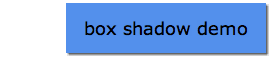
In the code snippet above, we are setting the x and y positions of the shadow to 2 pixels to create a shadow to the bottom right. We also set the blur size to 2 pixels and the color to #666 (grey).
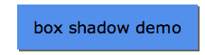
If we wished the shadow to go to the top left, rather than the bottom right we simply use negative values for the x and y shadow position.
.myElement {
    box-shadow:-2px -2px 2px #666;
}

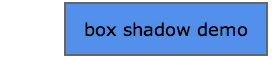
Using the xPosition and yPosition values without a blur, we can create a block shadow with an offset, like so:
.myElement {
    box-shadow:2px 2px 0 #666;
}
If you want to create a box shadow all around the element, you don’t need to create four box shadows. Instead, use spreadSize to create a block shadow around the element, like so:
.myElement {
    box-shadow:0 0 0 2px #666;
}
Want your block shadow to be blurred? No problem!
.myElement {
    box-shadow:0 0 5px 2px #666;
}

If you wish your shadow to appear inside your element, use the keyword inset. Positive numbers will make the shadow appear to the left (on the xPosition) and above (on the yPosition).
.myElement {
    box-shadow:inset 2px 2px 2px #000;
}

While negative numbers will make the shadow appear on the right and bottom edge.
.myElement {
    box-shadow:inset -2px -2px 2px #000;
}

Let’s do something useful with inset. Ever wanted to create a button with a glow effect? With box shadow, it’s easy! The following code fills half the button with a different color, with a simple blur at the middle.
.myElement {
    box-shadow:inset 0 25px 2px #92baf4;
}

Again, you can fill your shadow from the bottom to create an effect in the opposite direction.
.myElement {
    box-shadow:inset 0 -25px 2px #92baf4;
}

Like text shadow, you are not restricted to just one shadow. Using a comma, you can create multiple shadows. Here, we’ve created a shadow both inside and outside the box.
.myElement {
    box-shadow:2px 2px 2px #666, inset 0 -25px 2px #92baf4;
}

Using border-radius from the last blog, we can combine the two to create more rounded button. This looks nicer, but the shadow will take on the same radius as the box
.myElement {
    border-radius:8px;
    box-shadow:2px 2px 2px #666, inset 0 25px 0 #92baf4;
}

Fortunately, there is a way to solve this. By adding a negative spread, we can reduce the border-radius effect. You may need to play with the negative value to get the setting right for you.
.myElement {
    border-radius:8px;
    box-shadow:2px 2px 2px #666, inset 0 60px 0 -36px #92baf4;
}

So which browsers support box-shadow? Thankfully more than those that support border-image!

All green for all browsers – well, IE9 and beyond. It’s also supported on mobile, but if you want to use it on Android and iOS 3 and 4, you’ll need to add the -webkit- prefix. Similarly if you are still supporting Firefox 3.6, you’ll want to add the -moz- prefix.
If you’ve created any awesome box shadow effects, let us know in the comments!