With CSS3, a whole host of text shadow effects are available for us to play with. In this article, we’ll cover some of the effects you can make with relatively little CSS code.
CSS3 text shadows can be applied to any text on the page. The syntax for text shadows is as follows:
text-shadow:xPosition yPosition blurSize color;Where:
- xPosition is the horizontal position of the text shadow relative to the text.
- yPosition is the vertical position of the text shadow relative to the text.
- blurSize is the size of the shadows blur.
- color is the color value – hex, rgb, rgba, hsl, hsla or named color.
Assuming that we had a paragraph with the class “myText” within our HTML, we could apply a text shadow with the following CSS:
p.myText { text-shadow:1px 1px 2px #f00; }Here we are asking the browser to create a text shadow 1 pixel to the bottom right of the text, with a blur of 2 pixels and a color of red (which has the hex value #ff0000, which can be shorted to #f00). And here’s the finished effect:

Perhaps red isn’t the best color. Here’s a version in grey:
p.myText { text-shadow:2px 2px 2px #aaa; }
Here, we’ve created a nicer text shadow effect which compliments the font.
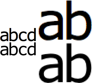
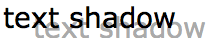
For typography fanatics, it’s worth noting that in some browsers using text-shadow actually thins your font very slightly as it triggers a different anti-aliasing method. In the example below, the top text is rendered without a text shadow, while the bottom text has a white text shadow and appears slightly thinner.
So which browsers support text-shadow? Good news! Quite a few!
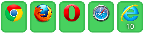
Sadly, Internet Explorer does not support text shadows until version 10. For browsers that do not support text shadow, the text will still appear but the shadow will be missing.
10 other effects using CSS3 Text Shadow
With CSS3 text shadow, you can create many different effects. Let’s take a look at some:
Top left shadow
Using negative values for the xPosition and yPosition we can move the text shadow to the top left.

p.myText { text-shadow:-2px -2px 2px #aaa; }Shadow only
By setting the font color to the same as the background, we can create a shadow only effect.

p.myText { color:#fff; text-shadow:2px 2px 2px #000; }Blurred Shadow
Having an xPosition and yPosition of 0 together with a large blur creates this effect.

p.myText { color:#fff; text-shadow:0 0 5px #000; }Blurred Text
Setting the font color to transparent create this effect which makes the text look blurred.

p.myText { color:transparent; text-shadow:0 0 5px #000; }No Blur Shadow
Setting the blur to 0 gives us another effect.
p.myText { text-shadow:2px 2px 0 #aaa; }Multiple No Blur Shadows
By using a comma, we can specify multiple text shadows. Here we have created the first text shadow with the same color as th background to give a semi-3D effect.

p.myText { text-shadow:1px 1px 0 #fff, 2px 2px 0 #000; }Far Away Shadow
Your shadow can be as near or as far away your text as you like. Watch over for elements with the CSS overflow property if you set it too far away as they may chop the shadow.
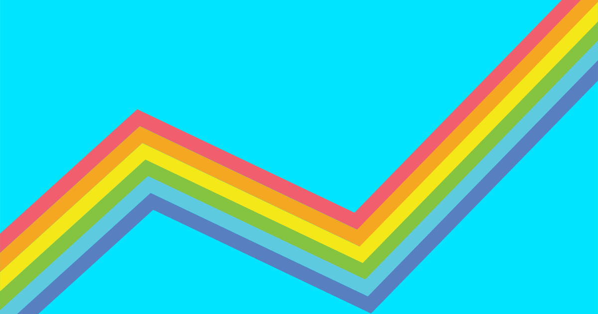
p.myText { text-shadow:30px 10px 0 #aaa; }Rainbow Shadow
You can use as many shadows as you wish. Here I’ve created a lovely rainbow effect.
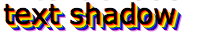
p.myText { color:#000; text-shadow:1px 1px 0 red, 2px 2px 0 orange, 3px 3px 0 yellow, 4px 4px 0 green, 5px 5px 0 blue, 6px 6px 0 indigo, 7px 7px 0 violet; }Outline Shadow
By creating 4 shadows around the text, we can create a outline effect.
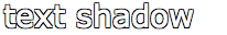
p.myText { color:#fff; text-shadow:-1px -1px 0 #000,-1px 1px 0 #000,1px -1px 0 #000,1px 1px 0 #000; }See Through Shadow
By using a rgba or hsla font color, we can see an alpha transparency value which allows us to see through the text, and see the shadow below.

p.myText { color:rgba(0,0,0,0.5); text-shadow:3px 3px 0 #aaa; }RGBA is a new feature for CSS3 which allows you to set a alpha transparency value to RGB colors. Values for alpha transparency can range from 0 to 1. An alpha value of 0 will make the color entirely transparent, while a value of 1 will ensure there is no transparency. 0.5 and 0.8 work well for most effects.
HSL and HSLA are also new color formats for CSS3 and allow us to define colors based on hue, saturation and lightness. The value of hue begins with red at 0, with green at 120, blue at 240, going back to red at 360. Saturation and lightness are percentages, with 100% providing the most saturated/lightest value.
Live Demos
If you’d like to know more about each of the text-shadow effects shown here, I’ve uploaded the code to JSFiddle.
Coming Up
In a later article, we’ll explore @font-face and how it allows you to use custom fonts as web text. Until then, have fun with using these text shadows!