Typography is an element that should compliment the content of a website. When used well, it establishes a visual hierarchy and helps the user connect with the content. In the modern web, new technologies and tools, such as API utilization, @font-face, CSS3, make this task much easier in creating compelling visual impressions.
When planning a web project think about the message your typefaces are trying to convey. If you haven’t, explore the categories of type and then mix typefaces from them until the design communicates what you’re trying to say.
In this article we’ll take a look at 10 websites that effectively use type to convey information and get visitors visually interested in their offerings.
1. Lake Wapogasset
A strong, brief headline commands our attention on this camp website and ties the four divisions of the site together through its wording. When used correctly, display fonts can make a big difference in creating a novel website design. Additionally, a text shadow property lifts the headline off the page and dominates the visual hierarchy. The rest of the site is a nice contrast, featuring a simple sans-serif font to aide in readability.
Fonts used: Fono Compressed, Helvetica Neue
2. LA Wine Agency
The web design trend of creating typographic layouts that resemble posters hasn’t gone away. This is a great way to garner the visitors attention immediately. In this design, color adds enough contrast between elements and a limited type palette creates a soothing appearance.
Fonts used: Proxima-Nova, League Gothic
3. Wicked Palate
Again we see how ornate fonts can effectively be used sparsely at large sizes. This decorative font is paired well with a minimalistic sans-serif in creating a strong visual impression that speaks to the brand.
Fonts used: Bistro-Script-Web, Adrianna-extended, Adrianna, Helvetica Neue
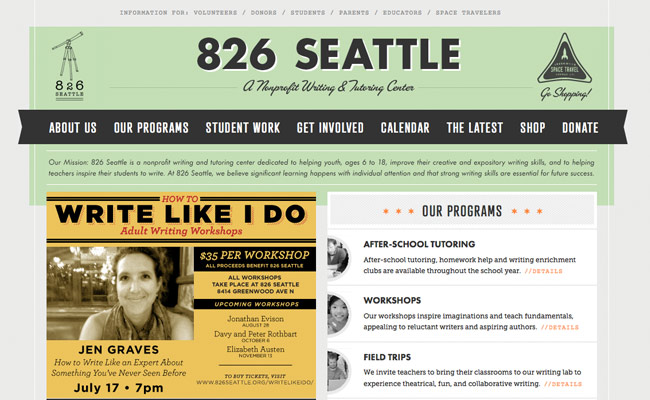
4. 826 Seattle
San-serif fonts are some of the most popular in web design. From short and round to tall and thin, most sans serifs work well for both large blocks of text and in display. A proper hierarchy is created on the website for 826 Seattle, allowing visitors to easily scan content and find important items.
Fonts used: Courier, Museo Slab, Futura, Alternate-gothic-no-1-d
5. Hull Digital Live 2012
Hull Digital Live is a digital and technology conference in the UK. The fonts used are well-chosen and compliment the modern, progressive nature of the event.
Fonts used: Duke Fill, Proxima-nova
6. Konos Air
The sans-serif font used here fits the type of business very well. Ample white space around the heading line gives just enough breathing room, creating a light, welcoming feel for the site.
Fonts used: Steelfish_bd, Pt_sans-reg
7. Boston Globe.com
An Old English typeface is used as the nameplate for the Boston Globe. Also called Fraktur or black letter fonts, these fonts are still commonly used in newspapers and their accompanying websites today. The rest of the site is cutting edge and modern. Font sizes, column widths, and navigation are informed by best practices in digital media. To keep up with the growing mobile landscape, The Boston Globe reformats its layout and typography to fit desktop screens, tablets, and smartphones using a responsive design.
Fonts used: Miller Headline, Benton Sans, Georgia, Helvetica
8. Cloudberry
The font for the Cloudberry website lends a friendly feel for this company that provides a good online experience. Paired with two colors and just a few simple spot illustrations, the typeface is enough to set the site apart.
Fonts used: ARS Maquette
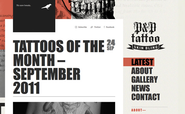
9. P&P Tattoo
Bold typography creates an impact for this tattooist website. Large typography is a trend in modern web design but should fit the design content it contains, such as in the above example.
Fonts used: Impact, Georgia
10. Life in Greenville
Another modern trend in web design is to use slab typefaces for headlines. What was once used for print advertising has become popular when used in small bursts of text, notably headlines, on the web. The result here gives the Life In Greenville site a fresh, clean appearance that compliments the entrepreneur-based town.
Fonts used: Kulturista-web
These samples are just a taste of how companies are using typography to attract visitors, give them a positive impression of their company, and ultimately lead then further down the conversion funnel. While there are no hard and fast rules in regards to type selection, experimentation, knowledge of font categories, and knowing your brand are key to creating a beautiful font combination.
What font combinations do you find visually interesting? Which of our examples really moves you? Let us know in the comments.


