We are in the middle of a cultural shift.
This evolving change is highly visible in the current state of communication. As attention spans continue to shorten, the significance of the novel and long-form is giving way to the 140-character tweet, the ephemeral 10-second Snapchat (with an optional caption) and listicles. While all these forms may have their detractors, their impact is still undeniable.
Web design has responded to the pressure of shorter attention spans with placing a higher emphasis on the landing page. When today’s web-savvy visitor lands on your homepage, you have mere seconds before their mind generates a favorable or unfavorable impression.
Generally, it boils down to choosing a combination of key visuals and concise copy that together packs a powerful punch in the same amount of time as the average web user spends on retweeting a snarky Tweet, commenting on an influential Instagram post or reblogging a viral Vine.
Storytelling has always been an effective tool for persuasion. But is it possible to tell a persuasive story in the short amount of time visitors spend on web pages today? Fortunately, the answer is ‘yes’.
Stories are still as powerful as ever; we just engage with them differently now. The short story is experiencing a cultural renaissance right now. See Alice Munro’s recent Nobel prize win or the one-sentence stories by Lydia Davis, who won the Man Booker prize last month.
There is a lesson here for visual storytellers as well: It is useful to think of landing pages as a one-page story that gets to the point quickly and effectively – and not a novel that takes its audience’s prolonged attention for granted.
Here are four design strategies that will help you build a compelling one-page story for your landing page:
1. Judge It By Its Cover
The old adage used to go that you shouldn’t judge a book by its cover. But, unfortunately, that’s exactly what most online customers end up doing.
Taken in its entirety, your landing page is the equivalent of a book cover. It can be just a striking visual with a single line of copy but even these two elements should together communicate what your product is about and build anticipation.
With photography repositories like Unsplash and Raumrot, and web font services like Adobe Typekit, it’s easier than ever to find an image and a typeface that are, both, a good fit for your brand and visually appealing.
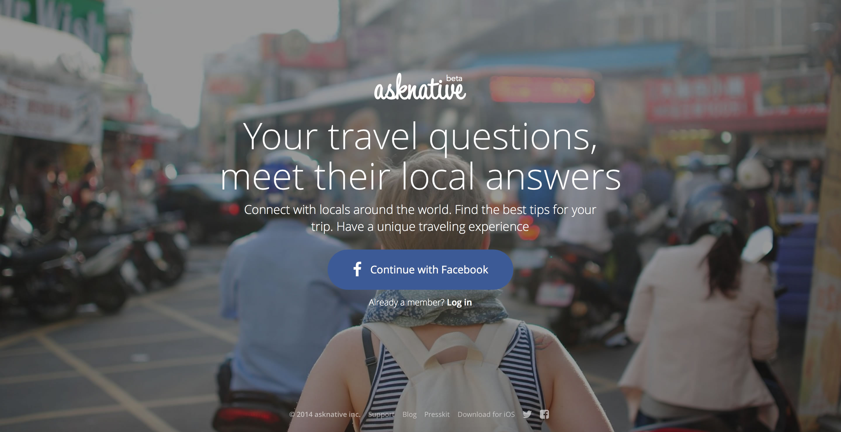
The Ask Native landing page uses an image that anyone who’s traveled abroad can identify with: a backpacker facing an unfamiliar and, often, overwhelming terrain.
The copy zeroes in on the questions we all have when traveling somewhere and promises to have locals answer them. By highlighting the core benefit to the target audience, the Ask Native landing page perfectly capturing the objective of the service and allows visitors to fill in the rest of the brand story.
2. Sharpen the Hook
If you end up having a lot of copy on your landing page (which isn’t recommended but may be necessary in certain situations), the quality of your hook is what will decide whether your visitors stick around for the longer message or not. The hook is what will reel in visitors long enough for them to convert.
Consider some of the most famous openings in fiction: ‘Call Me Ishmael’ (Herman Melville, Moby-Dick), at once intriguing and commanding or ‘Lolita, light of my life, fire of my Loins’ (Vladimir Nabokov, Lolita), a provocative yet apt summary of everything else to follow or even ‘”Where’s Papa going with that axe? …” (E. B. White, Charlotte’s Web), an unsettling opening for a children’s book that establishes the book’s central theme and fear laden feeling.
All of these hooks have one thing in common: they establish a voice and reveal an important aspect of the whole story. If you manage to do the same with your landing page, differentiating your brand from the competition becomes a lot easier.

Vivino phrases its brand’s biggest benefit as a mistake avoided. ‘Never Pick Another Bad Wine’ not only implies that Vivino helps you become an amateur sommelier but it also acts as a commanding call-to-action: The tagline simultaneously forbids you from choosing poor quality wine and encourages you to use Vivino to make better selections.
A hook is more than just a witty opener and doesn’t even have to be a written one. The objective is for all the elements on your landing page to establish a voice and essence for your brand. A good hook asserts your positioning in visitors’ minds much more powerfully than any direct claims of what you do and why. After all, there is a reason why first impressions count.

Kong is an app that lets its users turn their video selfies into gifs and its landing page is little else but a collection of such gifs. While it can be argued that there is a downside in not using more explanatory text, this landing page does boast a distinctive voice- an essential feature of a great hook.
3. Create and Hold a Moment
Unlike the novel, where there is ample time to build a backstory and flesh out a climax, the short story triumphs by focusing on and emphasizing a revealing moment. In terms of landing pages, a similar strategy is the most effective.
Instead of trying to explain everything about your company or the genesis of the product, your visuals and copy should concentrate on one moment, feeling or idea that your product/service needs to be most strongly associated with. It can be a key benefit or the USP (Unique Selling Proposition), an allusion to a lifestyle that best fits your product or a piece of the user experience.

The Periscope landing page – instead of going on and on about the benefits of live streaming- shows just a single moment shared through its app: a user’s experience of taking a trip in a hot air balloon as their followers post comments and heart emojis. For a more extended look at the sort of content shared on Periscope, you have to play the video but this single carefully chosen moment alone showcases a very valuable aspect of the Periscope experience.
4. Befriend Brevity
The fact that your customers have shorter attention spans isn’t as damaging as it seems.
Ask any designer and they will tell you that constraints only stimulate creativity. The same is true for landing pages. By requiring you to distill your brand into a combination of key visual(s) and succinct copy, you are forced to think clearly about your USP and present your brand in the sharpest and most focused fashion- attributes that will help you stand out from the competition.
Since the technical aspect of putting up a landing page is easier than ever before (thanks to services like Spaces and the plethora of WYIWYG design software) and it’s increasingly preferable to err on the side of less than more design, you have more freedom and time to brainstorm and fine tune what actually matters: your brand and how it can be represented in the simplest and quickest way possible.

The Operator landing page makes the most out of minimalism (shall we coin this brand new aphorism the MMM?) by cleverly using the name of the app in context (Hello, Operator!) followed by the key user benefit and culminating in a simple call-to-action that lets users join the waitlist. A single photo of the app at work and a clean black and white aesthetic keeps the clutter to a minimum and the message always at a maximum.
The human brain is naturally wired to make connections, create associations and build relationships. As long as your landing page has all the right ingredients for a great story, your visitors will find it difficult to turn away.
Do you have any advice for designing landing pages for shorter attention spans or leveraging storytelling for conversions? Let us know in the comments section!