Giving feedback to the visitors is a massive part of the user experience, if the user clicks a button they would expect to see something happen.
An example of this is uploading an image to a website, it may take some time for the server to upload the image, but when the user clicks the upload button they would expect the page to do something.
If the page doesn’t give any feedback that the image is currently being uploaded, the visitor could get impatient and either repeatedly click the upload button or navigate away from the page before the upload is complete, for this reason you should always give feedback to your visitors.
A common approach is to use a spinner graphic which is either done with a gif image or with Javascript. But in this tutorial you are going to learn how you can create this same effect by using just CSS3 animations.
We are going to look at 4 common loading images and turn them into CSS3.
The 4 loaders we are going to create are:
- Loading Bars – A circle of bars which will fade in and out giving the impression of spinning.
- Bar Spinner – A circle of bars spinning.
- Circle Spinner – A circle of circles spinning.
- Facebook Loader – Three bars growing and shrinking.
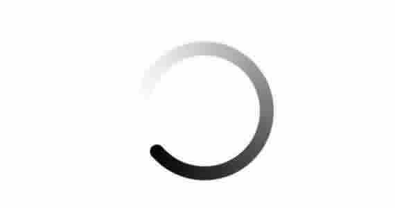
Loading Bars
This is made up of 8 bars arranged in a circle, they all start with different opacity the spinning effect comes from changing the opacity of each bar one at a time.
The HTML
The HTML for this is very simple as all the work is done by the CSS. All you need is 1 div and 8 divs inside which looks like this below.
<div class="loading bar">
     <div></div>
     <div></div>
     <div></div>
     <div></div>
     <div></div>
     <div></div>
     <div></div>
     <div></div>
</div>
The CSS
Below is the CSS that we use to create this effect of the Loading Bars.
We start off by creating the main area of the loading bars this is a box 100 pixels wide and 100 pixels high.
/* ==========================================================
 * Loading Bars
 * =========================================================*/
.loading{
     width:100px;
     height:100px;
     margin:30px auto;
     position:relative;
}
The next part of the CSS will be adding the animation to each bar of the spinner, this animation is going to be called fadeit and will run forever. The fadeit animation will change the opacity of the element from full to clear and back again. Changing the elements with this effect at different times will make it look like the bars are spinning.
.loading.bar div{
     width: 10px;
     height: 30px;
     background: black;
     position: absolute;
     top: 35px;
     left: 45px;
     opacity:0.05;
     -webkit-animation: fadeit 1.1s linear infinite;
     -moz-animation: fadeit 1.1s linear infinite;
     animation: fadeit 1.1s linear infinite;
}
Once we have assigned the animation to the bars we can now go through each of the bars and define the angle of the bar and the time delay of the animation.
We want to change the delay of each bar to be different so that the animation will start at different times.
.loading.bar div:nth-child(1){
     -webkit-transform: rotate(0deg) translate(0, -30px);
     -moz-transform: rotate(0deg) translate(0, -30px);
     transform: rotate(0deg) translate(0, -30px);

     -webkit-animation-delay:0.39s;
     -moz-animation-delay:0.39s;
     animation-delay:0.39s;
}

.loading.bar div:nth-child(2){
     -webkit-transform: rotate(45deg) translate(0, -30px);
     -moz-transform: rotate(45deg) translate(0, -30px);
     transform: rotate(45deg) translate(0, -30px);

     -webkit-animation-delay:0.52s;
     -moz-animation-delay:0.52s;
     animation-delay:0.52s;
}

.loading.bar div:nth-child(3){
     -webkit-transform: rotate(90deg) translate(0, -30px);
     -moz-transform: rotate(90deg) translate(0, -30px);
     transform: rotate(90deg) translate(0, -30px);

     -webkit-animation-delay:0.65s;
     -moz-animation-delay:0.65s;
     animation-delay:0.65s;
}

.loading.bar div:nth-child(4){
     -webkit-transform: rotate(135deg) translate(0, -30px);
     -moz-transform: rotate(135deg) translate(0, -30px);
     transform: rotate(135deg) translate(0, -30px);

     -webkit-animation-delay:0.78s;
     -moz-animation-delay:0.78s;
     animation-delay:0.78s;
}

.loading.bar div:nth-child(5){
     -webkit-transform: rotate(180deg) translate(0, -30px);
     -moz-transform: rotate(180deg) translate(0, -30px);
     transform: rotate(180deg) translate(0, -30px);

     -webkit-animation-delay:0.91s;
     -moz-animation-delay:0.91s;
     animation-delay:0.91s;
}

.loading.bar div:nth-child(6){
     -webkit-transform: rotate(225deg) translate(0, -30px);
     -moz-transform: rotate(225deg) translate(0, -30px);
     transform: rotate(225deg) translate(0, -30px);

     -webkit-animation-delay:1.04s;
     -moz-animation-delay:1.04s;
     animation-delay:1.04s;
}

.loading.bar div:nth-child(7){
     -webkit-transform: rotate(270deg) translate(0, -30px);
     -moz-transform: rotate(270deg) translate(0, -30px);
     transform: rotate(270deg) translate(0, -30px);

     -webkit-animation-delay:1.17s;
     -moz-animation-delay:1.17s;
     animation-delay:1.17s;
}

.loading.bar div:nth-child(8){
     -webkit-transform: rotate(315deg) translate(0, -30px);
     -moz-transform: rotate(315deg) translate(0, -30px);
     transform: rotate(315deg) translate(0, -30px);

     -webkit-animation-delay:1.3s;
     -moz-animation-delay:1.3s;
     animation-delay:1.3s;
}
Below is the animation keyframes fadeit, this is where we define what we want the animation to do. On this animation we are starting the element opacity to be full and by the end of the animation the element will be clear.
@-webkit-keyframes fadeit{
     0%{
          opacity:1;
     }
     100%{
          opacity:0;
     }
}
@-moz-keyframes fadeit{
     0%{
          opacity:1;
     }
     100%{
          opacity:0;
     }
}
@keyframes fadeit{
     0%{
          opacity:1;
     }
     100%{
          opacity:0;
     }
}
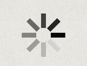
Bar Spinner
The next spinner we are going to create is very similar to the above but instead of changing each bar we are going to rotate the entire collection of bars to make all of them spin together.
The HTML
Again the HTML is very simple as the CSS will be doing everything. All we need is a 1 div with 8 divs inside it.
<div class="spinner bar">
     <div></div>
     <div></div>
     <div></div>
     <div></div>
     <div></div>
     <div></div>
     <div></div>
     <div></div>
</div>
The CSS
To start with we need to define the outside container div. This is exactly the same as the loader above but we are going to add the animation to the container div, this way the entire collection will rotate.
/* ==========================================================
 * Spinner
 * =========================================================*/
.spinner{
     width:100px;
     height:100px;
     margin:30px auto;
     position:relative;
     -webkit-animation: rotateit 1.3s linear infinite;
     -moz-animation: rotateit 1.3s linear infinite;
     animation: rotateit 1.3s linear infinite;
}
Below are the keyframes that we are going to use to rotate the entire collection, the keyframes are going to start with a rotation of 360 degrees and will end at 0 degrees.
@-webkit-keyframes rotateit {
     from {
          -webkit-transform: rotate(360deg);
     }
     to {
          -webkit-transform: rotate(0deg);
     }
}
@-moz-keyframes rotateit {
     from {
          -moz-transform: rotate(360deg);
     }
     to {
          -moz-transform: rotate(0deg);
     }
}
@keyframes rotateit {
     from {
          transform: rotate(360deg);
     }
     to {
          transform: rotate(0deg);
     }
}
Now we have defined the container and the animation, all we have to do now is position each of the bars in the spinner.
/* ================================================
 * Bars
 * ================================================*/
.spinner.bar div{
     width: 10px;
     height: 30px;
     background: black;
     position: absolute;
     top: 35px;
     left: 45px;
}
.spinner.bar div:nth-child(1){
     -webkit-transform: rotate(0deg) translate(0, -30px);
     -moz-transform: rotate(0deg) translate(0, -30px);
     transform: rotate(0deg) translate(0, -30px);
}
.spinner.bar div:nth-child(2){
     -webkit-transform: rotate(45deg) translate(0, -30px);
     -moz-transform: rotate(45deg) translate(0, -30px);
     transform: rotate(45deg) translate(0, -30px);
     opacity:0.7;
}
.spinner.bar div:nth-child(3){
     -webkit-transform: rotate(90deg) translate(0, -30px);
     -moz-transform: rotate(90deg) translate(0, -30px);
     transform: rotate(90deg) translate(0, -30px);
     opacity:0.6;
}
.spinner.bar div:nth-child(4){
     -webkit-transform: rotate(135deg) translate(0, -30px);
     -moz-transform: rotate(135deg) translate(0, -30px);
     transform: rotate(135deg) translate(0, -30px);
     opacity:0.5;
}
.spinner.bar div:nth-child(5){
     -webkit-transform: rotate(180deg) translate(0, -30px);
     -moz-transform: rotate(180deg) translate(0, -30px);
     transform: rotate(180deg) translate(0, -30px);
     opacity:0.4;
}
.spinner.bar div:nth-child(6){
     -webkit-transform: rotate(225deg) translate(0, -30px);
     -moz-transform: rotate(225deg) translate(0, -30px);
     transform: rotate(225deg) translate(0, -30px);
     opacity:0.3;
}
.spinner.bar div:nth-child(7){
     -webkit-transform: rotate(270deg) translate(0, -30px);
     -moz-transform: rotate(270deg) translate(0, -30px);
     transform: rotate(270deg) translate(0, -30px);
     opacity:0.2;
}
.spinner.bar div:nth-child(8){
     -webkit-transform: rotate(315deg) translate(0, -30px);
     -moz-transform: rotate(315deg) translate(0, -30px);
     transform: rotate(315deg) translate(0, -30px);
     opacity:0.1;
}
Circle Spinner
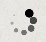
The circle spinner has the same HTML and CSS as the bar spinner the only difference we have here is we add a border-radius property of 50% to each of the bars. That’s all it takes to completely change the look of the spinner.
The HTML
<div class="spinner circles">
     <div></div>
     <div></div>
     <div></div>
     <div></div>
     <div></div>
     <div></div>
     <div></div>
     <div></div>
</div>
The CSS
/* ==========================================================
 * Spinner
 * =========================================================*/
.spinner{
     width:100px;
     height:100px;
     margin:30px auto;
     position:relative;
     -webkit-animation: rotateit 1.3s linear infinite;
     -moz-animation: rotateit 1.3s linear infinite;
     animation: rotateit 1.3s linear infinite;
}
@-webkit-keyframes rotateit {
     from {
          -webkit-transform: rotate(360deg);
     }
     to {
          -webkit-transform: rotate(0deg);
     }
}
@-moz-keyframes rotateit {
     from {
          -moz-transform: rotate(360deg);
     }
     to {
          -moz-transform: rotate(0deg);
     }
}
@keyframes rotateit {
     from {
          transform: rotate(360deg);
     }
     to {
          transform: rotate(0deg);
     }
}
/*=======================================================
 * Circles
 *======================================================*/
.spinner.circles div{
     width: 20px;
     height: 20px;
     border-radius:50%;
     background: black;
     position: absolute;
     top: 35px;
     left: 45px;
}
.spinner.circles div:nth-child(1){
     -webkit-transform: rotate(0deg) translate(0, -35px) scale(1.4);
     -moz-transform: rotate(0deg) translate(0, -35px) scale(1.4);
     transform: rotate(0deg) translate(0, -35px) scale(1.4);
}
.spinner.circles div:nth-child(2){
     -webkit-transform: rotate(45deg) translate(0, -35px) scale(1.2);
     -moz-transform: rotate(45deg) translate(0, -35px) scale(1.2);
     transform: rotate(45deg) translate(0, -35px) scale(1.2);
     opacity:0.7;
}
.spinner.circles div:nth-child(3){
     -webkit-transform: rotate(90deg) translate(0, -35px) scale(1.1);
     -moz-transform: rotate(90deg) translate(0, -35px) scale(1.1);
     transform: rotate(90deg) translate(0, -35px) scale(1.1);
     opacity:0.6;
}
.spinner.circles div:nth-child(4){
     -webkit-transform: rotate(135deg) translate(0, -35px) scale(0.9);
     -moz-transform: rotate(135deg) translate(0, -35px) scale(0.9);
     transform: rotate(135deg) translate(0, -35px) scale(0.9);
     opacity:0.5;
}
.spinner.circles div:nth-child(5){
     -webkit-transform: rotate(180deg) translate(0, -35px) scale(0.7);
     -moz-transform: rotate(180deg) translate(0, -35px) scale(0.7);
     transform: rotate(180deg) translate(0, -35px) scale(0.7);
     opacity:0.4;
}
.spinner.circles div:nth-child(6){
     -webkit-transform: rotate(225deg) translate(0, -35px) scale(0.5);
     -moz-transform: rotate(225deg) translate(0, -35px) scale(0.5);
     transform: rotate(225deg) translate(0, -35px) scale(0.5);
     opacity:0.3;
}
.spinner.circles div:nth-child(7){
     -webkit-transform: rotate(270deg) translate(0, -35px) scale(0.3);
     -moz-transform: rotate(270deg) translate(0, -35px) scale(0.3);
     transform: rotate(270deg) translate(0, -35px) scale(0.3);
     opacity:0.2;
}
.spinner.circles div:nth-child(8){
     -webkit-transform: rotate(315deg) translate(0, -35px) scale(0.1);
     -moz-transform: rotate(315deg) translate(0, -35px) scale(0.1);
     transform: rotate(315deg) translate(0, -35px) scale(0.1);
     opacity:0.1;
}
Facebook Loader

If you are a user of Facebook, which I’m sure most of you are then you might of noticed the loader they use when uploading images.
This is constructed of 3 blue bars which will grow and shrink from left to right, now we are going to create this just by using CSS3.
The HTML
Again the HTML for this is very simple all you need is a containing div and 3 divs inside.
<div class="facebook">
     <div></div>
     <div></div>
     <div></div>
</div>
The CSS
The CSS starts by defining the animation on each of the bars in the Facebook loader. You need to add a border and a background to each of the bars for the styling.
The Facebook loader uses the a similar effect as the first loader in this tutorial, each of the bars do the same animation but at different times which creates a wave effect.
Therefore we add the Facebook loader animation to all of the bars but change the delay on each of the elements.
/*===========================================================
 * Facebook Loader
 * ========================================================*/
.facebook div{
     height:50px;
     width:20px;
     display:inline-block;
     background-color: #56bbdb;
     border:1px solid #217c99;
     -webkit-animation:facebook_loader 1.3s linear infinite;
     -moz-animation:facebook_loader 1.3s linear infinite;
     animation:facebook_loader 1.3s linear infinite;
     -webkit-transform:scale(0.91);
     -moz-transform:scale(0.91);
     transform:scale(0.91);
}
Now the animation is set we can change the delay on each of the bars.
.facebook div:nth-child(1){
     -webkit-animation-delay:0.39s;
     -moz-animation-delay:0.39s;
     animation-delay:0.39s;
}
.facebook div:nth-child(2){
     -webkit-animation-delay:0.52s;
     -moz-animation-delay:0.52s;
     animation-delay:0.52s;
}
.facebook div:nth-child(3){
     -webkit-animation-delay:0.65s;
     -moz-animation-delay:0.65s;
     animation-delay:0.65s;
}
Below is the facebook animation we are going to use to grow the bars with full opacity and then by the end of the animation it will shrink and change the opacity to clear, doing this animation is all you need to create this Facebook loader effect.
@-webkit-keyframes facebook_loader{
     0%{
          -webkit-transform:scale(1.2);
          opacity:1
     }
     100%{
          -webkit-transform:scale(0.7);
          opacity:0.1
     }
}
@-moz-keyframes facebook_loader{
     0%{
          -moz-transform:scale(1.2);
          opacity:1
     }
     100%{
          -moz-transform:scale(0.7);
          opacity:0.1
     }
}
@keyframes facebook_loader{
     0%{
          transform:scale(1.2);
          opacity:1
     }
     100%{
          transform:scale(0.7);
          opacity:0.1
     }
}
Demo
That’s it! These are just 4 different effects of loaders you can create with CSS3. If you have any other examples please share them.