If you’re wondering what people actually click when they’re on your website, you need a heatmap. But you need to know how to read a heatmap before you’re able to analyze what the colors and other elements are actually telling you.
This guide will walk you through different types of heatmaps and how you can read them to get a full understanding of how your website is performing and what might need some changes.
Let’s dig in.
What Is a Heatmap?
A heatmap is data visualization that highlights how people scroll, click around, or use your website. Using a color scale to depict hot spots for actions, heatmaps help marketers, developers, and business owners alike to understand popular areas of their websites, as well as areas that may need improvement.
Let’s take a look at a quick example. Below, we see two versions of a heatmap with two different button placements.
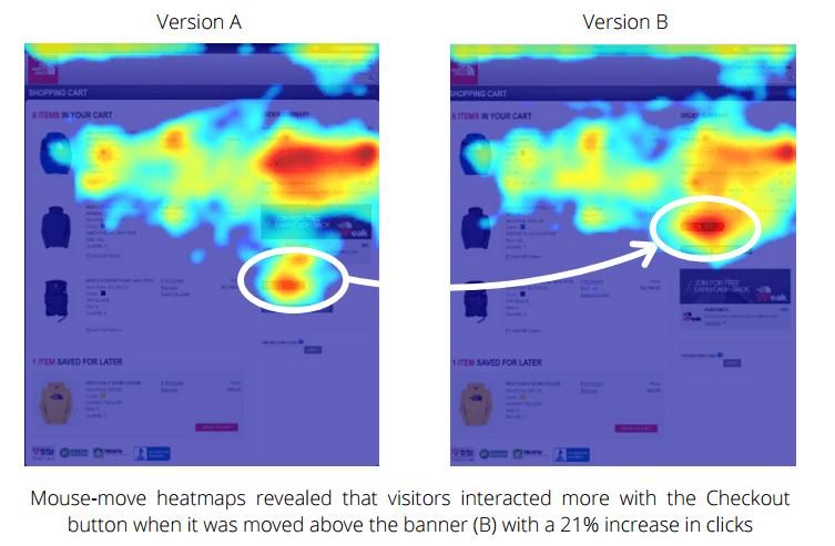
We can see that when the button is moved closer to the top of the page, it gets more action from website visitors. Which is ultimately the goal of any website—interactions from website visitors.
Incorporating heatmaps into website performance analysis is a key component of any conversion optimization strategy because they can provide data just like this, helping website owners see exactly how their websites are being used and what changes can improve actions taken.
Why Are Heatmaps Useful?
Heatmaps give you a completely visual interpretation of how people are using your website. There’s zero guesswork left—you’re able to see exactly where people are scrolling and clicking across each of your webpages.
- Not sure if your button placement is right? A heatmap will let you know.
- Curious how many people are actually making it to the bottom of your landing page? A heatmap will certainly be able to detect that information.
- Wanting to test a new landing page design? A heatmap will give you the tangible data you need to know if it’s working for you.
Heatmaps are essential tools for understanding what your website visitors do each time they land on a page. If you’re looking to maximize conversions on your site, you need to be using a heatmapping tool.
3 Types of Heatmaps
There are a few different types of heatmaps, but let’s look at three main ones and what they tell you about your website visitor behavior.
Clickmaps
A clickmap gives you insight into where website visitors tend to click the most when they visit your website. It uses thermal imaging to detect hotspots on your website, using a color scale to showcase the most popular buttons and links on any given page.
This map is a great indicator of your most popular links and buttons, showcasing exactly where users go to take action on different pages of your website.
Scrollmaps
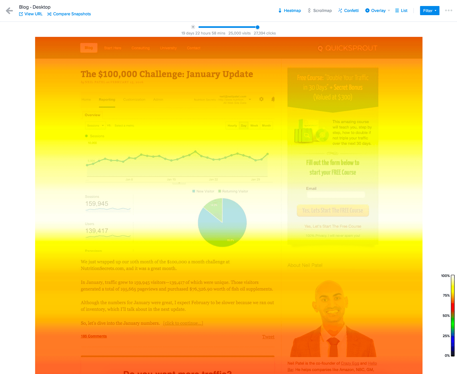
A scrollmap lets you see how far down your webpages users tend to scroll before leaving or moving onto another page. This type of heatmap is also color coded based on the areas of the landing page that users spend the most time looking at.
While clickmaps tell you about how users are taking action, scrollmaps give you insight into how people use your website. You need both to get a clear idea of how people consume your content and move into the action phase.
Confetti
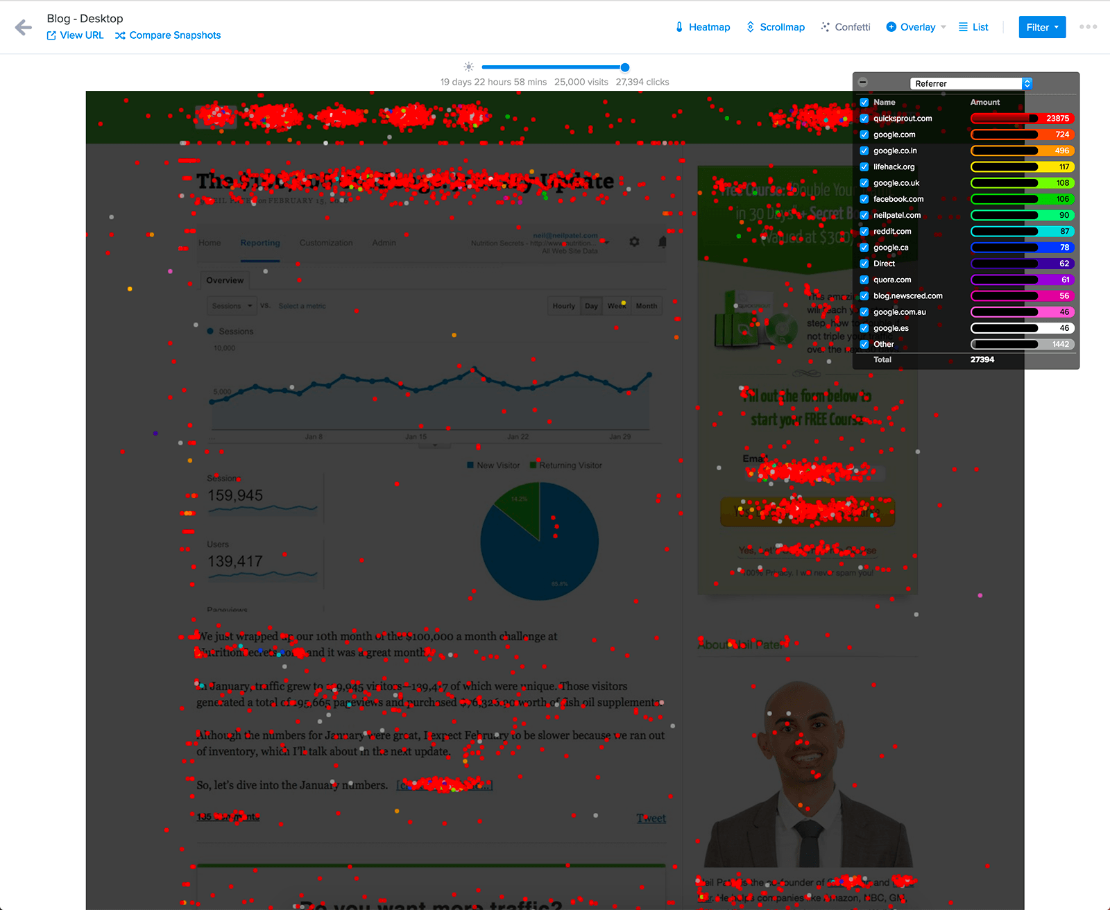
A confetti map is the same as a clickmap, but instead of showing hotspots of popular click areas, the confetti map shows you exactly where people are clicking on your site. Having more in-depth data like this can give you even more insight into how people use your website.
How to Read a Heatmap
Now that you’ve seen some of the most popular types of heatmaps—all of which are available using CrazyEgg’s heatmapping features—let’s walk you through how to actually read a heatmap so you can accurately interpret the data.
1. Check the Color Scale
The first step you need to take is to double check the color scale of your heatmap. Color scales or palettes aren’t always the same across the board, so you’ll need to look at what indicates a hotspot versus a cold zone (more on these next).
In general, though (and the default color scale in CrazyEgg), you can expect hotspots to be indicated by hot colors like red, orange, and yellow, and cold zones to be indicated by cooler tones like blue and green.
And if there’s no color, that means there’s no activity on that part of the website.
2. Pinpoint Hotspots
Now that you know what color to look for with hotspots, you can start pinpointing areas of your website that see a lot of activity.
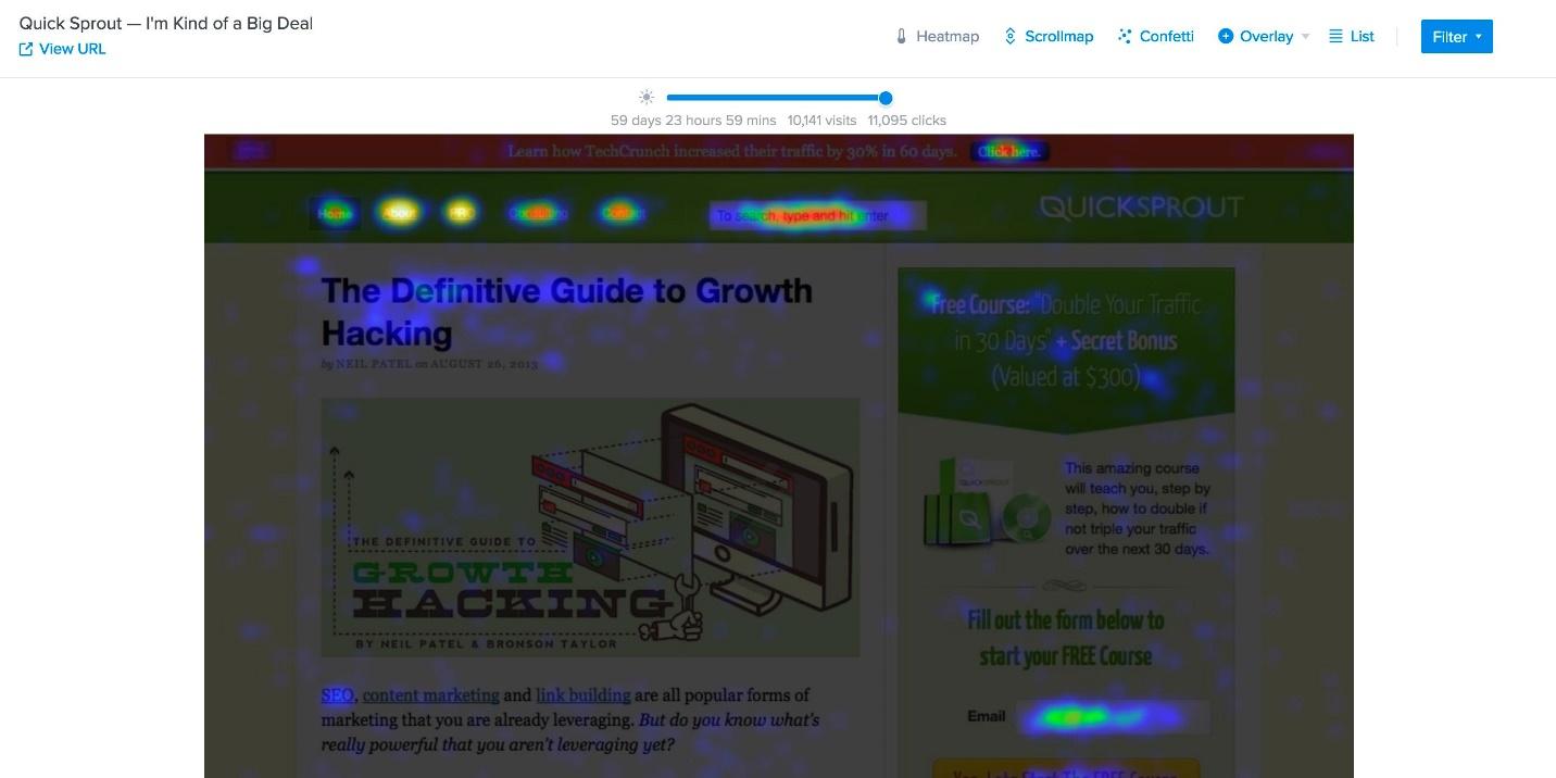
Look at this heatmap as an example:

By paying attention to the red, orange, and yellow areas, we can see that the most commonly clicked links are:
- The logo
- Websites
- Blogging
- Marketing
- Other
These are all in the top navigation bar, and they tell us exactly what the most popular topics on this blog are. The website owner can use this information to create more content that their audience is more likely to want.
Essentially, hotspots are things you want to see. They tell you where people are looking or clicking.
3. Look at Cold Zones
Cold zones are areas of your website that are seeing little to no activity. Ideally, you’ll see cold zones on a clickmap in areas that have no links.
But if you’re seeing cold zones at the bottom of a long webpage on a scrollmap or on buttons you’re hoping will lead to sales pages on clickmaps, you may need to rethink your page design.
4. Identify Patterns
After you’ve identified the most and least popular areas of your website, it’s time to identify patterns amongst each one.
For hotspots, patterns can give you insight into things like:
- Topics your audience wants to see more of
- Buttons/designs that grab attention and increase clicks
- Decorative elements that people think are clickable but aren’t (this likely indicates you need to switch up your design a bit or make the element clickable)
With cold zones, you can discover information like:
- Pages that are too long or uninteresting
- Buttons that are hard to find or don’t have a compelling enough CTA
- Poorly designed areas that aren’t generating the results you’d hoped for
If you have pages with similar designs, be sure to analyze for patterns between them. This can further help you identify problem areas that need to be fixed.
5. Compare to Your Goals
Now that you have an idea of how your website is performing, compare that to the overall goal of each webpage. Is your homepage leading to the secondary pages you’d hoped for? Are your landing pages generating clicks to the signup or purchase pages? Is your blog easy to navigate and find new topics?
By looking at your website analysis alongside the goals you have for how you want your website to be used, you can see if it’s performing well or if you need to make some adjustments.
6. Find Areas for Improvement
And that’s where we find ourselves in step six. While the ideal result from all of this analysis is that your website is performing perfectly, there’s always room for improvement.
So in this step, you want to look at:
- Parts of your page that aren’t getting much attention. How can you make them more engaging so people scrolling through your site will want to stop and read?
- Buttons that aren’t as popular. Can you test another CTA or design that can make it pop and increase clicks?
- Click attempts on non-clickable elements. Is there a way you can adjust the design or maybe add a link to a sales page to boost improvement?
Identify any element of your website that isn’t performing how you’d hoped and come up with some plans to improve it.
7. Test and Repeat
Once you know what you want to fix on your website, it’s time to do some testing. Take one element at a time and test 2-3 different iterations to see which one performs better. This is called A/B testing and is the perfect way to maximize results based on tangible data from your website visitors.
Once you’ve landed on the best performing element, it’s time to test another one. And rinse and repeat until you’re happy with your website performance.
Common Mistakes When Reading Heatmaps
While reading your heatmap might seem straightforward, there are a few common errors you want to avoid. Some of these mistakes include:
- Thinking red is always positive: Sometimes clicks are happening in areas that don’t actually make sense. This indicates an issue with the design and needs to be addressed.
- Only paying attention to desktop behavior: Mobile users will interact with your website differently than desktop users, and elements often aren’t in the same places. Analyze your mobile heatmaps just as frequently.
- Ignoring additional context: Session recordings, visitor segmentations, traffic sources, and other elements can provide additional context to your heatmap results. Be sure to take that into consideration as you analyze your data.
- Relying on too small of a data set: You need to give your heatmap a large enough time frame for the results to actually paint a true picture of website behavior. Give your website at least 2-4 weeks to generate results before analyzing your data.
Best Practices When Using Heatmaps
If you want to start incorporating heatmaps into your website performance analysis process, let’s cover some best practices to keep in mind. These can help you make the most of your heatmapping tool.
Focus on Transactional Pages
You don’t need to start testing every page on your website with a heatmap. Instead, focus on the most important ones—the pages that are actually bringing your business revenue.
This means pages like:
- Product pages
- Service pages
- Signup pages
- Sales landing pages
These are the pages you need insight on how your website visitors use them. You need to make sure the button placement, information about your services or features, and product checkout details are easy to find and click on. If your pages are difficult to use or the design isn’t functional, you’re missing out on potential conversions.
Know Your Objectives
Different types of heatmaps are used for different objectives. You need to know what your goals are before you choose your heatmap.
For example, if you’re looking at how often buttons on your website get clicked, you’ll want a clickmap. If you want to know which sections of your website are read through the most, you’ll need a scrollmap.
But there are also overlay maps that can help you gauge the success of specific CTAs on your landing pages or list maps that provide you with simple click counts for each of your website elements.
Knowing your overall objective is key to understanding which type of map will provide you with the data that’s actually needed.
Segment Your Data
Heatmapping tools give you the ability to segment your data based on different filters, giving you even more insight into how people use your website.
You can segment based on things like:
- Traffic source: Where did the website user come from? Does this impact what they click on?
- User types: How do new customers use your website compared to people who’ve been there before? This can be a great way to determine how easy your site is to navigate for people who’ve never seen it before.
- Device: Understand how people use your website on mobile devices versus desktop, as it’s going to be a very different experience.
- Browser/operating system: This can give you insight into areas of your website that may be broken or appear incorrectly from browser to browser.
Getting down into the nitty gritty gives you even more insight into how your website is performing. You don’t want to assume everyone is accessing your site the same way. Finding out the difference between new vs. returning users, traffic sources, devices, and more gives you even more key information.
Learn How to Read a Heatmap and Analyze Website Performance
Website heatmaps are amazing tools for understanding how your audience actually uses your website. But you need to know how to accurately read them in order to properly analyze your results. Use this guide plus CrazyEgg’s heatmapping capabilities to dig into your website performance.