It’s now the norm for B2B apps to have customer-facing analytics.
Grammarly Pro, for instance, comes with a dashboard. Canva’s reporting is also pretty nifty. And Coursera for Teams lets users track an assortment of metrics, including new employee competencies.
If you’re planning on adding embedded analytics to your app, you’ve made a good decision. Done right, they are a strong differentiator. But it’s vital to first understand how to create user experiences that are both satisfying and add genuine value.
What Is Embedded Analytics?
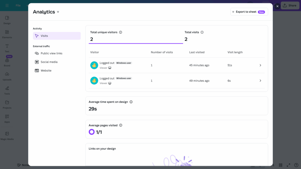
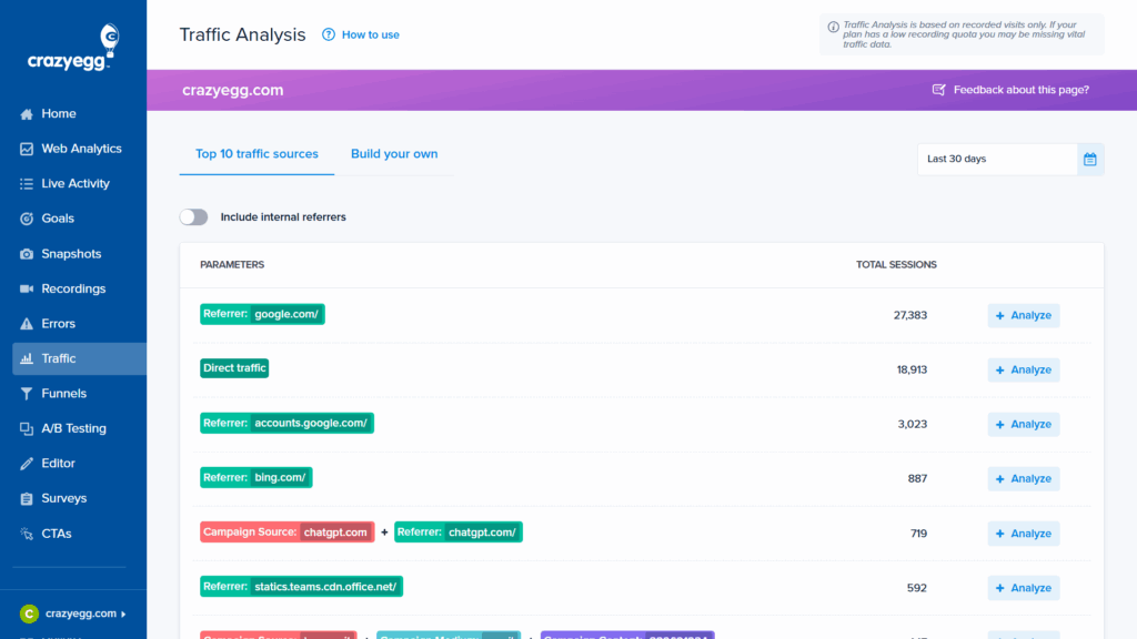
Embedded analytics is the integration of a reporting dashboard into a customer-facing app. It’s most common in B2B SaaS (as in the Canva example below), but many B2C companies also offer it. Banking and gaming apps are two well-known examples.
There are three parts to an embedded analytics solution:
- The database: Contains the data the user dashboard will show
- The semantic layer (or data modelling layer): Retrieves and structures data from the database in response to dashboard requests
- The user interface (UI): Presents the data through charts and visualizations
Up until fairly recently, most developers had to rely on APIs and design their frontends from the ground up. The only other option was to embed clunky iframes. However, things have changed. Most vendors now offer SDKs that let users define models and build dashboards quickly to integrate them into their apps. Software engineering skills are still required but the dev burden has significantly reduced.
Our Findings: Embedded Analytics Prioritization Matrix
We conducted a user test to identify which core features customers wanted from analytics tools in general. We also asked participants about their biggest frustrations with popular platforms.
To tailor these principles to embedded analytics, the results were combined with the in-house expertise of our team. The focus was on creating a practical UX foundation that would be useful for B2B apps for which reporting was a supplementary feature and not the primary category.
The resulting prioritization matrix tells you which features to prioritize in your own embedded analytics. You should include Mission Critical and Must-Have features before rollout, adding others—in the Secondary Focus and Optional Enhancements quadrants—as resources allow.
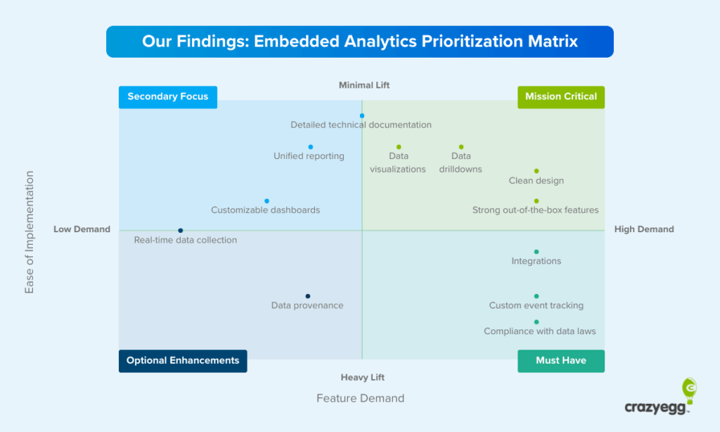
Let’s look at each of the reporting features and UX elements in the matrix in a little more depth and define exactly what they mean and when and why they matter, starting with those in the highest priority quadrant.
- Clean, intuitive user interface: A clean UI was a must-have feature for participants. It was also apparent from responses that they struggled with cluttered dashboards in other platforms, with GA4 often mentioned. One user said that “Using Google Analytics requires a PhD.”
- Strong out-of-the-box features: Users wanted to be able to log in and track key areas of activity with an absolute minimum of setup time. Lars Lofgren, who I interviewed for this article, said long setup time drove high churn at Kissmetrics: “The platform required a lot of work to get up and running, and this was a major issue for users.”
- A wide range of drill-downs: One interesting finding was that users varied widely in their drill-down requirements. There was little uniformity in demands—some wanted to understand micro-trends, and others wanted to compare specific data sets. As such, wide-ranging and highly granular drilldowns should be a priority.
- Easy-to-understand visualizations: Most users understood data primarily through visualizations (rather than table breakdowns). One respondent went so far as to say that “numbers are pointless unless compared to other numbers in visualizations.” Visual representations in our test were praised because they were perceived as being well-suited to the activity being tracked—pie charts for percentages, graphs for trends, and bar charts for categories.
- A large integrations library: One of the biggest frustrations among users was the inability of analytics platforms to integrate with their existing tech stack. This shortcoming was often a deal-breaker—users said things like, “I don’t want to go between dashboards,” and, “We have a process that works. We don’t want to change it.”
- Custom event tracking: In addition to plug ‘n’ play functionality, users repeatedly spoke about user-defined behavioral logging. This should fall high on your priority list if it’s essential for core decision-making in the org. To give you an idea of the demand for custom tracking, one user said, “We currently have 50 custom events we’re tracking.”
- Compliance with data laws: This is a must-have, and prospective buyers will often avoid non-compliant platforms simply because they are bound by company regulations.
- Clear, shareable documentation: One user summed up the need for documentation perfectly: “I would like to share written documentation with my colleagues to make sure that it doesn’t present any technical or information security issues for us.” Demand for detailed technical documents was largely in the context of securing team approval, rather than onboarding. Buyers needed to know that there wouldn’t be any security or technical issues.
- Unified reporting that connects multiple sources: Unified reporting provides packaged insights for data from multiple sources. This way users can act on it without the need for heavy analysis. AI features now make this possible in a meaningful way without the need for any direct input from users.
- Customizable dashboards: Customizable dashboards are a secondary focus because they were not universally sought after by the study participants. Most users are happy to work within the existing layout of a dashboard, especially if it’s well designed, and will only make minor modifications if they are given the choice.
- Data provenance (capture and storage transparency): Data provenance is a highly detailed account of how data is captured and where it is stored. This fell relatively low on the demand spectrum—simply knowing that compliance was accounted for was usually enough—but it was raised.
- Fast (ideally real-time) data: Real-time data was a lesser concern among users. Contrary to the way it is touted as a must-have feature, real-time analytics will often not be a primary requirement among users of embedded analytics.
Should You Offer Analytics?
If you answer yes to one of the following questions, you have a strong reason for including them in your app.
Do analytics drive core decisions?
Tracking is often a core operational necessity. In these cases, embedded analytics are a baseline feature, and the quality of your dashboards compared to other providers can make or break a deal.
You must include analytics if your customers rely on your platform for any of the following:
- Compliance obligations
- Staff activity monitoring that feeds into HR decisions
- Sales and revenue tracking
- Marketing campaign performance
- Inventory management
- Financial reporting for tax preparation
- KPI tracking (revenue growth, margins, customer acquisition, NPS, etc.)
Embedded analytics are particularly crucial if your users have well-defined operational data needs and limited tech experience. Pulling data from Shopify’s databases into an in-house BI platform, for example, is beyond the scope of many independent merchants.
Are analytics necessary for market parity?
You shouldn’t follow the market for its own sake. Fads come and go, and chasing them mindlessly is a sure route to wasted resources.
Instead, aim for market parity if you meet the following two criteria:
- You see a trend towards embedded analytics among your competitors.
- Your customers demonstrate a clear desire for them in focus groups and sales calls.
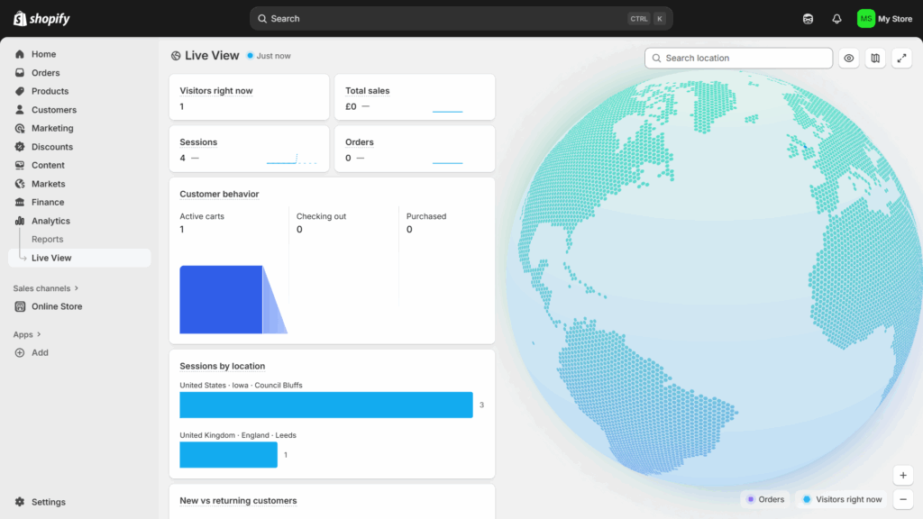
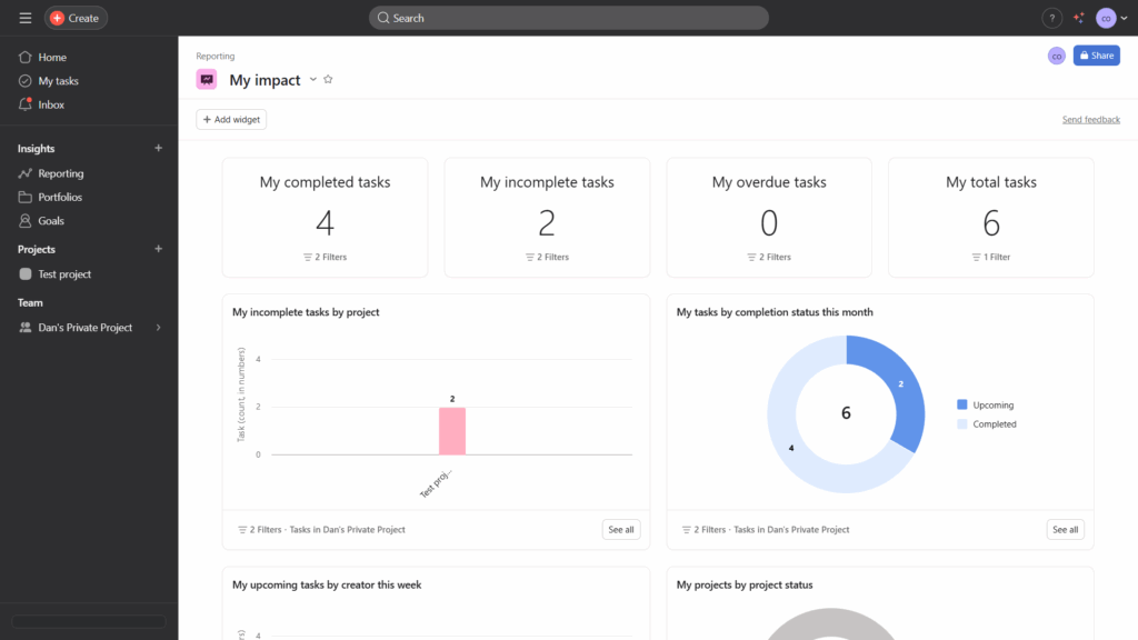
We’ve seen a category shift towards embedded analytics in project management apps like Monday and Asana (pictured below). Dashboards tend to be relatively straightforward with limited functionality. They are add-ons rather than essential functionality, but users regularly cite them as valuable in online reviews.
Will embedded analytics drive meaningful differentiation?
Embedded analytics can be a competitive differentiator if they report metrics that drive change and users can act on them.
This is a key point: you can only differentiate by improving an outcome for users, not by providing glitzy charts. If you can’t identify specific decisions in your customer’s workflows, realistic scope for influence, and definite outcomes tied to the metrics that matter to your customers, meaningful differentiation likely isn’t a possibility.
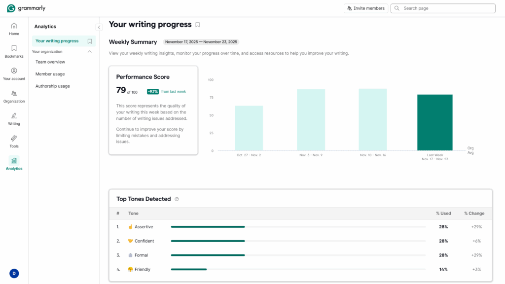
Grammarly is an excellent example. As one of the market leaders in writing assistants, its analytics tools are both unique and useful. Organizations often want to test different writing tones with a view to improving customer engagement.
How to Design Your Customer-Facing Analytics: 5-Step Playbook
The features in the embedded analytics matrix describe what a finished platform looks like. However, they are the result of a multifaceted process whirring away under the hood.
Providing “strong out-of-the-box functionality,” for instance, requires you to actually know what functionality users want. In fact, more than this—not just what they want but what they’ll actually use.
“Clean design” and “data visualizations” sound simple enough. But pick a vendor that’s misaligned with your company’s software engineering capabilities—one whose “no-code toolkit” is a set of rigid iframes—and you’ll find them impossible to provide.
With this in mind, I spoke to two experts who know analytics inside out—Crazy Egg CEO Hiten Shah and former Director of Growth at KISSmetrics Lars Lofgren.
1. Determine Which Data Insights Drive Change
You’ve sat down with your customers, you’ve run open-ended surveys, and you’ve picked your way through as many sales transcripts as you can bear.
All good. All necessary.
But you don’t yet know what your dashboard will look like. For Hiten Shah, CEO of Crazy Egg, any metrics that you include need to affect meaningful change. He calls everything else “clutter.”
Unpicking real user needs is an issue with all qualitative customer research, but it’s intensified with analytics. A study by Userlane and PwC found staff only use 40% of an app’s features on average. Customers will often say they want something—often attracted by the idea of a promising or popular feature—and ignore it when they start using your app.
That’s why it’s important not to stop at the self-disclosed pain points, problems, frustrations, and desired outcomes you uncover during the research phase. You need to combine this with a nuanced understanding of their organization’s decision-making process at the operational (day to day), analytical, and strategic levels.
Working on the basis of your customer research, Hiten recommends asking three questions of every proposed data model:
- What decision will this metric change?
- Can the user influence the thing being measured?
- What’s the smallest useful slice of information we can show?
The final question is important. Depending on the size of your application, embedding analytics can represent a significant development cost. Quality assurance, debugging, maintenance, security—they all require ongoing resources. So don’t build an entire reporting suite before you can guarantee adoption. You’re treating feature requests—even those that are aligned with internal decision-making workflows—as hypotheses.
As a practical rule of thumb, Hiten suggests building for the highest-leverage user, not the most vocal requester. He says, “In most SaaS products, that’s the user responsible for outcomes, not the user responsible for data entry.
Keep in mind, however, that aiming for usefulness doesn’t mean you should ignore vanity metrics altogether. Yes, they’re clutter. But they can play an important role. The ever-present battle is balancing what customers need with what they want.
Lars Logfren, former growth lead at KISSmetrics, takes a pragmatic stance on this issue: “Give users a crunchy snack, then follow up with the side of broccoli. Too many product managers will go straight to a heap of broccoli. I’ve tried this a few times. It’s always a mistake. Entice first, then follow up with the value that requires some work.”
2. Pick the Right Vendor
In the past, software engineers had to either build a frontend from scratch with APIs or use rigid iframes with limited design flexibility. Fortunately, there are now many dedicated vendors focused exclusively on embedded analytics. And more “traditional” internal BI platforms are increasingly expanding their functionality in this direction.
Dedicated solutions give developers access to chart builders, comprehensive SDKs, data modeling tools, and pre-built components that make building and maintaining analytics dashboards much easier and cost-effective.
If you’re looking for speed above all else, using a traditional BI platform and embedding iframes is your best bet. This is especially the case if your team has knowledge of how the platform works because it’s used internally.
For a reasonably quick setup with greater control over customer-facing analytics capabilities and consistent, transparent pricing (expect plans to start at around $2000/month with a sliding scale based on usage), go with a dedicated tool.
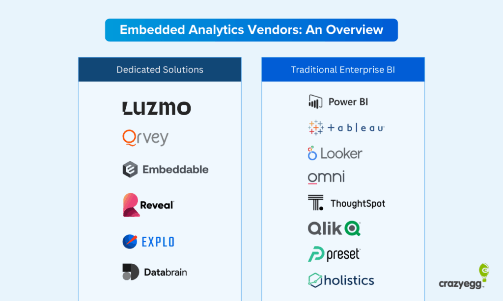
Finally, if you want to offer AI features—such as data analysis or in-dashboard chatbots—keep this in mind when evaluating platforms. Vendors are adding AI to their platforms, but some are further along the curve than others. In particular, Databrain, Explo, and ThoughtSpot are known for their strong AI focus.
3. Focus AI Features on Interpretation
There are two reasons you should be thinking about AI. The first is simply because of the momentum behind the current hype cycle. Following the crowd is usually terrible advice, but there’s sound business reasoning behind it in this case.
When Lars Lofgren was head of growth at Kissmetrics, he was reluctant to run with the real-time analytics craze. Heaps of research showed that while users wanted real-time analytics, they didn’t need or use them in practice. “It turned out we were right,” he said. “But it was the wrong decision—it meant we lost a huge number of customers to our competitor, Mixpanel. Even though users didn’t use that feature, they were basing their buying decision off of it. Sometimes you need to give people what they’re asking for even if the impact for your users is minimal.”
Fortunately, there is a powerful AI analytics use case. And it happens to be one that people are excited about. For Hiten, AI’s ability to interpret data is where the opportunity lies: “AI is becoming essential because the real bottleneck in analytics is interpretation, not data collection.” This is the intersection—of hype and real usefulness—that you should focus on.
AI is the first-ever tool that can autonomously do the following:
- Turn patterns into explanations
- Map anomalies to likely causes
- Summarize complex behavior in plain language
- Highlight changes before a human notices
AI singlehandedly moves analytics from passive reporting to active guidance. You don’t necessarily need a chatbot in your dashboard, although some vendors do provide this out of the box. But you do need a layer that translates raw information in your charts into recommendations.
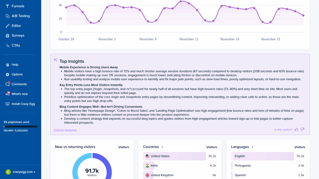
CrazyEgg, for example, includes an AI-generated “Top Insights” explainer in its home view.
4. Tailor UI Design Principles to Analytics Dashboards
Analytics dashboards are particularly prone to clutter, complexity, and a general lack of focus. They’re also much harder for first-time users to navigate successfully. Standard UI design principles apply, but they require some creative adaptation.
Use the following UX checklist when designing your general architecture, page layout, and charts.
Strategic UX Guidelines
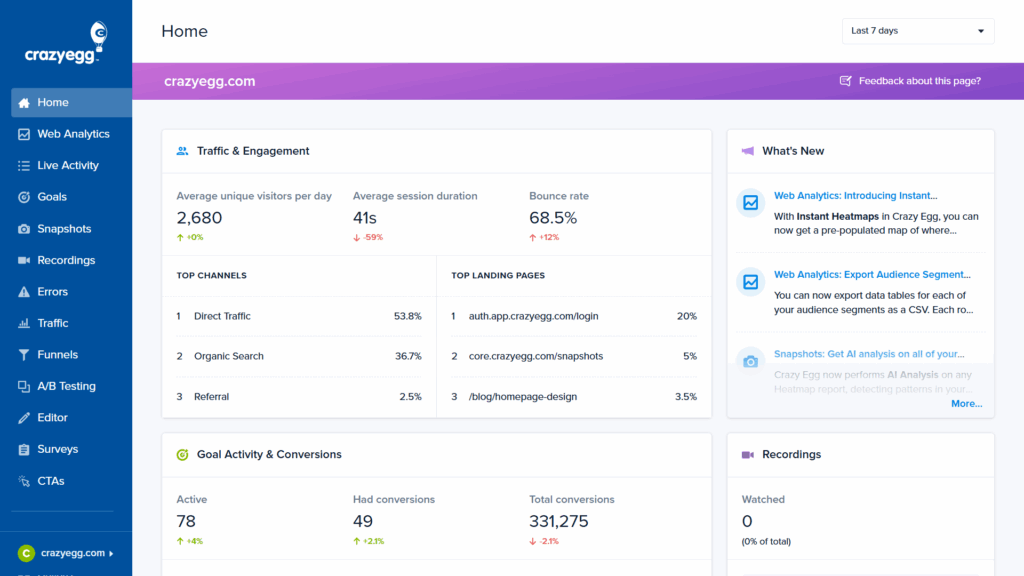
- Build what Hiten calls “opinionated defaults.” These are information hierarchies that you believe work best and reduce decision-making for users. As our research shows, most people won’t customize dashboards. Crazy Egg follows a clear prioritization schema in its home view.
- Interpret data for users in all but the cases when insights are immediately obvious Even a short statement like “This is rising faster than usual,” can change comprehension.
- Integrate charts into workflows where possible. Users shouldn’t have to pause tasks to access data that may influence choices.
- Support different levels of skill and user roles. Experts will typically seek depth while novices want clarity. Good reporting provides both without overwhelming either.
Tactical UX Guidelines
- Provide a guided UI walkthrough for users
- Use navigation that mirrors normal browsing habits: a left-side navbar, clear icons, descriptive labels, breadcrumb trails, and a ranking of views in the navbar based on user priorities.
- Use clear page titles and descriptions for immediate orientation.
- Include tooltips and info boxes.
- Follow the “minimum clicks to insights” principle.
- Use natural language summaries at the top of charts.
- Focus on trends over raw data. People understand direction faster than volume.
- Use comparisons that match thinking and decision-making uncovered in your research (this week vs last week, this cohort vs previous).
- Hide advanced filters until needed.

- Favor sparklines (mini charts without axes) and mini-visuals for at-a-glance monitoring.
- Always accompany charts with a minimal explanation of why that chart matters.
- Keep reporting design and language consistent. As Lars points out, “People will take the time to learn your reporting language once, but they’re not going to do it multiple times if each of your reports is highly customized.”
5. Keep the Two “Demons” of Dashboard Design in Mind
For Hiten, analytics suffer from two consistent UX traps: a lack of clarity and a lack of insight. And it’s balancing these two factors that presents the biggest challenge. Lars also echoes this sentiment: “The biggest problem with an analytics UI has always been designing one that’s clear enough for people to understand while also useful enough that people can act on.”
Fortunately, they are relatively easy to fix. You simply need to incorporate explanatory cues alongside visual and informational hierarchies.
1. People don’t know what the data means
“A number without context is noise,” says Hiten. And noise eventually gets blocked out. Users of embedded analytics are invariably not data experts. They need some degree of assistance with interpretation. Clear, minimal charts that surface only the most important data (with options for more advanced users) limit the possibility of misinterpretation. Explanatory text, tooltips, and in-dashboard AI chatbots then add an additional layer of context.
2. People don’t know what to do with the insight
Dashboards often stop at “what happened” and don’t provide any indications of “what’s next.” The best embedded analytics UIs shorten the path between recognition and action. The “narrative” of the dashboard should take the user along a journey—from a straightforward presentation of data to an understanding of its meaning. Visualizations that make trends obvious, forecasting features, and recommended actions all achieve this.
Wrapping Up: Why It’s Still Early Days for Embedded Analytics
The research is clear. More and more app users are drawing on data insights to inform their decision-making, from the operational to the strategic. The fact that B2B tools like Grammarly, Canva, and Coursera—which are as far from dedicated analytics platforms as it’s possible to be—offer dashboards likely means that you need one too.
The day is coming when embedded analytics are table stakes for buyers rather than a nice add-on. All of the experts I spoke to highlighted this fact. And that means product developers, UI designers, and software engineers need to understand what goes into a dashboard that users actually use, like, and benefit from.
Your first step should be to build a sense of where data in your platform overlaps with customer decision-making processes. As Hiten Shah says, you need to ask, “What decisions can proposed charts and metrics meaningfully improve?”
The answer to that question will ultimately come from your customer surveys, focus groups, and feedback sessions. When you understand how choices are being made, only then can you design a dashboard that helps users make them better.