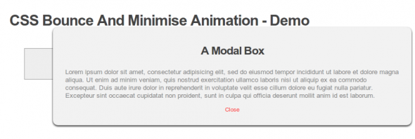
In this tutorial we are going to create a modal box which will open by bouncing on to the screen and then when you close the box it will minimise out of sight.
To do this we are going to use new CSS3 features of 3D transforms, which means that it’s not going to be supported on all browsers. To get the best experience you will need to use the latest webkit browsers so Chrome or Safari. You can also view these CSS3 3D transforms in the latest version of Firefox.
As we are limited to what you see in different browsers we are still going to use transition animation so in older browsers you will see a fade-in and fade-out effect instead of a bounce. Also worth noting is that IE users will just see it open and close.
The HTML
Lets start with the HTML, we are going to create a button to open the modal box, this button will be a link to open the modal box ID.
The modal box is going to be a div and have text and another link inside.
The CSS
To start off we are going to position and style the modal box we don’t need to worry about the animation for now lets just get it looking as we want on the page.
/*Position and set the opacity of the modal box*/
.modal {
position: fixed;
top: 0;
left: 0;
right: 0;
bottom: 0;
z-index: 10000;
opacity: 0;
pointer-events: none;

/*Set the opacity transition will be used by older browsers that don't support 3D transforms*/
-webkit-transition:opacity 500ms ease-in;
   -moz-transition:opacity 500ms ease-in;
     -o-transition:opacity 500ms ease-in;
        transition:opacity 500ms ease-in;
}

/*Styling the inner box of the modal box*/
.modal div {
width: 50%;
background: #fff;
position: relative;
margin: 10% auto;
box-shadow: 0px 2px 5px #222;
-moz-box-shadow: 0px 2px 5px #222;
-webkit-box-shadow: 0px 2px 5px #222;
border-radius:10px;
-moz-border-radius:10px;
-webkit-border-radius:10px;
background:#f2f2f2;
padding:25px;

/* Set the default animation*/
-webkit-animation:minimise 500ms linear;
   -moz-animation:minimise 500ms linear;
    -ms-animation:minimise 500ms linear;
     -o-animation:minimise 500ms linear;
        animation:minimise 500ms linear;
}

/*Style the header of the modal box*/
.modal h2 {
     font-size: 2em;
     padding:10px 0;
     text-align:center;
}

/*Style the close button inside the box*/
.close{
     text-align: center;
     display:block;
     color:#FF4444;
     font-size:12px;
}
That’s all we need to create the look of the modal box as you can see we have added a default animation setting of minimise to the inner div of the modal box. We will create this animation setting later in the tutorial.
You will notice from the link button and the close button we are linking to an #open and #close which means this will go into the URL, from this setting we can then use the :target selector to style the modal box.
Add the following to the CSS to change the default animation when you click the open button.
.modal:target {
     opacity: 1;
     pointer-events: auto;
}

.modal:target > div {
-webkit-animation-name:bounce;
   -moz-animation-name:bounce;
    -ms-animation-name:bounce;
     -o-animation-name:bounce;
        animation-name:bounce;
}
The above styles will be applied when we have clicked on the open link.
Now we can create the animation for the bounce and the minimise effect.
CSS Bounce Animation
Add the following to your CSS file to create a bounce effect.
/*Setup the bounce animation*/
@-webkit-keyframes bounce {
  0% {
    /*transform*/
	-webkit-transform:scale3d(0.1,0.1,1);
	   -moz-transform:scale3d(0.1,0.1,1);
	    -ms-transform:scale3d(0.1,0.1,1);
	     -o-transform:scale3d(0.1,0.1,1);
	        transform:scale3d(0.1,0.1,1);
        -webkit-box-shadow:0 3px 20px rgba(0,0,0,0.9);
           -moz-box-shadow:0 3px 20px rgba(0,0,0,0.9);
            -ms-box-shadow:0 3px 20px rgba(0,0,0,0.9);
   	     -o-box-shadow:0 3px 20px rgba(0,0,0,0.9);
                box-shadow:0 3px 20px rgba(0,0,0,0.9);
  }
  55% {
    -webkit-transform: scale3d(1.08,1.08,1);
    -moz-transform: scale3d(1.08,1.08,1);
    -ms-transform: scale3d(1.08,1.08,1);
    -o-transform: scale3d(1.08,1.08,1);
    transform: scale3d(1.08,1.08,1);
    -webkit-box-shadow: 0 10px 20px rgba(0,0,0,0);
    -moz-box-shadow: 0 10px 20px rgba(0,0,0,0);
    -ms-box-shadow: 0 10px 20px rgba(0,0,0,0);
    -o-box-shadow: 0 10px 20px rgba(0,0,0,0);
    box-shadow: 0 10px 20px rgba(0,0,0,0);
  }
  75% {
    -webkit-transform: scale3d(0.95,0.95,1);
    -moz-transform: scale3d(0.95,0.95,1);
    -ms-transform: scale3d(0.95,0.95,1);
    -o-transform: scale3d(0.95,0.95,1);
    transform: scale3d(0.95,0.95,1);
    -webkit-box-shadow: 0 0 20px rgba(0,0,0,0.9);
    -moz-box-shadow: 0 0 20px rgba(0,0,0,0.9);
    -ms-box-shadow: 0 0 20px rgba(0,0,0,0.9);
    -o-box-shadow: 0 0 20px rgba(0,0,0,0.9);
    box-shadow: 0 0 20px rgba(0,0,0,0.9);
  }
  100% {
    -webkit-transform: scale3d(1,1,1);
    -moz-transform: scale3d(1,1,1);
    -ms-transform: scale3d(1,1,1);
    -o-transform: scale3d(1,1,1);
    transform: scale3d(1,1,1);
    -webkit-box-shadow: 0 3px 20px rgba(0,0,0,0.9);
    -moz-box-shadow: 0 3px 20px rgba(0,0,0,0.9);
    -ms-box-shadow: 0 3px 20px rgba(0,0,0,0.9);
    -o-box-shadow: 0 3px 20px rgba(0,0,0,0.9);
    box-shadow: 0 3px 20px rgba(0,0,0,0.9);
  }
}
CSS Minimise Animation
Now the CSS minimise animation.
/*Setup the minimise animation*/
@-webkit-keyframes minimise {
  0% {
    -webkit-transform: scale3d(1,1,1);
    -moz-transform: scale3d(1,1,1);
    -ms-transform: scale3d(1,1,1);
    -o-transform: scale3d(1,1,1);
    transform: scale3d(1,1,1);
  }
  100% {
    -webkit-transform: scale3d(0.1,0.1,1);
    -moz-transform: scale3d(0.1,0.1,1);
    -ms-transform: scale3d(0.1,0.1,1);
    -o-transform: scale3d(0.1,0.1,1);
    transform: scale3d(0.1,0.1,1);
  }
}
That’s it. View the demo and give it a go.