We all know that colors play a large role in our marketing efforts, but have you ever taken a closer look at how color may be affecting your bottom line?
Believe it or not, color has a powerful influence on our emotions and decision making abilities, not to mention our first impressions of everything from a logo to a landing page.

Psychologists have suggested that color impression can account for 60% of the acceptance or rejection of a project or service.
Is this statement backed by data? You bet, it is.
According to recent research, 92.6% of people say that visual dimension is the top influencing factor affecting a purchase decision. By harnessing the power of color, your business has the potential to be even more successful, particularly in regards to conversion optimization.
Let’s examine how colors can play into building more effective landing pages:
Designing for Gender
Depending on your industry, gender preferences may play heavily into purchase decisions so it pays to do your research on which colors can persuade someone to stay on a page and take action.
For women, according to this research, colors that appeal to them most include blue, purple and green while orange, brown, and gray are least appealing.
Marie Forleo’s B-School was all about women, and when it was launched, it became a huge hit instantly. But a lot more goes into a successful launch than knowing who you’re targeting. From landing pages to email templates everything was branded perfectly—that attracted the right buyer for her.

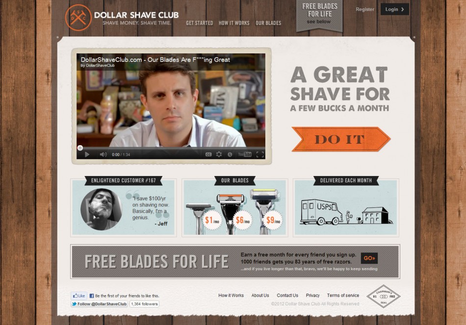
For men, blue, green, and black are often well-loved and brown, orange, and purple are least-loved. Keeping this in mind, consider your color choices when crafting your call to actions, buttons, or landing page design in general.
Let’s take a look at the landing page of a male-focused startup that really got our attention in last two years, thanks to their viral video.
Other than having a strong call to action, the landing page gives a real masculine feel with the brown wood background and orange elements.
Designing for Age
When choosing colors for your landing page, don’t forget to take into account your demographic spread in terms of age. In an online research project conducted by Joe Hallock, color preferences based on age were documented and explored.
In general, children or younger audiences tend to prefer warm and bright colors that are associated with positivity and high energy such as:
- Red
- Orange
- Pink
- Yellow
However there are few colors that are often associated with sadness and negativity by children, these are:
- Brown
- Purple
- Blue
As people age into adulthood, there’s shift in color preference towards cool shades, as evidenced by blue being widely regarded as the most popular favorite color by adults.
Adults have also been found to associate more symbolism or emotion with certain colors, such as black being associated with mourning and red being associated with alarm, intensity, or passion.
Which leads us into our next point: Perhaps one of the most powerful factors that plays into color choice in landing pages is that of color psychology and symbolism.
Designing for Emotion
Depending on your goal for your landing page, you may want to encourage a user to feel a specific emotion. This can be accomplished through a combination of smart design, well-written copy, well-chosen graphic elements, and of course, color.
Research tells us that these colors tend to be associated with these emotions:
- Red: This is a polarizing color that triggers opposing emotions of love and passion, as well as anger and danger. It’s known to increase heart rate and generate excitement. Plus, in some cases, it can boost appetite.
- Orange: Often associated with vitality and happiness, orange draws attention and expresses energy. It’s more inviting than red but is still attention grabbing. Many agree that it’s a great choice for a call to action.
- Yellow: Associated with laughter, hope, and sunshine, yellow is about giving a gentle energy to a page, with a goal of making it feel cheerful and optimistic. However, yellow should be used in moderation, as it tends to irritate the eyes if over used.
- Green: Rebirth, life, health, wealth, and growth are connected to the color green. Naturally, green is a color found in many financial organization logos since it suggests growth, financial health, and possibility.
- Blue: Known for being a very calming color, it’s also associated with trust and security (and can be found in many company logos as a result!). Blue actually encourages the body to create chemicals that soothe and calm, allowing the viewer to be more relaxed. Additionally, it’s regarded as a favorite color by most, so it’s often seen as very professional.
- Purple: This color is associated with creativity, nostalgia, royalty, and wealth. It can be soothing or intriguing, depending on which shade you choose. It’s often associated with luxury and romance.
Gregory Ciotti has created one of the most comprehensive pieces you could read about the psychology of color on the Help Scout blog.
In his article he says:
“Additional research in studies on color perception and color preferences show that when it comes to shades, tints and hues men seem to prefer bold colors while women prefer softer colors. Also, men were more likely to select shades of colors as their favorites (colors with black added), whereas women were more receptive to tints of colors (colors with white added):


Source: KISSmetrics
The above infographic from KISSmetrics showcases the disparity in men and women’s color preferences.”
Now that we have all this information and data you can start making landing pages with color that will resonate with your target audience to see which one converts best. The work does not end by simply creating a landing page, more in-depth research can be conducted on your particular audience segment by doing A/B testing.
There are dozens of examples where a simple change in the color of a call-to-action button increased conversions, since other than copy, design and color play a huge role in the success or failure of any landing page.
Some real-life case studies are referenced here, but feel free to conduct one of your own. You may be surprised at changing the color of a call to action or a click to purchase button making all the difference in your conversion rate.
Image Credits: Magician extracting colored paint