Most AI website builders promise instant, professional-looking websites with a single prompt. But do they actually follow best practices?
To find out, I put 19 different AI website builders to the test. I generated 51 landing pages and scored them against 60 different UX, CRO, and SEO criteria.
Here are the results.
TL;DR Summary
- AI is like a lazy designer: It’ll generate a quick layout that looks modern, yet minimal. It’s fine at first glance, but it often skips the critical details that make a page truly convert.
- You’ve got to bring your own branding: Most layouts in the test had minimal colors or typography. They were often on plain white or black backgrounds with no standout features.
- If possible, use an existing template: For traditional website builders, like Wix or WordPress, it’s often easier to use an existing theme or template than to fiddle with the AI features.
- Vibe coding platforms performed the best: The three best-performing platforms (Base 44, Figma, and Bolt) all take a written prompt and use AI to turn it into a professional design in under five minutes.
- Website planning is essential: You’ll benefit so much more if you go through this website planning process and use AI once you get to step six.
Methodology
To keep things fair, I only used free platforms and features. Where possible, I created three types of landing pages on each builder.
- E-commerce product page for a high-end laptop stand
- Sales page for a digital course
- Service page for a local plumbing business
I used these prompts:
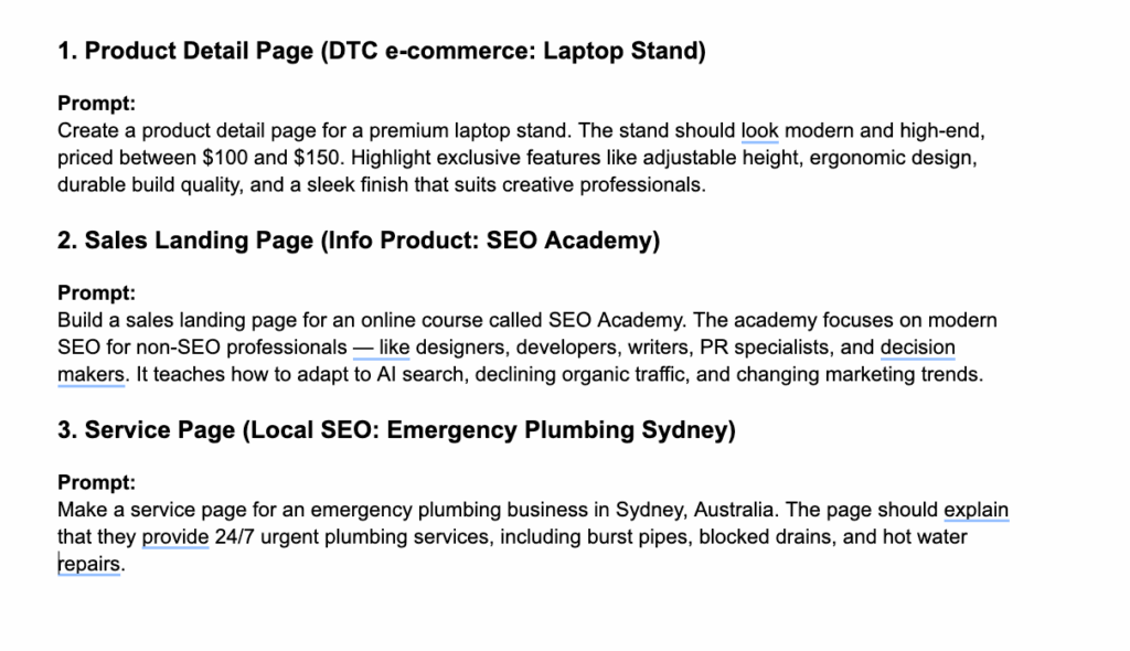
The prompts were intentionally simple and open-ended. I wanted to mimic how non-designers would likely use each platform and to fairly assess each website builder’s baseline.
I ended up with 51 landing pages from 19 different platforms. (Some platforms only allowed one design on the free tier, in case you noticed that the math wasn’t mathing.)
Then, I scored each landing page against 60 different criteria covering best practices for user experience, conversions, and search optimization. Here’s a snippet of what it looked like:
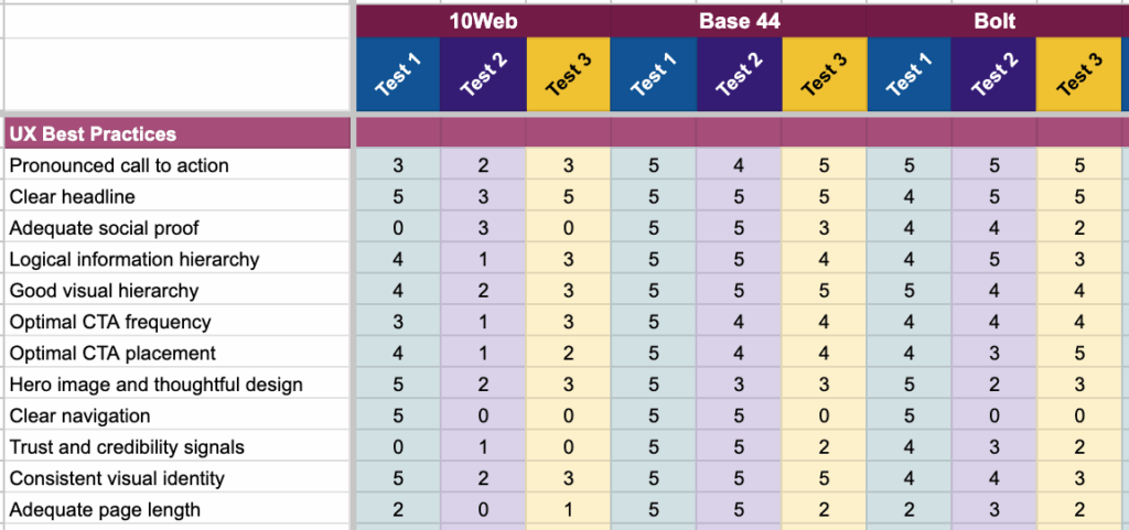
Scoring was on a five-point scale for each marker.
To make the results easier to compare across platforms and page types, I converted those scores into a percentage grade, similar to how a teacher grades an assignment. This provided a consistent benchmark for ranking performance, rather than relying solely on raw scores.
Then I analyzed the data across four layers:
- Per marker: how well AI handles specific best practices in general.
- Per page: the overall score of each generated landing page.
- Per platform: assessing which builders performed the best overall.
- Per page type: differences between the e-commerce, course, and service page layouts.
This approach allowed me to see not only which platforms came out on top, but also where AI website builders consistently shine (and where they repeatedly fall short).
Types of AI Website Builders Tested
It’s worth noting that the comparison was not apples-to-apples. Every platform uses AI differently, from instant “type a prompt, get a site” builders to more traditional tools with AI add-ons.
Because of this, the results varied significantly depending on the approach each platform takes.
Vibe coding platforms (best performers)
These platforms take a natural language prompt and instantly generate a high-fidelity website design. Think of them as “prompt-to-page” builders. They often look like this:
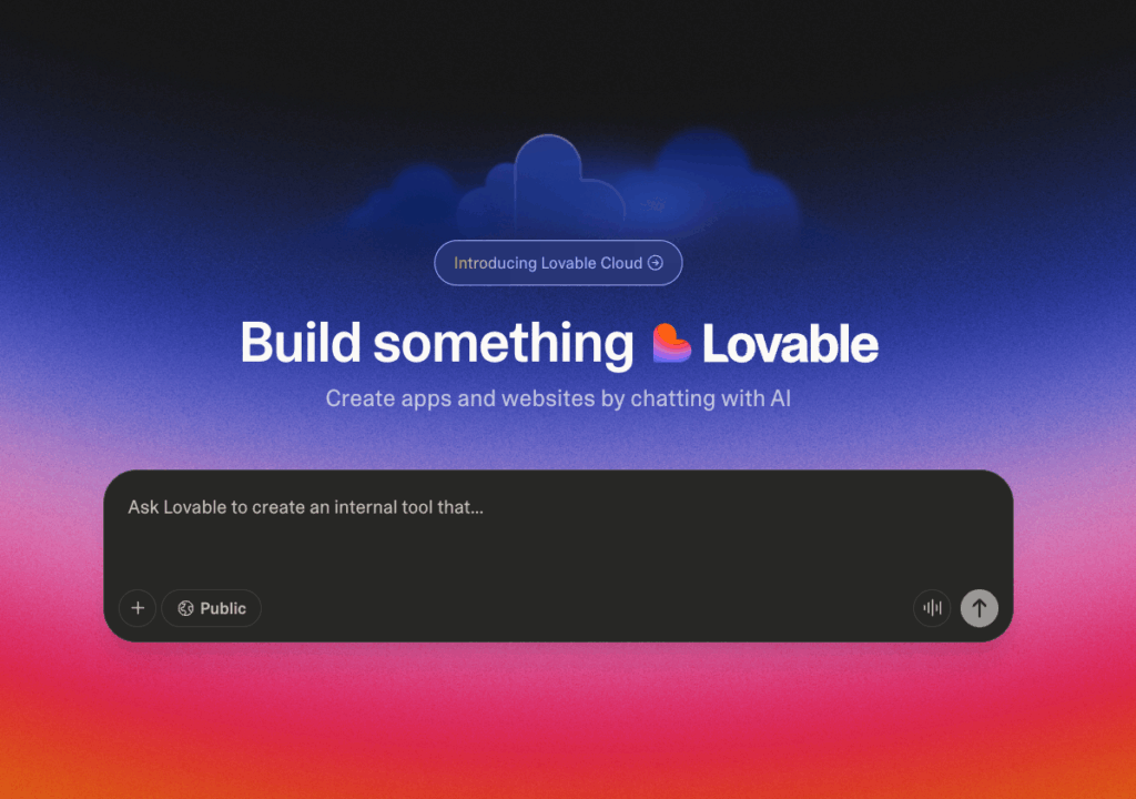
In the test, vibe coding platforms consistently performed the best. They produced polished layouts in under five minutes and often included modern design elements out of the box.
For example, here’s Base 44’s e-commerce layout:

This was the winning design in the test, scoring 92%. There’s not a lot of fancy design going on either, which shows just how low the bar for AI web design really is.
Traditional website builders with AI capabilities (worst performers)
Traditional website builders like Wix, Squarespace, and WordPress now offer AI functionality, but it’s built around pre-existing ecosystems.
I found the experience clunky, and the designs were the worst across the board in this test.
These platforms have been around for many years and have libraries with thousands of themes and templates. That’s why my expectation was that the AI features should at least match the quality of these existing layouts, if not elevate them.
The reality was the opposite.
For instance, this was Wix’s design for the e-commerce test:
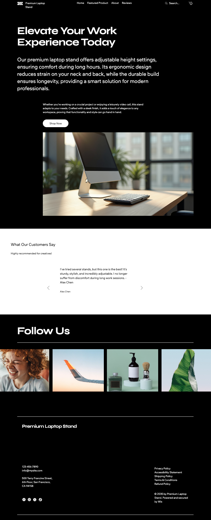
Putting aside the fact that the page doesn’t really follow a standard e-commerce layout, it’s also fairly basic compared to Wix’s existing e-commerce site templates.
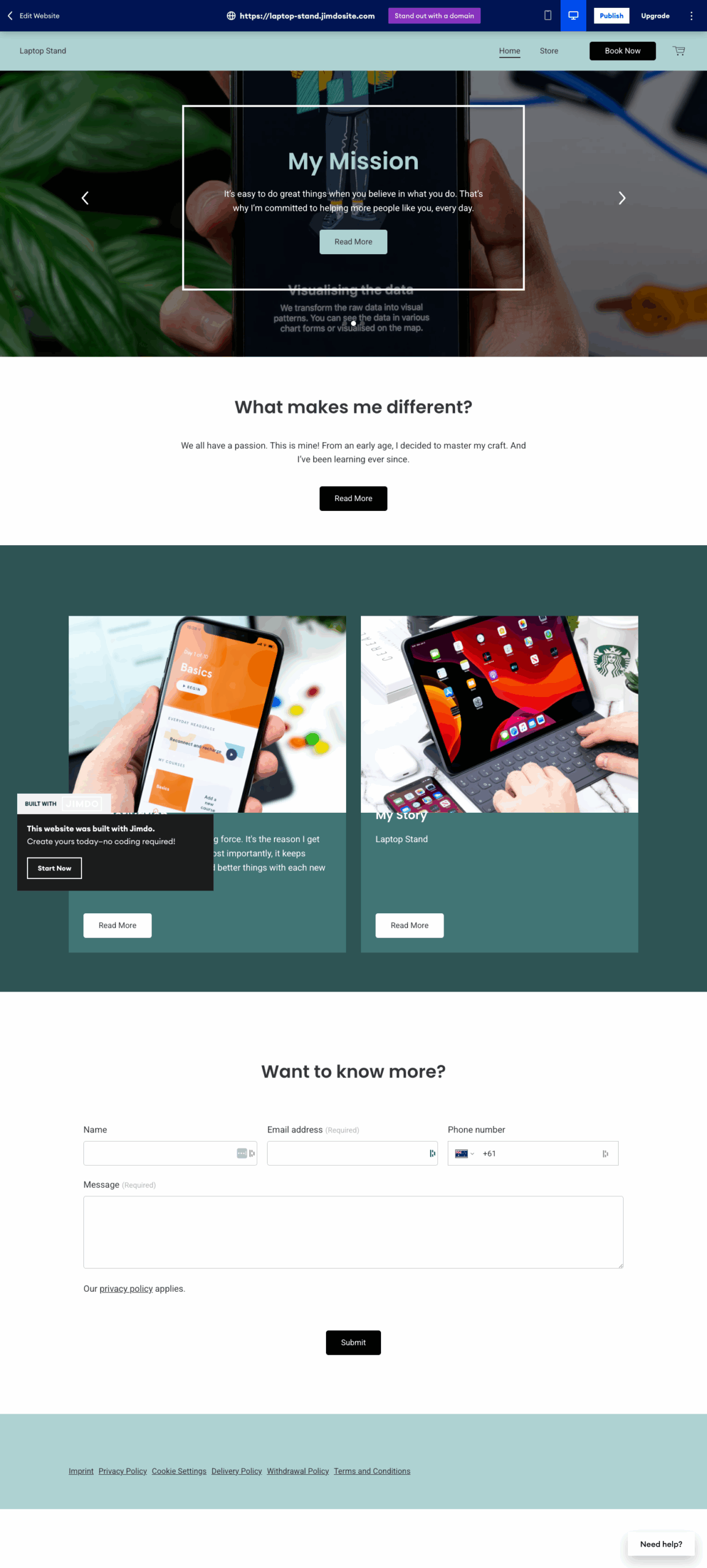
And, to be fair, this wasn’t even the worst design in this category. That title goes to Jimdo with this layout for the e-commerce test:
AI wireframing and sitemapping tools (weak at this stage)
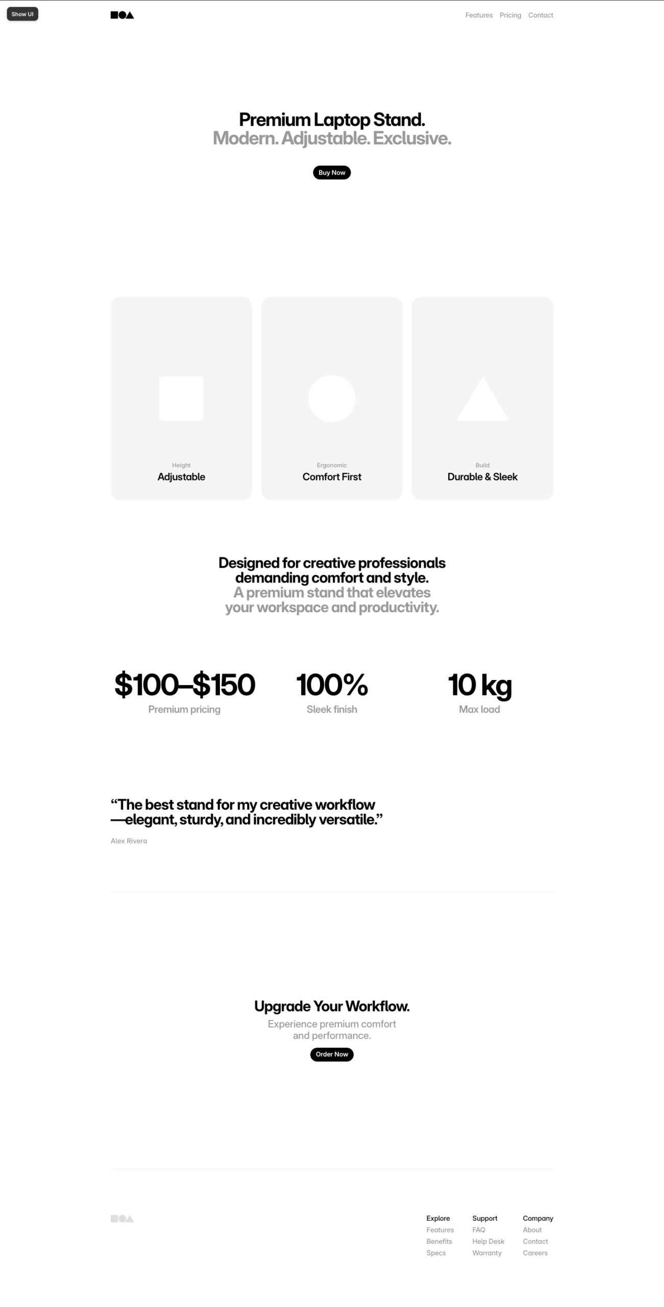
A couple of the platforms I tested, like Framer and Relume, focus less on polished design and more on early-stage planning. For instance, here’s an example of one layout generated for the e-commerce test:
They can auto-generate wireframes, sitemaps, and low-fidelity layouts. While useful for brainstorming, they performed poorly in this test for a few reasons:
- I scored against UX best practices that often require a high-fidelity design
- I did not re-prompt any platforms, and therefore, I could not elevate the initial designs delivered
- I purposely acted as a non-designer to determine each platform’s baseline
These tools have potential earlier in the planning process, but aren’t yet ready for production-ready landing pages.
However, if you are a designer, they’re well worth checking out to make your end-to-end design process run more smoothly.
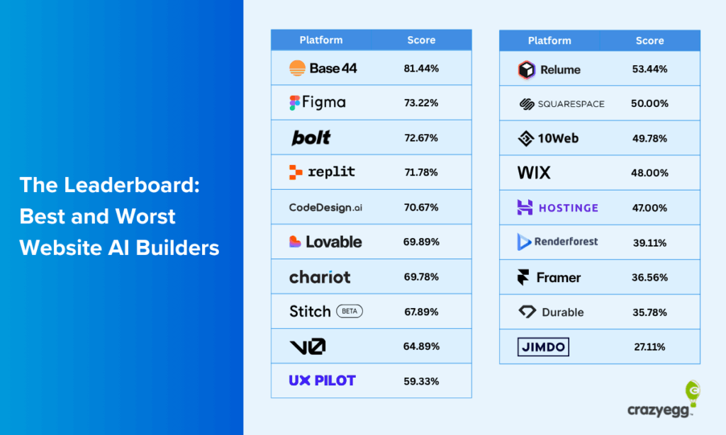
The Leaderboard: Best and Worst AI Website Builders
After grading all layouts generated, these were the best and worst platforms that emerged.
Best overall performers
- Base 44 with a score of 81.44%: Strongest layouts across all three page types, particularly ecommerce.
- Figma with a score of 73.22%: Consistently clean, structured, and scored the highest for sales and service pages.
- Bolt with a score of 72.67%: Fast, polished results with strong UX fundamentals, and can be used well with Framer.
Worst overall performers
- Jimdo with a score of 27.11%: Missed core UX markers and struggled most with service and ecommerce layouts.
- Durable with a score of 35.78%: Minimalist outputs that lacked CRO and UX fundamentals; weakest course sales page.
- Framer with a score of 36.56%: Minimalist low-fidelity designs that had a lot of basic UX best practices missing.
What AI Web Design Platforms Tend To Do Well
Despite their flaws, most AI-generated landing pages showed some consistent strengths. Across platforms and page types, a few best practices were handled surprisingly well:
Calls to action above the fold
Most platforms placed a call-to-action button in the hero section, making it instantly visible. While the copy itself wasn’t always persuasive, the placement followed best practice for optimal conversions.
Minimal, uncluttered layouts
AI leans toward simplicity and whitespace by default.
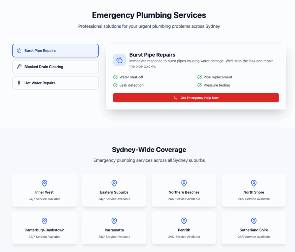
Pages were rarely overwhelming or overcrowded, which meant layouts were easy to scan. This minimalism helped readability, even if it sometimes veered into being too bare.
Clear headlines
Almost every builder delivered short, punchy headlines that communicated the main message clearly. Sub-headlines were hit or miss, but the top-level messaging was usually designed strongly enough to grab attention.

Adapting page layouts
AI did show some ability to adapt layouts based on the prompt. For example, e-commerce pages tended to include product imagery and purchase buttons, while service pages leaned toward location information and click-to-call buttons.
The execution wasn’t always perfect, but the intent to match page type was evident.
The worst-performing platforms generated layouts that were too similar to each other, repeated similar sections for each page type, or lacked significant design flexibility.
For example, Relume included this section (among others) in all three layouts, even though it’s not particularly well-designed:

This was a rare occurrence across the board, though.
Where They Often Go Wrong (And Pitfalls You May Encounter)
While AI platforms can produce quick layouts, they also tend to repeat the same mistakes. These pitfalls showed up across most builders tested.
Doing the bare minimum (if that)
Many designs felt unfinished or too minimal, often lacking substance. Pages were short, thin on content, and lacked depth. Here’s an example:
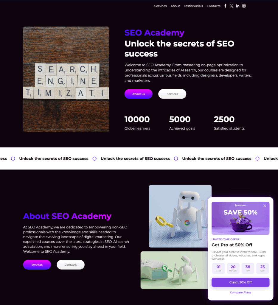
This was the complete design generated.
While it technically qualifies as a landing page, it misses the entire point of what makes one effective: building trust, providing context, and guiding visitors toward conversion.
This problem showed up repeatedly across builders and page types.
Instead of fleshed-out, persuasive pages, many AI platforms delivered skeleton layouts that would need significant human input to drive conversions.
Page layouts don’t match the use case
Even when prompted for a specific use case, several platforms defaulted to a generic “homepage-style” design. Critical sections that define different landing page types were often missing:
- No testimonials or social proof for product pages.
- No instructor bio or course curriculum for course pages.
- No map, address, or location signals for local service pages.
And sure, it’s easy enough to re-prompt and add a missing section here or there.
But some builders completely missed the mark and no amount of re-prompting would be able to get them on track. You’d essentially need to build the page from scratch… which defeats the purpose of using an AI builder in the first place.
Here’s an example of Jimdo’s emergency plumbing services page:
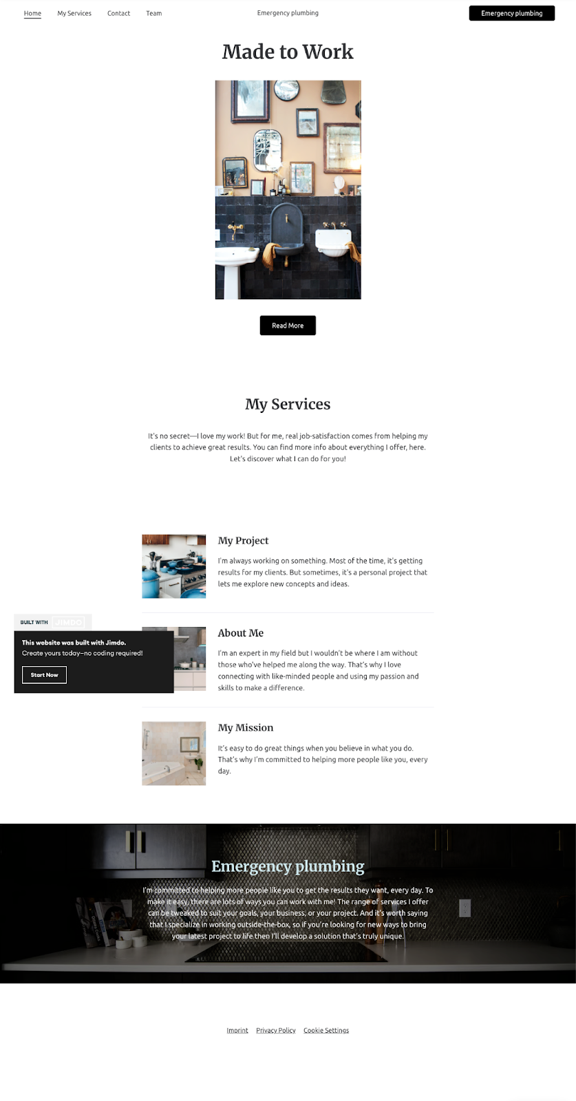
There is not a single section on this page that I’d keep for this page type. Even the “Emergency Plumbing” section buried at the bottom comes across as hand-wavy.
I’ve yet to meet a plumber who will “develop a solution that’s truly unique”. Have you?
Lack of professional design quality
The outputs rarely looked like they came from an experienced designer. Common issues included:
- Limited or no branding elements. (While I didn’t prompt for these, many designs were too generic.)
- Overly plain color schemes (often just black or white backgrounds).
- Generic fonts with no consideration of any typography or font pairing.
- Occasional clutter or odd layout choices that delivered poor UX.
- Random AI artifacts like blank buttons with no functional purpose.
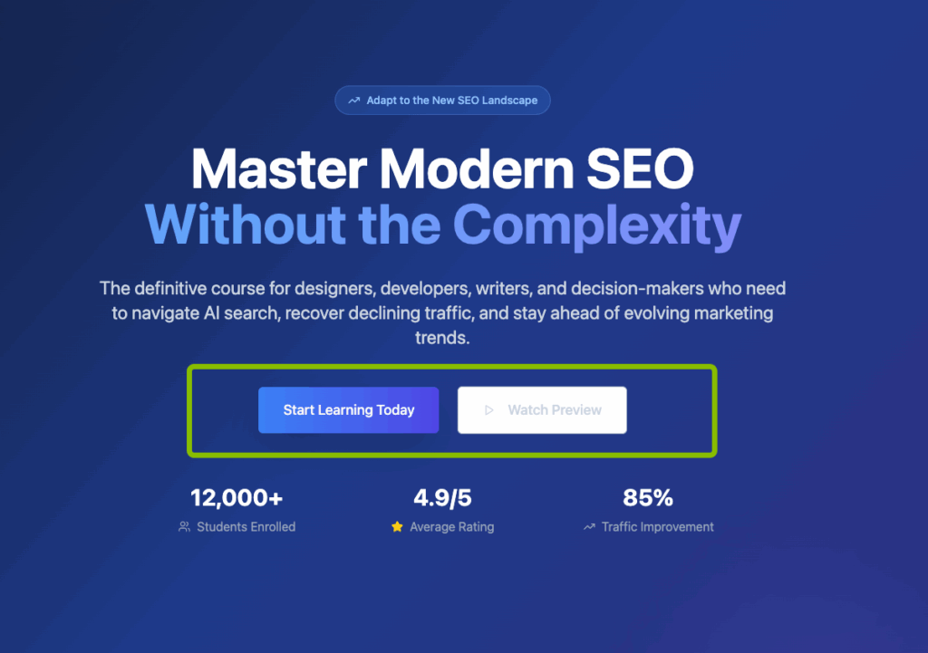
For example, this is the hero section of one of the course sales page layouts with very poor text contrast:

Or this section featuring only two images on an image background, creating a cluttered look for a potentially useless section:

The end result: pages that technically “work,” but lack the polish, attention to detail, and design quality you’d expect from a professionally built landing page.
How to Get the Most Out of AI Website Design Platforms
AI website builders are best used as accelerators, not replacements. To get results you’ll actually be happy with, you need to guide the AI with specific prompts. Here’s what to include:
What to tell AI to do
- Specify your goal clearly: e.g., “Create a sales landing page for an online course” instead of just “Make a landing page.”
- Define your audience: Mention who the page is for (students, local homeowners, business buyers) so the layout and tone match.
- Request sections for trust signals: Ask for testimonials, reviews, case studies, or certifications to make the page more credible.
- Call out must-have sections: e.g., “Include an instructor bio,” “add a pricing table,” or “show a contact form with address and map.”
- Set a style direction: Provide branding cues like colors, fonts, or adjectives like “minimalist,” “bold,” or “professional.”
- Ask for SEO basics: Prompt for optimized headlines, images, and keyword-rich content.
- Push for content depth: Instead of one-screen pages, ask for multiple sections and your preferred order, like hero, product features, testimonials, FAQs, and call to action repeats.
What not to rely on AI website builders for
- Brand voice: Replace generic filler copy with your own tone and messaging.
- Conversion copywriting: CTAs and headlines often need human refinement.
- Fine-tuned SEO: Optimized content, internal linking, and keyword strategy require manual work.
- Final design polish: Fonts, hierarchy, and layout spacing usually need editing in the builder.
Don’t use AI tools blindly. Plan first, then prompt
Even with impressive AI capabilities, a little upfront website planning makes all the difference. Business owners and solo marketers shouldn’t skip the basics just because a tool can spit out a page in seconds.
Before you prompt an AI builder, clarify the essentials your website will need:
- Set your website’s goal: Is it meant to generate leads, sell a product, or build an email list? Figure this out first because your page layouts will depend on it.
- Define your audience and brand cues: Note your target audience, tone of voice, colors, and fonts. AI will default to generic outputs if you don’t provide direction.
- Plan pages for things people actually search for: Gather keywords your audience is actively searching for and plan pages that can meet their search intent.
- Map the must-have sections: For each page, think about essential information your audience will require and map it out. Things like benefits, testimonials, pricing, FAQs, and calls-to-action. This prevents AI from leaving out critical conversion elements.
The point is to avoid relying on AI’s weakest spots: strategy, brand voice, and persuasive copy.
A simple checklist upfront ensures the layout AI generates has a clear purpose, matches your brand, and doesn’t fall into the common trap of looking “fine at first glance” but failing to convert.
After you launch your site, it’s also worth setting up analytics like Crazy Egg heatmaps or A/B testing. These measure how well each page is performing and whether you need to tweak any of the elements designed by AI.
The State of AI for UX and Web Design
AI website builders are fast, but they’re not yet smart.
What they do well is speed: turning a short prompt into a working page in minutes. For many businesses, that’s an exciting starting point. Something that used to take days of wireframing and design iterations can now happen instantly.
But the trade-off is clear.
These pages rarely go beyond a first draft. They miss the nuance of real UX design like the trust signals that convince, the branding that differentiates, and the polish that turns a generic layout into something memorable.
In that sense, AI really does act like a lazy designer: it’ll sketch the outline, but it won’t sweat the details.
The bigger picture is that AI is shifting where design effort happens.
Instead of starting from scratch, teams now begin with AI drafts and focus their energy on refinement, adding strategy, brand, and the conversion-focused details AI skips.
The winners will be those who treat AI not as a shortcut to finished design, but as a collaborator that accelerates the messy first stages of the process.


