Online retailers face a dilemma.
There’s a huge assortment of product page elements that might boost conversions, from old-school countdown timers to AI chatbots.
So which should they add? And where does broader product page strategy fit in?
To answer these questions, I analyzed the web’s top ecommerce sites to build a snapshot of what product pages currently look like. I then asked some of the best retail experts in the world how merchants should be adapting.
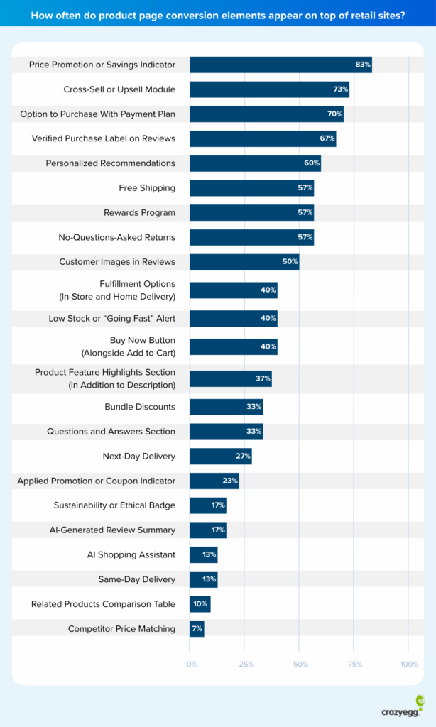
Top Ecommerce Product Page Elements by Frequency
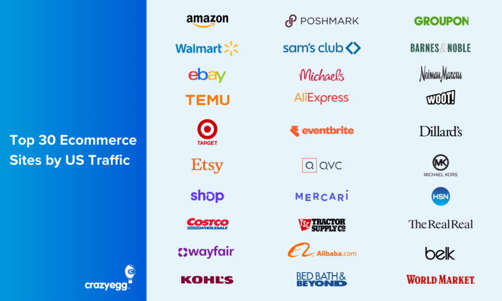
To build a complete picture of what product pages currently look like, I ranked the top 30 US ecommerce websites using data from SimilarWeb.
I then took a sample of PDPs from each of these—on mobile and desktop—and identified conversion-related elements. I used a mix of automated data extraction (simple Python and JS scripts), AI analysis, and human review.
I defined a conversion-related element as any standalone element that could impact conversions in a meaningful way. I excluded traditional structural elements, such as product descriptions and add-to-cart buttons, that are consistent across all pages.
Top 10 Features Every Product Page Needs
Let’s look at the top 10 most frequently used product page elements and why they work.
Because a top site takes a certain approach doesn’t necessarily mean it’s effective. But it’s a useful starting point for your own optimizations. These sites have the traffic, budget, and in-house CRO know-how to do serious testing.
In addition, all of the elements here have minimum downside. They either reduce friction or increase trust with relatively little risk of alienating customers or overcrowding your pages.
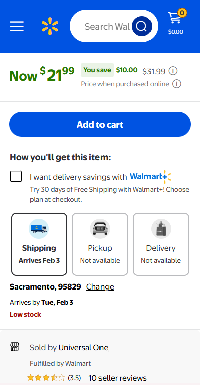
1. Price Promotion or Savings Indicator
Price discount notifications were by far the top feature, present to some degree on nearly all of the sites I looked at (83%).
The following screenshot is of Walmart’s mobile site and is an excellent example of a discount notification done well. It includes the original price of the item, the discounted price, and the amount saved. There are also info icons to provide full context for the savings.
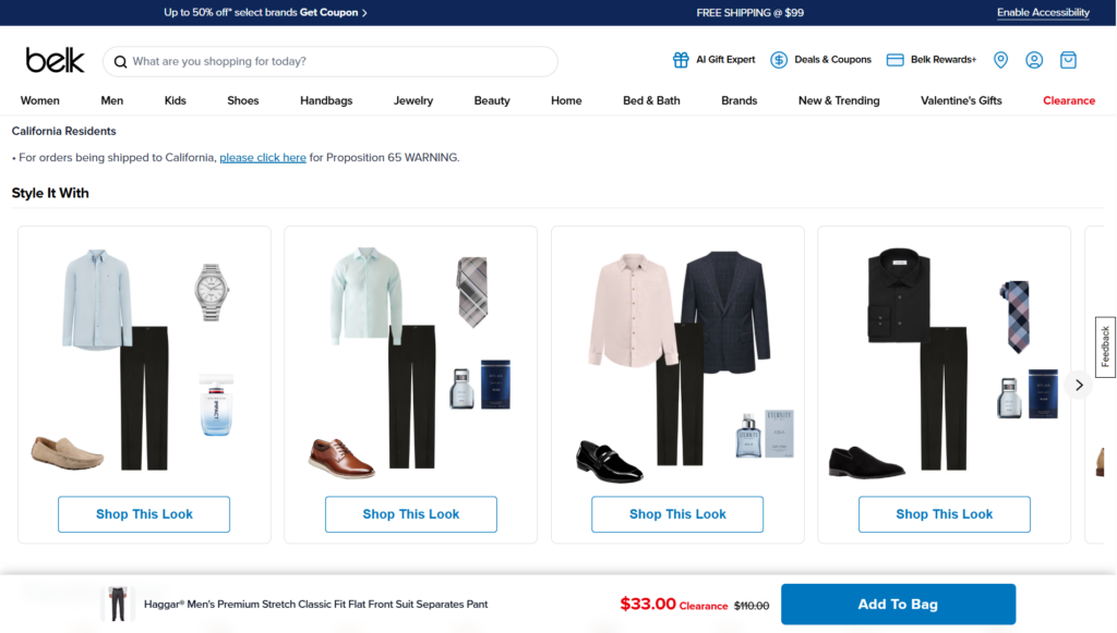
2. Cross-Sell or Upsell Module
Cross-sell and upsell modules took a variety of forms but were present on 73% of pages. Simple “Recommended products” and “Customers also bought” widgets were prevalent, but there were also some creative alternatives.
The Belk example below (the site was included in my sample) uses an original automated “Shop the Look” matching feature, offering a range of complementary, cross-sell items.
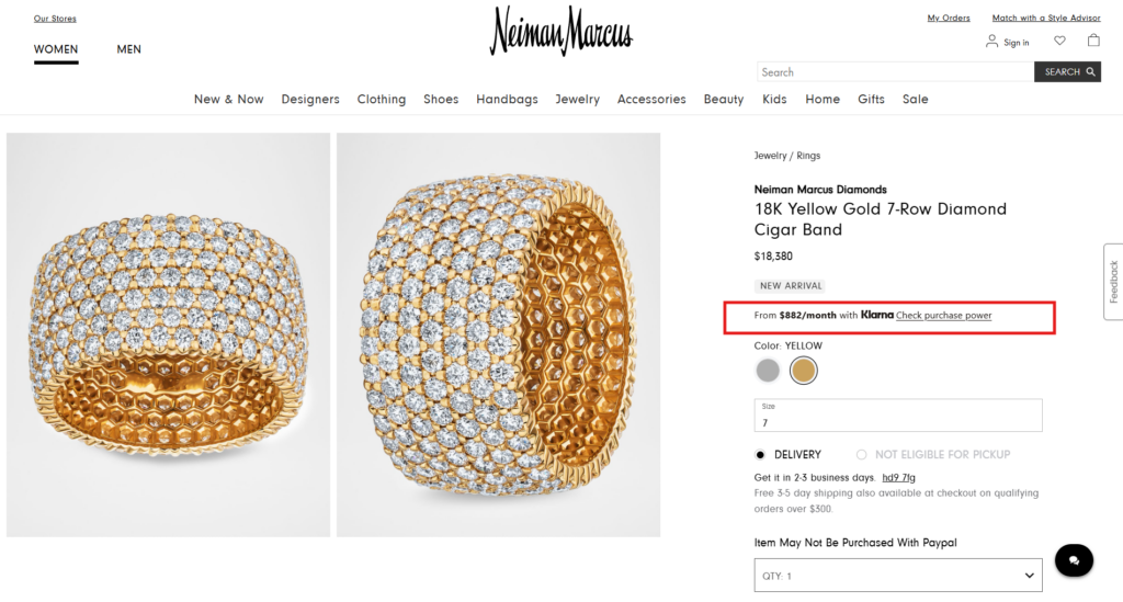
3. Credit or Payment Plan Option
Payment options were also ubiquitous, appearing on two-thirds (70%) of all product pages, usually near the add-to-cart button. Because these credit plans are usually managed by third parties that conduct their own background checks, it’s feasible for smaller retailers to offer them.
The same third-party providers kept cropping up—Affirm, Afterpay, Klarna, and PayPal Credit. Payment plans were often interest-free or, where interest was applied, decreased for fewer, larger payments, as in the case of Neiman Marcus below.
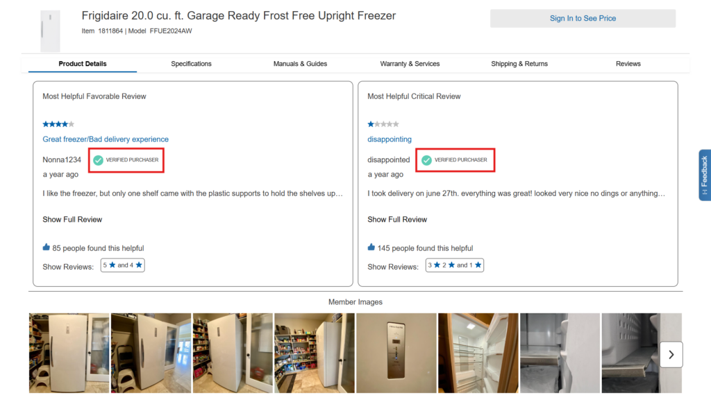
4. Verified Purchase Label in Reviews
Verified review labels also appeared on 67% of product pages. Given that fake reviews have long been a concern among customers, not to mention a proven conversion killer, it’s unsurprising that retailers have adopted these so widely, as in the following example from Costco.
5. Personalized Recommendations Module
Personalized recommendations showed up on 60% of pages, with “Recently Viewed” carousels leading the way.
Although it’s difficult to say with certainty if AI engines are behind these recommendations, the general direction of travel seems to be towards AI personalization. Many product page integrations with personalized widgets now include AI functionality as a core part of their value prop.
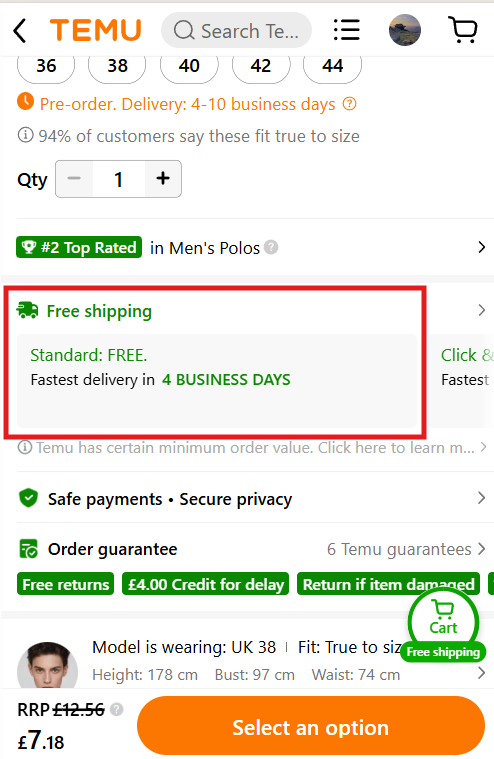
6. Free Shipping
Free shipping was common—with a notice included on 57% of pages—but not universal. Free shipping is frequently cited as one of the most desirable extras. Four in ten shoppers said a lack of free shipping has stopped them from making a purchase in one study (KPMG).
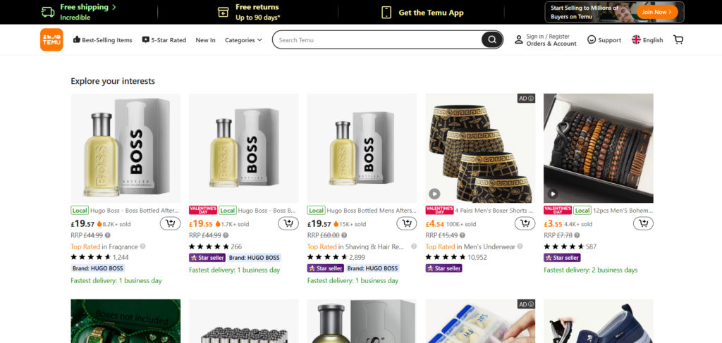
However, it’s not always feasible for retailers to offer it. It’s good to have, but not an absolute necessity. High shipping costs are more frequently cited as a major deal-breaker—90% of consumers in a McKinsey survey. If you do intend to offer free shipping, display it prominently near the product pricing section, as shown in the mobile Temu page below.
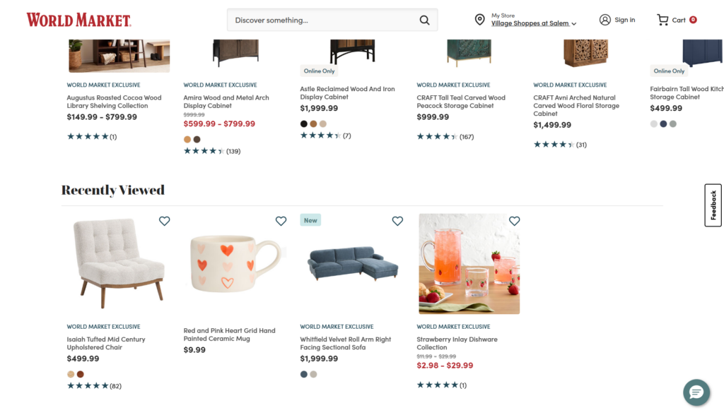
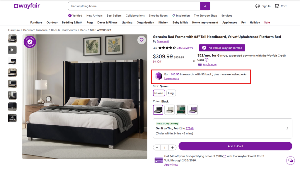
7. Rewards Program
Fifty-seven percent of sites offered some form of rewards scheme. Often, these rewards took the form of points that could be redeemed for “shopping dollars” (between 1% and 5%) for use on future purchases. It was common for rewards to only be available as part of a monthly premium subscription with additional perks like free shipping, such as Wayfair Rewards at $3/month.
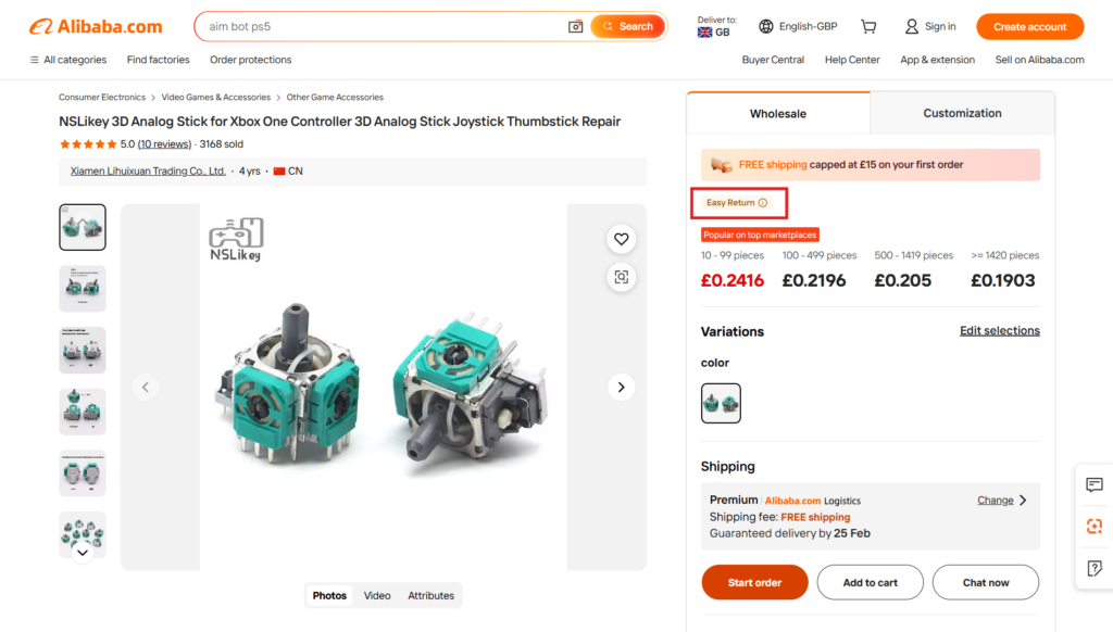
8. No-Questions Asked Returns
“Easy Returns” notifications or equivalents—displayed in the Alibaba example below with an info box—were also common, appearing on 57% of pages. These stipulated that returns would be processed quickly and without any questions. Research by Radial found that easy returns are one of the most important factors in deciding to buy among consumers (ranking above brand identity and personalization), so this should be a priority.
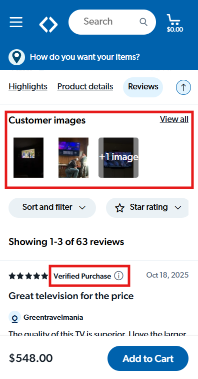
9. Customer Images in Reviews
Customer images, shown in this example from Sam’s Club alongside a “Verified Purchase” label, add to the authenticity of customer reviews and were included on half of all websites in my sample. They’re particularly useful because they provide a broad overview of product features, some of which may have been overlooked in the official photographs.
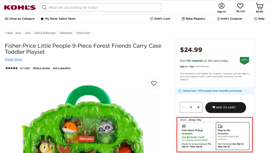
10. Joint Fulfillment Options (In-Store and Home Delivery)
Flexible fulfillment appeared on 40% of pages, which is understandable given that this option is beyond the scope of most retailers without physical branches. However, for retailers able to offer both in-store pickup and home delivery, it’s certainly worth doing. Research by Forrester shows that a growing chunk of shoppers appreciates the flexibility.
What’s Next for the Ecommerce Product Page?
What’s next for ecommerce product pages? To answer this question, it’s worth looking at how they’ve evolved since the late 90s, when online retail became mainstream.
Two things quickly become apparent. First, the underlying template and structure have remained largely the same. Second, while there are lots of tactical innovations, product pages fundamentally create a larger overall story about the retail brand and the product.
Ecommerce of the Past: The Original Product Page
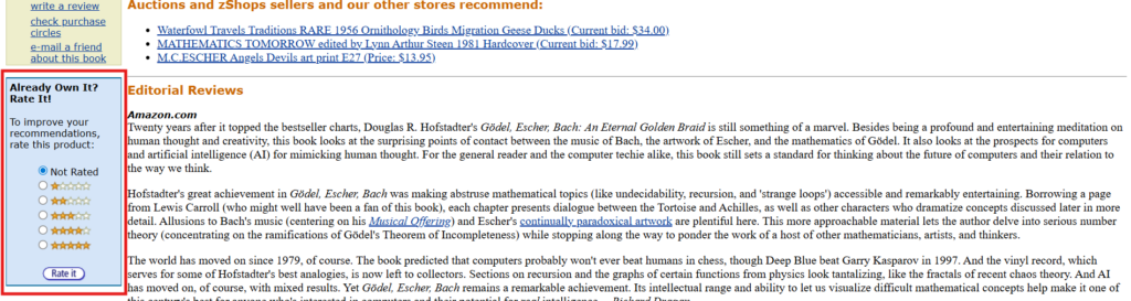
Here’s a snap of an early Amazon page from the year 2000 for the book Godel, Escher, Bach: An Eternal Golden Braid. You’ll see how the desktop layout of the page, with the product on the left, the above-the-fold buy box on the right, and the core description immediately following, has remained the same.
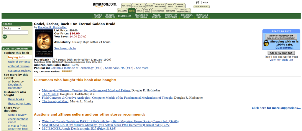
All of the following elements match an entry on my research list, either fully or as an early precursor:
- A “You Save” price promotion offering a reduction of $4.
- “Customers who bought this book also bought…” cross-sell section.
- An early form of review “proof” by showing the location of the reviewer.
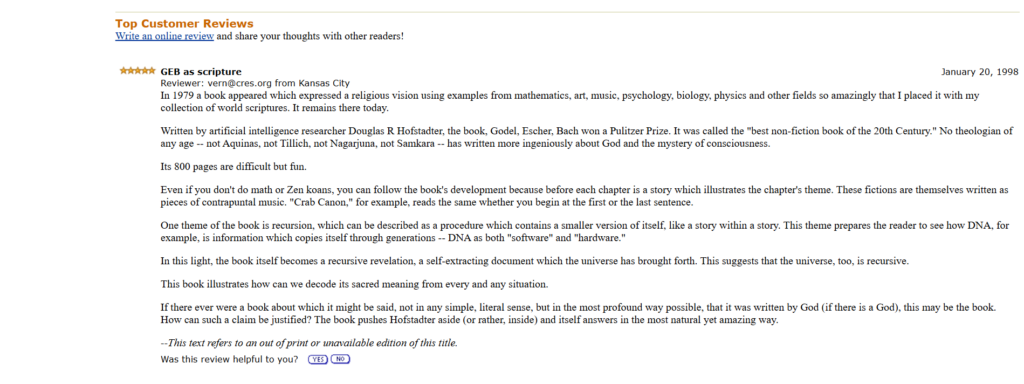
- A feedback form for personalized recommendations (Amazon pioneered post-purchase email recommendations). This was a precursor to the page-wide personalization we see today.
- A notice about shipping processing within 24 hours.
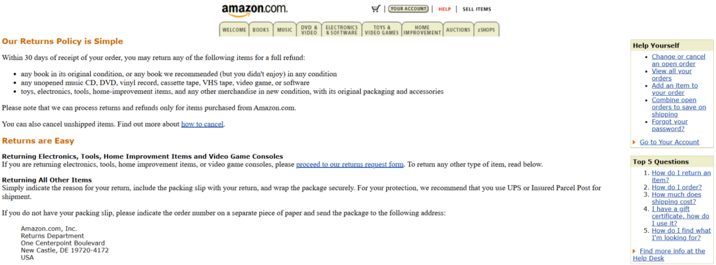
- Text under the Add to Shopping Cart button that reads, “Shopping with us is 100% safe. Guaranteed.” It then links through to a page that includes a generous returns policy.
In one sense, you can look at this page as a collection of linked elements that aim to maximize customer value. The other way of understanding it, however, is as a story.
In this early Amazon page, there is immediate merchandising clarity around what the product is, what its primary features are, and how much it costs. This is immediately followed by context centered around benefits to the prospective reader. Editorial reviews highlight the book’s best qualities and are backed by real customer reviews.
At every stage, Amazon also seeks to answer the question “Why pick us?” The discounts, security guarantee, personalization options (like the wish list), and the friendly tone throughout are all geared towards creating trust and brand differentiation.
Ecommerce of the Present: Lower Friction and Higher Proof
Love it or loathe it, Temu gets a lot right when it comes to product pages. They include most of the elements that I identified in my study, exemplifying how to combine multiple conversion-focused tactics into a hyper-optimized version of a standard product page.
Here’s a rundown of the various features included on Temu’s product pages:
- Significant price markdowns along with the option of an interest-free payment plan from Klarna.
- A “Free shipping” notification both at the top of the page and in the buy box.
- A returns policy—typically with no questions asked—that is valid for 90 days.
- A badge that stipulates all reviews are from verified purchases.
- An accelerated checkout Buy Now button alongside the Add to Cart button.
- Social proof (“3.1K+ sold”) and a sales countdown where appropriate (not shown in the example below).
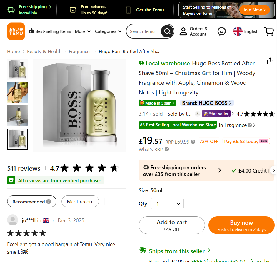
- A “Recommended” view that surfaces the most helpful reviews.
- User pictures in reviews.
- A notice about Temu’s ethical policy and tree-planting program.
- A large personalized product carousel at the end of the page.
While Temu has come under criticism for exploitative practices, it’s difficult to deny that it has entered a crowded and competitive space successfully. This is no doubt due in part to its highly optimized product pages.
You can see Temu as solidifying the story represented in Amazon’s early product pages. From the get-go, the emphasis is on communicating value. Of the product itself and the surrounding add-ons—significant discounts, friction-reducing free delivery, 90-day returns, and an optional interest-free payment plan.
This is then backed up by verified reviews (including user-generated images), detailed feature descriptions, and multiple high-resolution images. The page finishes with a roundup of personalized suggestions.
Temu’s pages excel at conversion optimization. They show exactly how the customer will benefit, prove all claims are trustworthy, and make a purchase possible with a minimum of friction and risk.
Ecommerce of the Future: AI Product Page Elements
As AI-based elements become easier to implement, what do product pages of the future hold?
There were two main AI features on the product pages I analyzed: chatbots and review summaries.
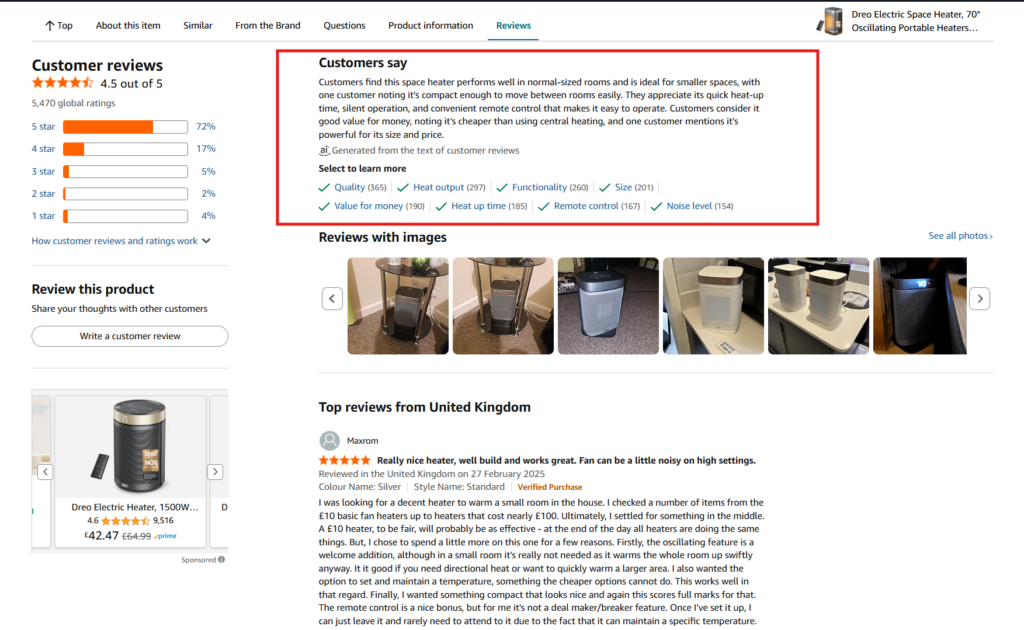
Seventeen percent of sites had AI summaries of customer reviews on product pages. This was the most common AI element and one that will likely continue to be adopted. Research by Nielsen Norman Group found that shoppers generally find these summaries helpful.
Combine this with the significant role that reviews play in enhancing conversions, and it’s a no-brainer for retailers. It builds even further on the crucial role that proof plays—synthesizing verified customer experiences in a way that reduces practically any friction previously involved in reading them.
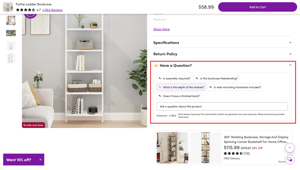
AI chatbots or shopping assistants also appeared on a small number of product pages (13%). Amazon’s Rufus is perhaps the best-known example of an on-page chatbot, but Wayfair (shown below) also had a question-and-answer AI bot in its product details panel. It’s powered by alby, who has an app on the Shopify App Store.
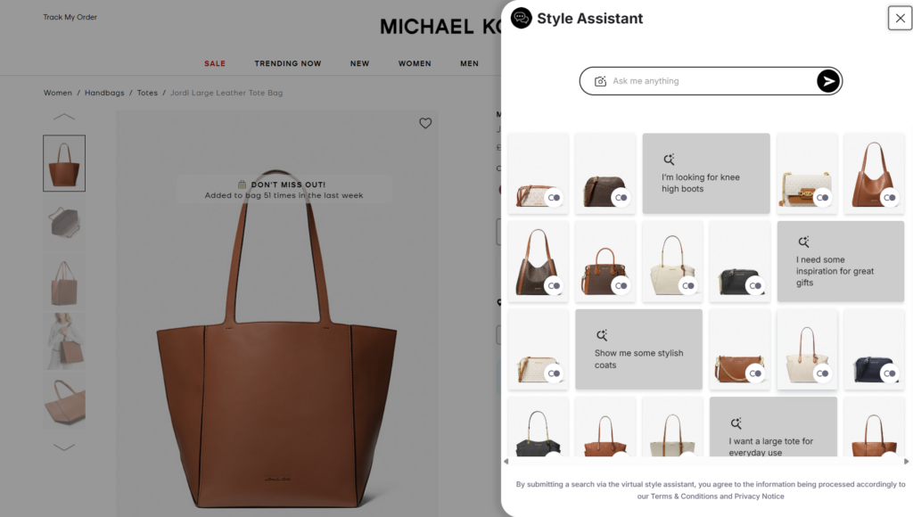
Several retailers also offered virtual assistants. These weren’t, however, page-specific chatbots. Despite being accessible from PDPs—such as Michael Kors’ “Style Assistant”—they were more akin to site-wide search functions.
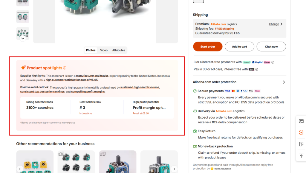
Finally, an interesting example of AI use on PDPs was Alibaba’s “Product spotlights” widget. Because it displays dynamic information without the need for constant manual updates, it’s potentially a strong AI use case that’s useful for customers.
The near-term outlook based on this data is that AI will primarily aggregate and summarize. It will draw on existing information contained on product pages, such as reviews, specs, and comparisons, and make it easier for customers to access the information they need. In this sense, it represents an evolution of the product page towards greater interactivity and efficient communication.
How to Optimize Your Product Pages in 2026 and Beyond: An Expert View
How can retailers like you navigate the plethora of conversion tactics on offer? Will PDPs even matter in five or ten years? And is AI as powerful as everybody is making out, or is it 90% hype?
To help answer these questions and more, I spoke to three of the world’s leading online retail experts. Using their insights, I then put together a six-step roadmap for ecom optimization in 2026 and beyond.
| Our expert contributors | |
 | Phillip Jackson RETHINK Retail Top Retail Expert and CEO of Future Commerce, a media company that helps retailers understand and prepare for the future of commerce. |
 | Ezra Firestone Ecommerce expert and educator and founder of Smart Marketer. He’s started multiple successful online retail brands. |
 | Andrew Youderian Investor and founder of eComFuel, a private community for 7- and 8-figure online retailers. |
1. Agentic Ecommerce Is a Secondary Priority (For Now)
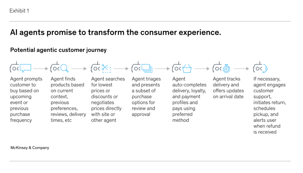
Let’s address the elephant in the room: agentic ecommerce. In typical grandiose fashion, a McKinsey article published last year predicted that the shift to agentic ecommerce would be “seismic.”
Current AI use cases exist on a spectrum. For example, if I head over to ChatGPT and say, “I need to buy a smart lightbulb,” it will research a set of options and provide me with the links to the product pages.
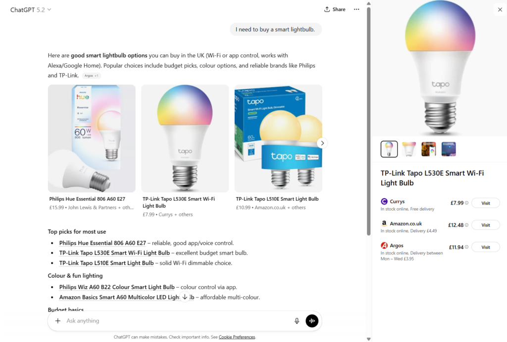
ChatGPT’s Instant Checkout feature (only available in the US for now) takes this a step further, letting the user buy products without leaving the interface.
Full agentic search, which is still largely in development, takes this right to the extreme. In theory, users will be able to ask an agent to autonomously handle all parts of the research and buying process. This would apply as much to individual purchases as it would to complex, multi-stage ones, like purchasing all the furniture for a new house.
Here’s an overview of what McKinsey and Co. thinks it might look like:
So, does this spell the end of the product page? Not in my view.
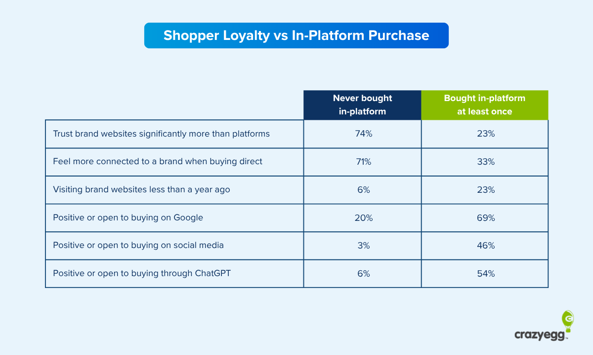
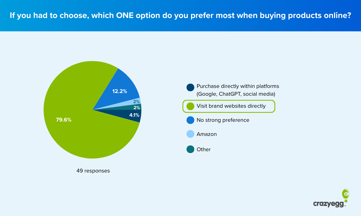
AI sends a miniscule amount of traffic at present—just over 1% across all industries, according to one study (Search Engine Land). Related data is also very mixed. For one, AI visits tend to convert at a higher rate compared to traditional search traffic. This would seem to indicate that product pages are more important than ever because they’re attracting high-intent visitors. Websites, and by extension product pages, remain the dominant channel through which users interact with their favorite brands, with 71% of consumers using them (Signifyd).
Research by Future Commerce also found that AI is mostly used for research. Only 23% of consumers wanted to complete checkout without leaving the AI chat interface.
Nobody knows how agentic ecommerce will pan out. At least not fully. For now, the bulk of your conversion efforts should be on optimizing “traditional” buyer journeys on your site and app.
2. Optimize the Full Sales Cycle, Not Your Product Pages Exclusively
Friction. Online merchants are obsessed with removing it. In the quest for more add-to-cart clicks and purchases, the very real impulse is often to remove anything that stands in their way at all costs.
However, this is a mistake. Optimization works best when it’s enacted across the whole customer cycle. Early-funnel metrics, while attractive, are often antagonistic to revenue.
Phillip Jackson, CEO of Future Commerce, provides strategic advice and foresight to some of the world’s top retail brands. When I spoke to him, he told me that he’s no stranger to this issue: “We’ve seen over and over again in our consumer research here at Future Commerce that aggressively removing friction can improve top-line conversion while quietly increasing returns, chargebacks, and customer service request volume downstream. That’s the opposite of optimization.”
For Phillip, it is far more useful to think in terms of productive and unproductive friction. Unproductive friction is fair game—it needlessly slows the buyer journey and hampers purchases. Productive friction, on the other hand, is about reducing regret. An outcome that ultimately manifests in stronger downstream metrics. Namely, customer lifetime value.
Here’s what productive friction might look like in practice:
- Clearer information (for example, model size on an apparel site)
- Explicit product use cases and shortcomings in edge cases
- Describing who a product is not for in the main description
“Personally, I think the PDP’s [product detail page’s] job isn’t to close the sale at all costs,” Phillip said. “What if, instead, we created a more informed buyer that built customer lifetime value? Long-term optimization beats short-term optimization every time.”
The crucial caveat here is that optimizing for the long term doesn’t mean ignoring tactics. There are many friction-reducing elements that have been successful. Founder of online community eComFuel, Andrew Youderian, for example, argues that Shopify’s Shop Pay button is one of the most important innovations of the last several years.
“It’s grown in adoption among shoppers, with the vast majority having their payment details saved,” he told me. “This has made purchasing products on a whim nearly frictionless. I know I’m much more likely, as a consumer, to buy something if there’s a SHOP button right on the product page, and I know I’m not alone.”
The key is context. Some conversion elements will reduce friction successfully. Others won’t. Locating them within a broader customer journey and seriously considering the possibility of negative downstream consequences is one of the best ways of protecting against surprise revenue losses that happen in spite of higher conversions.
3. Treat Optimization as an Ongoing, Cautious Process
One of my first long-term jobs when I started out as a writer was with a company called Growcode. They were a tech firm that specialized in optimization for Magento sites, with a focus on product pages.
The core of their client approach rested on continuous improvement. The idea was that optimization infrastructure should enable long-term, nonstop multivariate testing. Successful changes would be implemented, and duds would be dropped. And this should be happening all the time.
This stands in contrast to an overhaul approach, where a site is completely revamped every couple of years. It’s far more common than you might think and was practically the default strategy among clients.
Simple testing tools allow you to connect with your ecom platform and run multi-armed bandit tests easily via a website editor. If you haven’t already integrated this functionality, now is the time to do so.
The temptation, especially with AI-enabled technology, can be to overhaul. But a gradual, cautious approach lets you test new features with a minimum of risk and a high degree of certainty about what’s working and what’s not.
4. Own and Tell Your Story
When I asked Ezra Firestone, founder of SmartMarketer, for his best advice for retailers looking to improve their PDPs, he responded with four words: “Tell a better story.” Decades of experience both as a consultant and a retailer have convinced him that customers buy “outcomes and identity, not bullet points.”
For Ezra, the evolution of product pages is best understood as a shift from “spec sheets” to real “sales conversations.” All of the features that became part and parcel of product detail pages helped drive this shift—rich media, customer videos, social proof, FAQs, story-driven descriptions, and clear customer-focused context. The emphasis on social proof was a perfect example of this. “People stopped believing in polished marketing and started trusting other buyers,” Ezra said.
He offers a six-step framework with which brands can define their story:
- Context: What problem the product solves.
- Demonstration: Practical proof that it works.
- Social validation: Verified accounts of other humans saying it works.
- Reason to believe: A narrative that answers the question, “Why this brand vs. others?”
- Merchandising clarity: Transparent details around bundles, sizing, choices, and offers.
- Friction removal: Elements like free shipping, warranties, and guarantees to push customers over the line.
“When those six elements are present,” Ezra told me, “conversions almost always improve. Most PDPs list features but never answer why anyone should care.”
5. Deploy AI Carefully
AI is the topic on everybody’s lips. It’s clear from my research, however, that customer-visible AI product page components are relatively sparse at the moment. They’re more or less limited to chatbots and review summaries.
That said, it’s likely there will be a profusion of AI elements in the coming months and years. So what should your strategy be? All the experts I spoke to stressed the importance of being careful.
In some cases, AI will be relatively low-risk. This is true of review summaries. For Ezra Firestone, AI summaries are useful because they reduce friction. “If a PDP has 500 reviews, a paragraph of AI copy can give you the gist so you don’t drown in information,” he said.
However, he added a big caveat. “Where brands will get burned is trying to outsource taste and storytelling to AI. It can help me decide, but it can’t make me desire. When it comes to chatbots, I like them for high-AOV or high-consideration products where people need a guide. For low-consideration products, it’s just noise.”
Phillip Jackson echoed this point: “We’re generally skeptical of on-site branded chatbots as a primary product page feature, unless you’re operating at Alo or Lulu scale. For most brands, they introduce yet another interface and a decision point: ‘What do I type in here?’” He also spoke about how they can obstruct mobile UI with pop-outs, consume valuable vertical real estate, and hide buy buttons with the mobile keyboard.
Infrastructure that allows for ongoing testing, as outlined in step two, will go some way in mitigating against this problem. You would know pretty quickly, for example, whether chatbots are adding or reducing unproductive friction. But there’s also the issue of prioritization as more AI integrations become available.
The key is to put the customer at the center of your decision to test or not. Specifically, ask whether or not an AI feature adds value over a static element. In the case of AI review summaries, the benefits are obvious. For chatbots, it’s unclear if there’s any case for them over a detailed description.
6. Plan to Optimize for Intent (and Be Wary of Personalization Hype)
AI is primarily being used as a research tool. This explains why traffic from platforms like ChatGPT carries a comparatively higher conversion rate. Visitors are arriving after already having narrowed down their choices.
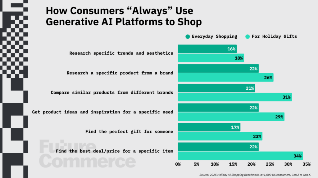
Commerce, in partnership with Future Commerce, published a report, New Modes: How AI is Shaping New Commerce Contexts and Expectations, that found that 33% of Gen Z shoppers opt for AI platforms for product research. That’s almost equal to the percentage that uses traditional search. As AI continues to become more accurate and reliable, that figure is only going to grow.
For Phillip Jackson, who co-authored the report, this is important. He believes the product page of the future will wrap itself around the “moment, not the person.” And this “moment” is fundamentally defined by intent. Not personalization based on past behavior or stored profiles, but an understanding of where the customer has come from—the context of entry.
“At Future Commerce,” Phillip said, “we’ve been very clear that personalization framed around the individual shopper is brittle and, frankly, creepy. What actually works is reshaping the PDP around the context of entry. The ad, the creative, the offer—these are all intent signals. In the end, the traffic source matters more than the human shopper. The page should be shaped around these intent signals and adapt that to what they see next. That’s the future.”
In practice, this means moving to a modular system that adapts based on the pre-entry journey. Ezra Firestone put it perfectly: “Returning customers won’t be treated like strangers. Cold visitors will get education. High-intent buyers will get clarity and trust.”
This shift—context over identity—is already starting to happen. Variants that run on traffic-source personalization and geotargeting, for example, are commercially viable and relatively easy to work with. As you add new elements to your product page, think about how you can adapt them to different traffic sources and varying levels of intent.
Wrapping UP: Your 10-Step Product Page Checklist
We’ve covered a lot of ground. You now have a full overview of the conversion elements that the world’s top sites are using, along with a high-level strategy that defines how to apply them.
Here’s a practical checklist that pulls all of that tactical and strategic CRO advice together:
- Optimize for the full customer lifecycle: Prioritize long-term value over short-term conversions. Don’t remove friction at any cost. Ask, “Is there a chance this will increase purchases at the expense of helping buyers make an informed decision?”
- Use the product’s core story as a template: Make the benefit of the product crystal clear, prove it works, validate the proof with real customer reviews, articulate why your brand should be the premier choice, make offers and purchase options transparent, and remove friction to push customers over the line.
- Design for intent, not personalization: Think about how you can adapt the page to traffic source and buyer stage mindset.
- Commit to continuous testing: Incremental experimentation will save significant resources over the long term compared to periodic redesigns.
- Establish merchandising clarity upfront: Price, payment options (including credit plans), bundles, sizing, and key details should be visible at a glance. High-res pictures are a baseline.
- Communicate value with promotions and incentives: Discounts and rewards are among the most common (and effective) product page conversion elements. Make use of them.
- Prove claims with high-quality social proof: Verified purchase badges and user-generated images bolster the impact of reviews, which are already your most powerful trust builders.
- Reduce risk at the decision point: Easy returns and free or discounted shipping (where possible) should be included near buy buttons so as to eliminate hesitancy when buyers are making decisions.
- Use AI to compress information: Don’t use AI to replace information on your product pages. Summaries, highlights, and chatbots speed up understanding, but they occupy a supplementary role.