


The Story
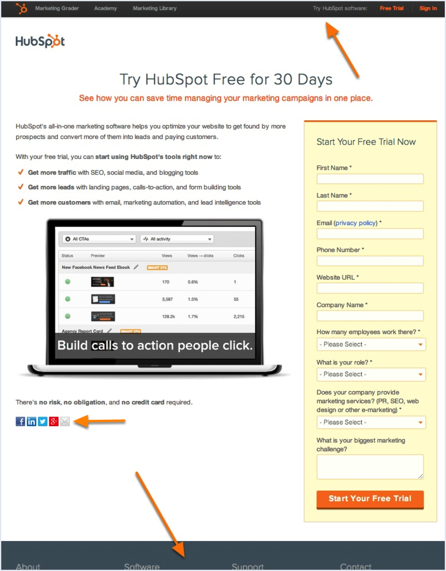
HubSpot did what every marketing playbook tells you to do. They kept the navigation bar, the footer links, and the social share buttons on every landing page. Best practice, right? Give visitors options. Reinforce the brand. Build trust through consistency.
But what if all these choices were reducing conversions?
They ran an A/B test on five of their busiest landing pages. The data wasn't subtle. Many of the links were distractions, harming conversions. The "best practice" was leaking conversions on the exact pages it was supposed to help.
So they stripped them. Same five pages. No navigation. No footer links. No social share buttons.
The result? Conversions surged by 16% to 28% on middle-of-funnel pages designed to showcase HubSpot software and facilitate sales connections.
Top-of-funnel pages, featuring free resources aimed at lead acquisition and providing marketing solutions, experienced a modest conversion lift of 0-4%.
The lesson: navigation helps when people are browsing. Navigation hurts when they are ready to act.
Why it worked
Every link on a landing page is a way out. When visitor intent is high, exits cost you conversions. The right design depends on the funnel stage: keep navigation for exploration pages, strip it for decision pages.
Aggregate analytics will tell you the page converts. They will not tell you that one in three of your most ready buyers escaped through the navigation before they ever saw your Call to Action (CTA). Crazy Egg shows you those exits, before they cost you another demo.