In the past 5 years, the term “infographic” has seen an impeccable rise in trend.

In fact, the popularity of infographics is expected to see an increase of almost 5% by next year, meaning that anyone who isn’t yet riding the infographic bandwagon is bound to fall behind. If you’re reading this, though, hopefully it means you’re ready to introduce more and better infographics into your content marketing strategy.
What Are Infographics?
The word infographic evolved from the term “information graphics.” It wasn’t until the late 18th century that statistical graphics were first invented. William Playfair developed the idea of graphical representation of data. He wanted to replace conventional tables of numbers with systematic visual representations and believed that graphics were instruments for reasoning about quantitative information.
What is the best way to describe, explore, or summarize a set of numbers? It is to look at a picture of those numbers, or in other words, a chart. Excellence in statistical graphics consists of complex ideas communicated with clarity, precision, and efficiency. Thus, infographics are used to communicate information through the simultaneous presentation of words, numbers, and pictures. Simply stated, infographics are meant to make understanding complex data a lot easier.
Now, let’s go step-by-step through the process of creating an infographic.
Start With Your Story
The first step in creating a compelling infographic is to decide on an interesting story that people will care about. The trick is to find a pain point and offer a solution. If the content you create is not useful or practical to your audience, why should they even bother reading it? There is a reason that articles offering tips and hacks are so popular. They provide readers with valuable insight, and their goal is to make readers’ lives easier. Consider your audience as the hero in their own journey. Ask yourself these questions:
1. What Is The Pain Point Your Readers Are Hoping To Solve? – Identify The Call To Action
Typically, when looking for a pain point, it is best to consider one of your own struggles for which you are in need of a solution. One of my preferred tactics is to scroll through some of the questions on Quora and Inbound.org. Because those questions are submitted by real people with real questions, you already know that by addressing their queries, you are producing content that has value to it.
2. What Advice Are You Offering Your Readers To Solve Their Problem? – Supreme Ordeal And Initiation
Some of the best advice you can offer to your readers is an account of your first-hand experience with an issue. For instance, if you are reading an article about infographics, chances are you don’t want to read it if it’s written by someone who has never made an infographic. First-hand experience is important because it can be helpful when forming a captivating narrative for your story. The next step is to back up your advice with other credible research.
3. How Does Your Advice Apply And In Turn Help Your Readers Overcome A Problem? – Unification Or Transformation
This is where your own experience in the matter proves to be very useful. You need to be able to show how your own actions resulted in your success. Remember, for your audience, their pain point is something they believe nearly impossible to solve. They have reached a point where their only hope is to ask the universe for assistance. If you can address that pain and provide your readers with proof that you were able to overcome the same problem, you allot them new hope.
4. Your Readers Have Gained Practical Insight And Can Now Solve Their Problem. – The Hero’s Return
Upon reading and understanding your story and your perspective on a certain case, your audience feels a renewed sense of potential, as well as practical insight that will motivate them to address the problem they once had. And, what do people do once they suddenly discover a new possibility of success? They share their knowledge and the stories they heard with others, because an objective that previously seemed impossible finally seems to be within reach.
It might feel like a lot of responsibility on your part, but rest assured, finding your story is the most difficult part of the process. The next steps flow much more logically.
Acquire Your Data
Over the past few years, there has been much debate about what exactly constitutes an infographic. Prior to information graphics being used as a tool for content marketing, they were predominantly used in the fields of science, philosophy, and psychology to most effectively process and communicate complex data and information to aid viewers’ analyses.
Because content marketers now need to focus so strongly on providing quality and in-depth content, it is crucial that they use complex ideas and datasets to add credibility and insight to their writing. But, finding interesting datasets is not always easy. Not all companies, and certainly not all content marketers, have access to large data libraries. Don’t worry! Here is a list of some excellent resources you can use to find copious quantities of interesting data:
Original research: Before you dive under the table in fear, it’s important to know that original research and data collection aren’t as terrifying as they sound. You don’t need a research team, data scientist, or a big budget to conduct quality research. Use a simple survey tool like Survey Monkey or Google Forms to collect user insight on a given pain point, or manually code the data.
Let’s say you’re doing a study on why certain infographics get more shares on Pinterest. You can observe a variety of different factors, such as color, length, genre, and font style. Then, document a sample size of infographics with a lot of shares based on those elements. It might seem like a lot of time-consuming work, but it identifies you as an expert on the topic and increases the chance that other people will refer to and link back to your original work.
Data.gov: This site is the U.S. government’s open data website. You can search for ages through a variety of public data. This includes anything from healthcare data to economic data. It takes a bit of digging to get the datasets, but it’s certainly worth exploring.
UN data: UN data is international data on a number of subjects, such as employment, poverty, population, export and import numbers, growth, etc. There are 34 databases in total, and you can filter through them by country.
Google public data: Google has a search engine specifically for looking through publicly available data. This is a good place to start as you can search a large number of datasets in one place. Another option is to take a look at Google Trends, which provides insight on keyword popularity based on search rankings.
Pew Research data: Pew Research is an excellent think tank that provides an abundance of research and polling in the fields of public interest, such as internet, science and technology trends, global attitudes, religion, and public life, as well as social and demographic trends. They also publish excellent reports and make all their datasets available for download.
World Bank: The World Bank has a lot of financial and economic data. This is great if you want high level or more complex datasets to include in your infographic.
World Economic Forum: WE Forum has more nuanced data on a variety of topics. Their data is typically embedded in their reports, so you want to make sure you read through them in order to understand exactly what the data is referring to.
Statista: Statista is a data aggregator that has thousands upon thousands of datasets. It is a paid service, but you can get some interesting datasets that are not always available publicly. They also have some surveys and statistics that are available on the site publicly.
Visualize Your Data
Only a select few individuals continue to practice the application of visualizing data, and more practical and simple methods of using charts have taken the lead. I’m not a fan of very complex forms of data visualization where the charts are actually more difficult to comprehend than the original report. Sure, they make for very beautiful and intricate artwork, but the point of a data visualization should be to simplify complex information. In order to do this, you need to ensure that you are choosing the right charts. Here is a discussion of some of the types of charts available:
Pictograms And Icon Charts
When there is an important number that you want to emphasize, if it can be conveyed as a percentage or a ratio, a pictogram is an excellent way of visualizing the number in a way that really complements the text. Similarly, you can use an icon chart, which is an icon that has two different color tones. The percentage or height of one color represents the ratio you are attempting to convey.

Bar Charts and Column Charts
The majority of data visualization deals with comparing a set of data points. Anything that can be counted and categorized can be easily visualized using a bar or column chart. Most multiple choice survey answers can be visualized in this way.

Bubble Charts And Treemaps
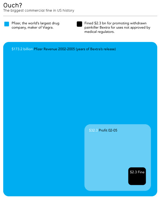
If you want to emphasize a particular value that is an outlier or that is much larger or smaller than other values, you can use an area-based chart, such as a bubble chart or a treemap. These types of charts use area to visualize the value, as opposed to height or length, as in the case of a bar or column chart. Using areas to visualize numbers brings out the contrast when there is a dominant category or value. This works only if there is an outlier whose value is a lot larger than the others.
Line Charts
The most common chart for displaying time series data is the line chart. If you have many data points, the line chart is the most effective one for depicting trends over time.

Timelines
Timeline charts are a great way to show a trend when you don’t have access to specific datasets, but you have access to dates and times. You can highlight an event or a situation’s progression with a timeline in order to provide a better understanding of how a specific topic has changed throughout history.
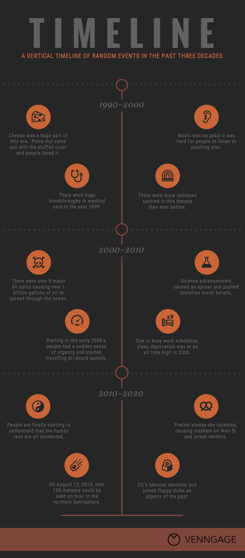
Image Source
Pie Charts
Despite its detractors, the pie chart or its cousin, the donut chart, is one of the most recognizable charts today and can be easily interpreted by most people. It’s an excellent choice if you are trying to portray percentage or composition.

Scatterplots
Scatterplots are most commonly used for depicting distribution. If you have access to a lot of raw data, such as the exact time of all support calls or the number of products a person buys during the year or the NPS score from hundreds of clients, then using a scatterplot to mark each data point is probably your best approach.

At first, choosing the appropriate means of visualizing your data can be overwhelming because it’s not always easy to understand how to input certain data. Read this article for more detailed information on how to choose the right charts for your infographic.
Design Your Infographic
For many content marketers who are weary of taking on the task of creating an infographic, their greatest fear is the design process. Many people worry that simply because they do not have a background in graphic design, they will be unable to produce a visually appealing infographic, but using the right infographic tool can make it very easy. In fact, designing the infographic is probably the easiest part since it’s just a matter of picking through your narrative and data points and placing those elements on your infographic.
Keep It Simple And Informative
At Venngage, the research we conducted on share-worthy infographics showed that people prefer very simple concepts. This comes back to the point about overly complex data visualizations not being an entirely effective means of translating information. The goal is to make your content as easy to digest as possible, but this doesn’t mean making it completely void of all intelligent matter. All this suggests is to keep your ideas and visualizations concise and to the point. Use a minimalist style and approach when compiling your research.
Many popular infographics follow a sectional or block format that separates different ideas, thus making the layout easy to follow. Neil Patel is notorious for using this style of infographic in his blog posts.
Determine The Right Style
When creating an infographic, there are many styles you can choose from. These include text-based infographics, image-based, illustration-based, chart-based, or image and text combinations.
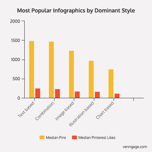
Our research showed that most people prefer either text-based infographics or a combination of text- and image-based infographics. If you’re considering transforming an existing blog post into an infographic, following the text-based style, or image/text combo style is a good route to take. If, however, you are attempting to relate important statistics to a crowd, you will obviously need to include charts in your infographic, but consider how you might be able to used image-based charts like pictograms and icon charts to visualize your data.
Be Mindful Of Fonts
The type of font you use in your infographic can determine if people decide to share it. People tend to believe serif fonts over sans serif fonts, so if the goal of your infographic is to prove a point, it’s wise to keep this information in mind. It’s also important to avoid using too many different fonts and styles.
The rule of thumb is no more than two different font styles (three at most but only if used for added emphasis). That being said, limit the variation in font sizes to three different sizes throughout your infographic. Remember, people like simplicity; and if you get too carried away with font styles, you risk confusing and frustrating your reader.

Finally, make sure your font isn’t too small. Stick to a minimum size 14 to 18 font, depending on the style. Titles and sub-headers should be considerably larger than descriptive text as well.
Pick Your Colors
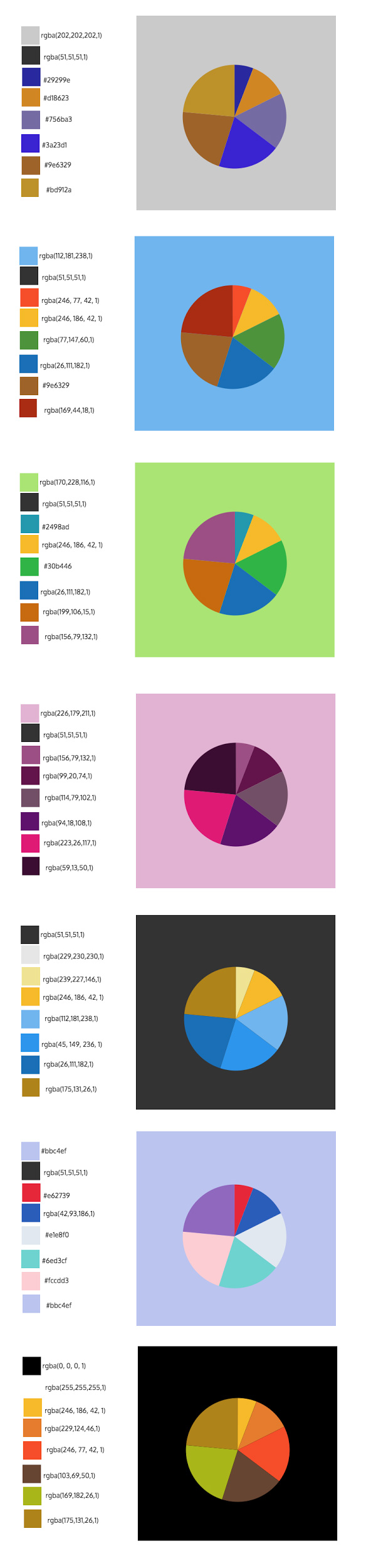
Based on the research done, we discovered that people prefer combinations of yellow and red in an infographic. In your design, using either of those as the dominant color could potentially decide whether or not people share your infographic. That being said, don’t go overboard with your color selection.
Stick to a consistent color scheme, and avoid using dark colors over other dark colors, or light on light. This makes images and text very difficult to see. Contrasting colors allow your icons and text to truly pop. You can reference this color scheme chart to help you when starting out. All the color codes are also there to guide you.
Follow The 5:9 Rule
The 5:9 rule refers to the width and length of your infographic design. Typically, people prefer infographics that are nine times longer than they are wide.

It seems like a rather strange rule, but the results speak for themselves. That being said, if you surpass that length, intrigue in your infographic may decrease substantially.
Create Your Infographic
Making an infographic can be overwhelming if it’s your first time. But, if you take your time and review your story, data, and design, there is no doubt that you can make a truly compelling infographic that will receive an abundance of attention. Remember, the point of an information graphic is to make the complex and detailed appear simpler. The better you are at translating complicated information into an easy-to-digest infographic, the more likely people will fawn over it and link back to it.
About the Author: Nadya Khoja is a Visual Content and Digital Marketing Specialist. She is part of the team at Venngage, an online infographic maker. Nadya has a B.A. with Specialized Honours in Devised Theatre and a Master’s Degree in Digital Media with a focus on Audience Engagement and Immersive Experiences. When she has time, Nadya directs, produces and sound designs for experimental and interactive performances.


