If you have ever had to hand-code an email, then you know how insanely difficult it can be to get your email looking just right.
I would say it’s more tedious and tricky than regular web development.
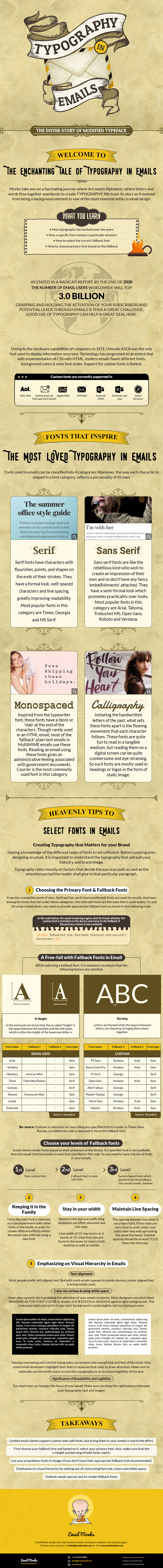
This infographic does a good job of showing you how to get your typography licked for your email campaigns. If you are serious about keeping your brand styling consistent across all marketing channels, then this is one area not to overlook.
Take a look at the infographic below to learn all the tiny details of lassoing your typography for your future email campaigns. I recommend bookmarking this ;).