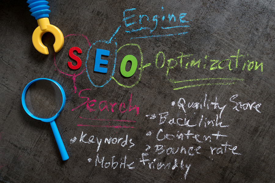
We all agree that conversion optimization is important. But knowing it’s important doesn’t always translate into results.
I think I understand why.
Recently I discovered a fantastic CRO training program that doesn’t just tell you what to do, but how to do it. Step by step. One piece of the puzzle at a time. So it’s downright easy.
While I enjoyed all the material covered, there was one section that jumped out at me—the section covering specific recommendations for optimizing the Web pages most likely to drive profits.
It occurred to me that most articles give general tips for optimizing your pages. They don’t call out the unique needs of the top pages for engaging and selling. As a result, our own CRO efforts can fall short of expectations.
So today, we’re going to remedy this.
To give credit where credit is due, I’ve pulled this information (with permission) from the training program. It’s called Boost Website Sales Fast with Conversion Rate Optimization, and it comes from conversion optimization specialist, Rich Page.
Keep in mind, this is just one small piece of this incredible resource. To master CRO and start increasing your profits, check out the entire program here. (Rich is offering a 35% discount to all Crazy Egg readers—but it expires November 30, so don’t wait.)
Okay, let’s dig in and learn Rich’s pro tips for improving three key Web pages: your home page, your product page, and your checkout flow.
Before we begin
True conversion optimization is about incremental improvements to specific pages. So you have to have two things in place before you begin:
- You need to have Google Analytics set up on your website.
- You need to be able to run A/B tests on your pages.
You also need to measure and write down key metrics that will tell you whether the changes you make on your pages help or hurt your conversion rate. In most cases, that will be:
- Bounce rate. This tells you how engaged visitors are on the page. Ideally, you want 40% or lower. 50–60% is average.
- Top next page. Where to people go after leaving the page? This will give you an idea of the traffic flow on your site.
- Click map. What are people clicking on when they’re on the page? For this, there’s no better tool than Crazy Egg. (If you haven’t tried it out, be sure to take advantage of our free trial.)
For your checkout flow, you also need to know:
- Cart abandonment rate. Ideally, it should be at or below 50%.
- Goal funnel report. Figure out where people most often abandon your cart and prioritize that page in your optimization efforts.
What you need to do: For each of the pages you optimize, record its performance before you begin testing. Then start testing different options on the page to see if you can improve performance over time. It’s that simple.
Home Page
Your home page is the page that typically gets the most traffic, and it’s the place new prospects often visit first. It’s here that you need a powerful value statement that tells people what you can do for them and what to do next.
Best Practice
- Unique value proposition above the fold
- Strong, engaging headline and images
- All clutter removed
- 1–2 CTA buttons (one above the fold) showing the next step for visitors to take
Example
Some home pages are essentially sales pages, with a lengthy sales presentation. My favorite format is a modular layout, with each “section” presenting one piece of the message.
For example, one section may call out a special benefit or feature. Another may offer social proof. By breaking up your message, adding icons and images for interest, with lots of white space between, you make it easy for visitors to find the information they need.
Here’s an example from RocketLawyer.

Notice how this page really explains the value people will get when they work with RocketLawyer. It also offers multiple ways to get into the site and multiple ways to respond right away.
Product Page
Product pages are your sales pages. They may be long-form sales pages or service pages, but here, we’re focusing on ecommerce product pages.
Your challenge in optimizing product pages is providing the product information, trust elements, and the response buttons without creating clutter. On this page, a lot of information needs to go above the fold, so you need to test different layouts to see what works best.
Best Practice
- Product overview above the fold (this may be a bulleted list of benefits)
- Price is optimized to be compelling
- Multiple, zoomable images or videos of the product
- Ratings and reviews
- Risk reducers, such as shipping information, guarantee, trust seals, etc.
Example
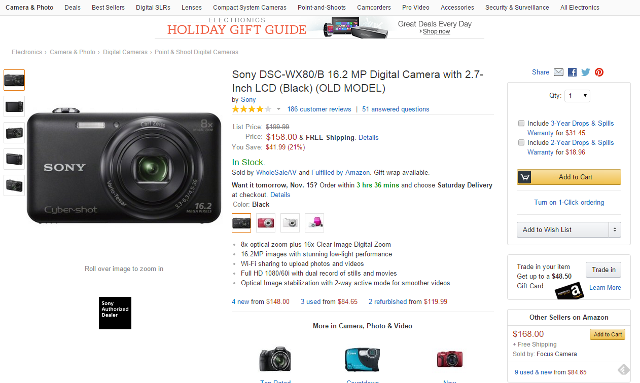
When designing your product page, always remember that online buyers can’t touch and feel your product. That’s why it’s important to include multiple images of your product.
This page does this particularly well. You get five images of this camera in black, three each in red and white, and two of the case and packaging. In addition, a pop-up enlarges images for closer inspection.
Other elements worth imitating…
The headline is a clear (but detailed) product name. There’s no question about what’s being sold here.
Customer ratings are just below that, with a link to below-the-fold reviews.
Included with the price are details about shipping. In this case, FREE shipping, which is always appealing. Note that the price is framed as a savings, and it specifies the dollar amount and the percentage of your savings.
The description is given in bullets, so you can see at a glance what you’re getting.
Below the fold, you can also see technical and product details, a lengthy description with a features list, Q&A, and customer reviews.
All these elements answer buyer questions and reduce concerns that they’ll make a bad buyer decision. Include as many as you can on your own product pages.
Checkout Flow
Best Practice
- Distractions and clutter removed
- Emphasis on benefits of the product
- Risk reducers are easy to see
- Security/trust seals
- Error checking and help tips to ensure customers include all required information
- Streamline forms to simplify checkout
Example
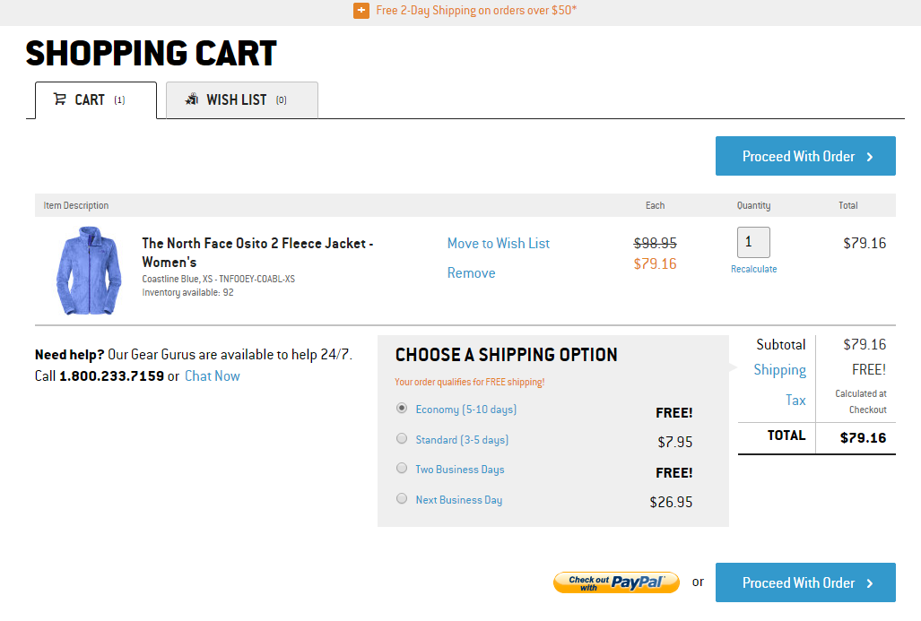
The shopping cart flow should be intuitive and easy. As an example, let’s look at BackCountry.com, who has a one-page checkout flow:
Product Page

If you try to check out without selecting your size, you’ll get an error message:

This is a great example of error checking that helps users get through your checkout flow quickly and easily.
Shopping Cart
This is a clean page that’s easy to understand. It’s hard to imagine a user having troubles here, but just in case, there’s a phone number and a link to open a chat box.
Checkout Page

The form is streamlined and the page is easy on the eye. The product you’re buying is showcased to the right, so there’s no question about what you’re getting. Plus, the Norton security seal helps reduce last-minute jitters.
Notice that throughout the flow, efforts are made to reduce shopping cart abandonment:
- Coupon code for a discount
- Phone number and chat are available throughout the flow
- Multiple shipping options
- Multiple payment options, including PayPal
Plus, you can complete your order without having to sign in. All these things are geared to build trust and reduce objections, which keep buyers engaged until the purchase is complete.
Another example (not in the program)
Interestingly, after watching this part of the program, I completed an online purchase at TeaBox and observed many of the same elements in their checkout flow.
In particular, I liked their status bar at the top of the page, so I knew exactly where I was in the process. The form was short and simple, and at the top of the page were stress-reducing reminders: direct from source, easy cancellation, secure payments, and worldwide shipping.

So as you can see, there are lots of options for creating a checkout flow that works for your customers. The key is to pay attention to how many customers drop out of the flow before completing their purchase—and on what page. Your goal is to optimize that page so you get the highest conversion rate possible.
Bottom Line
Ultimately, you need to optimize all your pages, but you can get a lot of mileage out of your home page, product pages and your checkout flow. If you’re new to CRO, that’s a good place to start.
No matter which pages you’re optimizing, remember that conversion optimization is about optimizing your pages to sell.
By learning the process pro CROs use to do their job, you can apply these same tactics to your website, providing an overall better experience for your visitors and converting more of them to loyal customers.
If that’s what you want, you can’t go wrong with Boost Website Sales Fast with Conversion Rate Optimization. Enjoy your special 35% discount as a Crazy Egg reader. (Hurry! This offer expires November 30, 2014.)
Read other Crazy Egg articles by Kathryn Aragon.