In the relatively old days, there was just one simple question: is the page converting or not?
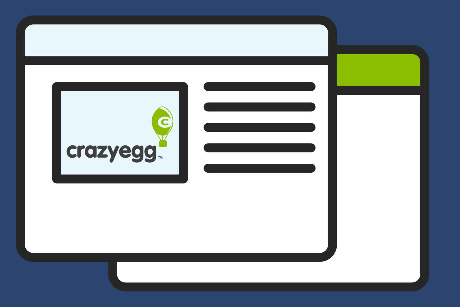
Today, thanks to measures like CrazyEgg, we can go a level deeper and evaluate the page in terms of every one of its elements: Which components convert and which don’t? Where should the copy be placed and why? What are the hotspots on the page- and what are dead weights?
Understandably, this meticulous scrutiny creates new challenges for designers. When every pixel and line of code is evaluated for its contribution to the overall conversion, there needs to be an intense effort towards design planning to make sure the desired results are achieved.
With such a strong- and necessary- emphasis on user interaction, the standards for usability, utility and aesthetics have never been higher.
Here are some fundamental do’s and don’ts of effective web design that can take you a long way in designing pages that are optimized, convertible and actionable.
1 – Don’t make the users think, wait or read
Here’s the cold, hard truth: Most internet surfers have the attention span of a two year old kid.
There is such a plethora of information and choices on the Internet that you have a VERY short window to gain a user’s interest before your page is forgone for the next most interesting link.
The best way to solve this problem is to make everything easier for the user. Introduce yourself in just in a line or two that doesn’t require a lot of reading or thought, and then allow the user to get started right away.
In the screenshots below, Ning does a great job of quickly identifying its offering, ‘Create Your Own Social Network for Anything’, and then dives directly into the two text fields and the ‘create’ button that will get users immediately involved.
Similarly, the folks at Fizzy Software make sure that the ‘contact us’ and ‘join us’ buttons are right below their single-sentence description of what they do.


2 – Direct the focus and flow
Users don’t scan web pages in a linear manner and they don’t take the time to carefully read and view everything that’s on a page. That’s why it’s up to you to capture their attention in the short time span allotted to you and direct it to what’s most important or attractive about your offering.
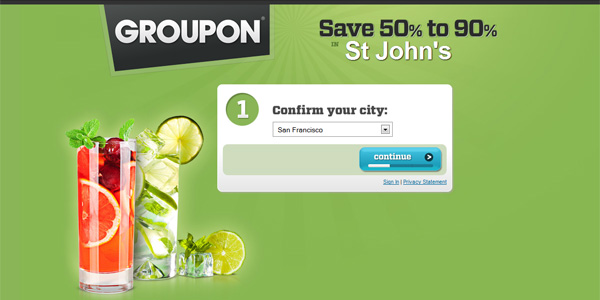
In fact, the classic 1-2-3-steps method used for feature exposure or process description works great for extending the user’s attention across the page and making it flow right down to the call-to-action button.
Groupon keeps its background and graphics eye catching but simple, and makes sure that the entire page brings the central rectangle in focus. And because it’s branded as ‘1’, users immediately know that they are on their way to saving 50% to 90% in St John’s!
3 – Do it Simply, Clearly, Distinctly and Visibly
When a website can boast the four adjectives in the heading above, it’s a job well done. After all, there’s very little to be gained from making the web design hard to navigate or confusing in intent.
In the Hazeltree page below, the organization and navigation is simple and clear, the color palette adds distinctiveness and every component and offering is visible without being overpowering.

4 – Make Use of High Quality Content
Content is king. If what you’re offering is actually beneficial to your users and you manage to relate that well, the content should take center stage. The designer’s job in this case is to make sure that the design aids and complements the content and does not overpower it.
Your visitors will appreciate high quality, credible content and it will keep them coming back for more even if the design is less than stellar and there are a ton of ads. After all, bells and whistles add a lot of style- but they’re never a substitute for substance.
Web MD is a great example of a website that manages to get away with multiple ads set inside a simple design just because of the strength of its content.

5 – Don’t Overlook the Power of Conventions
Designers strongly believe in the importance of creativity and uniqueness and, while they are undeniably worthwhile pursuits, they don’t always replace the strength of convention.
That’s because the more unique your web design is in organization and layout, the more of a learning curve it poses for visitors.
As we discussed above, users don’t want to be forced into using their thinking or problem solving skills when viewing a web page.
Conventional web pages have given them good practice with how to work their way around the elements on a web page and where to look for specific information, they are able to apply the same process to your page if you adhere to those conventions. That way there’s no time lost in users trying to figure out what your web page is about and where do they have to click to get more information.
In the screenshots below, you can see Club Divot and WordPress using tried and tested web design structures effectively.


6 – Use Typography Wisely
Typography is one of the most powerful tools in a designer’s arsenal. It could make or break your design and lead it to success or failure.
While picking the right typeface is a choice that deserves extensive thought, the rule of thumb is to avoid using more than two or three typefaces in your design. Too many variations in font types or colors can be distracting, confusing and borderline annoying.
If you’re not sure about your typographic prowess, just stick to a single web-friendly typeface that comes in different weights. That way you could have necessary variation for heading and body text while still retaining a consistent look.
Sometimes a number of different typefaces can be creatively used together in a very compelling and effective manner. In the screenshots below, you will be able to see a variety of serif and sans serif fonts used together to a unique and pleasing effect. However, as with all such experiments, make sure you know what you’re doing!


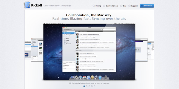
7 – Let the White Space In
An overdose of lurid colors, ugly graphics and bad typography all contribute to a clutter than can never make a good impression. However, the solution to this mess is brilliant in its simplicity: white space.
Web 2.0 has a strong focus on ‘clean’ and ‘minimalistic’ design and for good reason. Users want to have plenty of room to breathe and fully respond to a ‘less is more’ strategy. They don’t want to be overwhelmed with information, graphics, pops-up and an array of disoriented visuals. What they want is a simple, clear and well-designed page that gives them exact and important information and lets them know what they can do to learn more. Anything other than that is best replaced with a nice chunk of white pixels.
Kickoff and SEOBook use lots of white space to good effect.

8 – Try It, Test It, Take It Out for a Ride
When designing a page, we get so familiar with it that we are no longer the best judges of its effectiveness. You can never know if your web page does what it’s supposed to do unless you take it out for a test drive. Even if you can get one user to view and navigate your web site (and share their thoughts with you), it will provide you with several helpful insights that you wouldn’t have had otherwise.
Effective web design requires a designer to think as an artist, a businessman and an end user at the same time. The result is a website that is good looking, highly converting and user-friendly.