Is your blog sidebar a side-thought?
When was the last time you looked at your sidebar when trying to optimize your blog?
The closest most marketers get is slapping an opt-in box at the top and calling it a day.
Does this make you lazy? No, not at all. If you’re reading this article, you’re likely the type of marketer who is always striving to be better.
But the sidebar is rarely discussed, because every guru or expert recommends the same thing. It’s thought of as a “solved” element of conversion and user interaction.
As has been shown throughout marketing history, very few things can ever be solved for long.
[Tweet “Will Ditching Your Sidebar Increase Your Profits?”]
Why Your Sidebar Doesn’t Convert
Check your analytics if you can to see how many people actually click something in your sidebar.
Your regular readers barely ever click it, while new readers might be curious the first few visits to the site.
Bryan Harris from Video Fruit has a blog known for epic internet marketing content. He saw that his readers clicked his sidebar a whopping 0.3% of the time (yes that’s 3 in 1,000 page views).
Brian Dean, a leading SEO blogger, used Crazy Egg to determine that only 1.9% of visitors click his most important sidebar element, which is unusually high:

Even if you have the most amazing offer on the other side of that sidebar link and you convert 50-100% of the clicks, that’s still an abysmal conversion rate.
Banner Blindness? Sure. But Sidebar Blindness?
Think about the blogs you visit on a regular basis. Do you commonly click on links the sidebar?
No? Why not?
Because it’s the same damn thing every single time.
At best, it’s a distraction. It takes away attention from your blog post, even if your visitor has no intention of ever clicking on the sidebar.
Google already penalizes duplicate content across a site because visitors don’t want to see the same thing over and over (although they’re more lenient for sidebars).
What is the Goal of Your Blog Posts?
The golden rule of conversion: one page, one goal.
Most blog posts are designed to capture the email address of the reader.
A busy sidebar takes away attention from the most important part of your post: the intro. It’s like trying to focus on listening to your music when there is noise in the background.
When someone lands on your post, they have a decision: should I keep reading or stop?
This infographic from Slate illustrates that decision with a large spike of readers leaving an article right away.
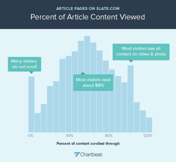
With about a million other blog posts being published every minute, there is an essentially infinite supply of competing posts.
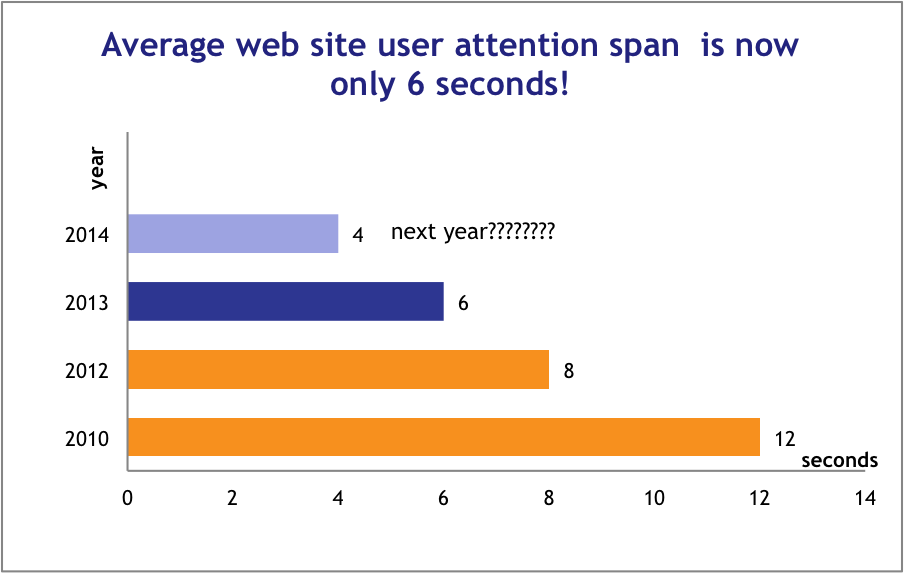
This is why the average time a user spends on a page is decreasing every year.
You have a finite amount of time to capture a reader’s attention, and you’re just going to throw away half of it with a clunky sidebar? No, you’re not, you’re a conversion rate optimizer. You’re going to test, and find a better alternative.
Does Your Sidebar Have Any Value?
Derek Halpern says every blog sidebar needs 3 things:
- an opt-in form (at the top of the sidebar)
- links to resource pages (preferably right under the opt-in form)
- links to popular articles
The opt-in form collects emails, and resource pages and popular articles are useful for new visitors.
This makes sense for new readers, but what value does this add to longtime readers?
Occasionally they might look for your top posts, but couldn’t you have a single link for that in the top menu?
There are very few items in a typical sidebar that could be considered essential, which is typically a red flag that space is being wasted.
Sidebars Are Useless For Mobile
Everyone knows that mobile usage has been consistently increasing for years, and that trend isn’t changing anytime soon.
Assuming you have a responsive website (which you should), have you ever checked what happens to your sidebar on a mobile device?
Most slide down to the very bottom of the page.
After the post.
After the related or recommended posts.
After the email signup form.
After the comments.
Only the most hardcore fans will ever scroll down that far and click on something or fill out an opt-in, but they’ve already done that further up the page.
Conclusion: Most sidebars only detract from your blog on mobile.
A Bold Hypothesis: Increase Your Signups by X% to Y% By REMOVING Your Sidebar
I think it’s clear by now that on most sites, a blog sidebar might not be the most useful part of your pages.
But every blog needs a sidebar…right?
Maybe not.
Luckily, there have been a few that were not only bold enough to test removing the sidebar completely, but to also publish the results.
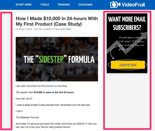
Case Study 1: Video Fruit
Bryan Harris already had a simplified sidebar on the Video Fruit blog. It looked like this:
He decided to split test the original (with a sidebar), with a version that involved removing the sidebar altogether:

The results? He was able to improve his email signup rate from about 11% to just under 14% by removing the sidebar altogether — an increase of 26%.
Most would be happy to achieve either one of those email opt-in rates. A major part of Bryan’s strategy is the content upgrade. Devesh showed how he increased his email subscribers by 492% with content upgrades a little while ago. Best of all, since these opt-ins are in the content, they convert well with mobile visitors as well.
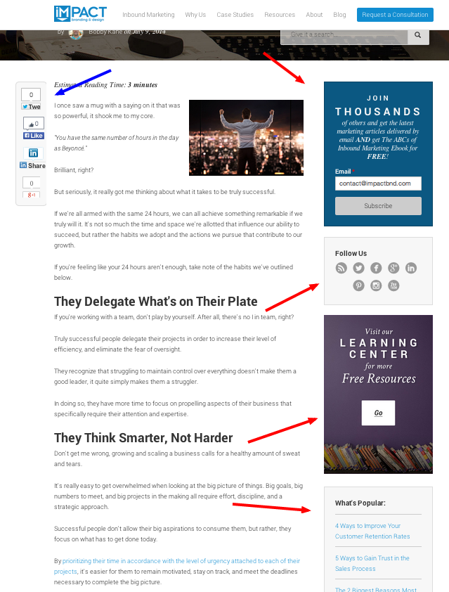
Case Study 2: Impact Branding & Design
The team over at Impact Branding & Design also tested removing their sidebar, and ended up loving the results.
Unlike Bryan, the Impact BnD team originally had a really busy sidebar, like many blogging gurus recommend:
They tested removing the sidebar completely, and instead put a call-to-action lead generation form at the bottom of the post.

The results? A 71% increase in leads.
These are not small improvements we are talking about. A small change like removing the sidebar may make a significant improvement to your bottom line.
Next Steps: Test Your Sidebar
Start by analyzing the typical user interaction with your sidebar. Make a note of any links or parts that users most frequently find useful.
Create and complete a split test comparing your standard layout to one with no sidebar. Make sure to come back and leave a comment about how it went.
After that, you have your answer as to whether or not a sidebar works for you.
But wait, you’re not done. Remember those sidebar elements that your users found most helpful? Find a way to preserve the elements that readers use most, either by including them in the header, the content, or slightly before or after the content. Test that again and you could further improvements.
You have a chance to increase your email opt-in rates by 26-71% from a simple test. What are you waiting for?
Read other Crazy Egg posts by Dale Cudmore.