A significant amount of testing, articles and research has been poured into the subject of the optimal ecommerce checkout flow in the UX and CRO community.
Extensive tests have gone on to prove that both one-page and multi-step checkout pages work in different circumstances. Guest checkouts are generally expected to be the norm to help ‘reduce friction’ for first time shoppers. Additionally:
- A security badge at checkout can help reduce shopper anxiety at first contact with an online store.
- The voucher/coupon code entries should be displayed as expandable links or buttons rather than text boxes (to keep shoppers from wandering to coupon sites).
- The general rule of thumb is to keep fields to an absolute minimum at checkout.
Although this is all great advice, the problem with the above is that they are all the best checkout practices for desktops. There is currently quite limited coverage on the optimal mobile checkout. With mobile devices now accounting for over 50 percent of ecommerce traffic, this post will break down the mobile checkout flow of some of the most mobile savvy ecommerce brands.
Note: The great tips presented in this post are simply best practices. There is no guarantee they will improve your mobile commerce conversion rates. Use them to form hypotheses and then commence testing!
1. Designing For Touch (the thumb) And Not The Mouse
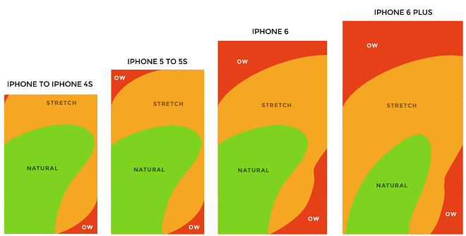
According to research undertaken by UX Matters, when users interact and touch their screens, they hold their phones in three basic ways:
- One handed – 49%
- Cradled – 39%
- Two-handed – 15%

Figure 1: How people hold and interact with mobile phones [credits: UX Matters, February 2013]
In all occurrences, the thumb plays a very active role in the screen touch interaction experience. Here is what the ‘Thumb Zone’ heat map as coined by Scott Hurf looks like:
Here is another illustration that shows easy, ok and hard to reach areas of a large phone screen for a thumb.
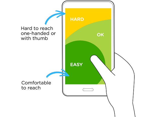
In the context of an ecommerce checkout, it will be prudent to place the most important elements in the easy and ok areas of the screen so that they are within reach of the thumb.
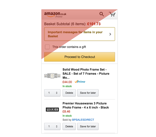
Here is what Amazon’s shopping basket page looks like; notice that the logo, subtotal and message box are in the ‘hard’ to reach area and that the ‘proceed to checkout’ button, and individual products are all within reach of a one-handed thumb.
Another point worth noting is that the use of scrollability brings difficult to reach areas to the ‘easy’ and ‘ok’ area.
2. Avoid Long One-Page Mobile Checkout Pages – Break up Checkout Into Multiple Pages
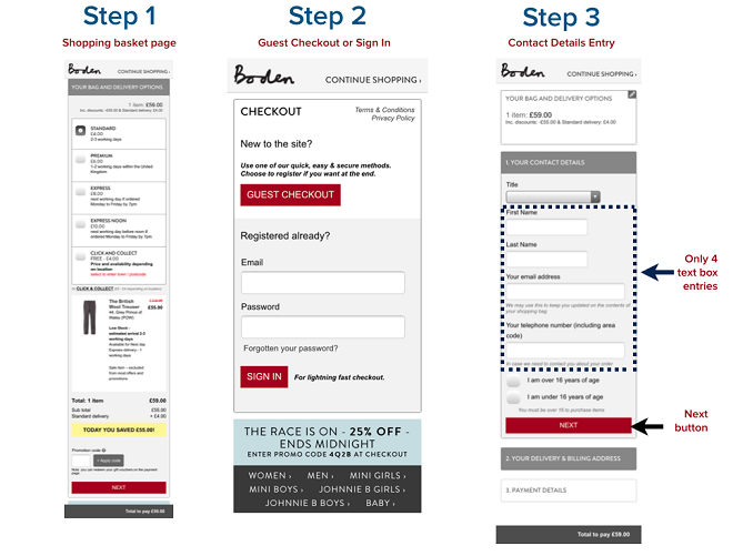
Typing and text input on mobile devices are a UX challenge; typing typically tends to be slower on mobile touch screens as compared to desktops where typing is carried out via keyboards.
Touch screens also necessitate the need for on-screen keyboards taking up half of the viewable screen area when in use. This is why you want to keep text input to the minimum for shoppers on your checkout page. Remember that prior to getting to the checkout page, shoppers would have only been browsing, selecting options and pressing buttons such as the ‘add to cart’ button. The checkout is probably the only page in the funnel that will require keyboard input entry.
Breaking up forms such as the checkout page into multiple pages that only takes up half of the screen, with a clear “next” button and progress indicator ensures that visitors are not intimidated to by the keyboard input entry requirements of an intimidatingly long form.
3. How To Break Down Your Checkout (progress indicators)

By placing the minimum number of required fields at each step of your checkout (ideally 3 steps), the best way to manage the expectations of shoppers is to display a progress indicator. A progress indicator reassures and provides a time estimate for the length of time their mobile checkout is going to take.
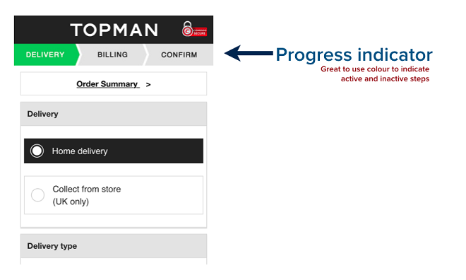
Also, use color in your progress indicator to indicate active and inactive steps. Just grey out the yet to be completed steps and color either active or completed steps.

As an alternative to progress indicators, consider using accordions to not only conserve space in your checkout page by collapsing each step but to also indicate progress at checkout to shoppers.
Accordions are an excellent tool in your mobile design arsenal, as they condense otherwise long forms and enable users to have a birds’ eye view of the entire form.
4. Speed and Smooth Transition Through Each Checkout Step
A fundamental principle of increasing and optimizing conversions at a mobile checkout is getting shoppers through your checkout as easily and quickly as possible. In order to make this happen, speed and shopper transition through each element at each of step should be optimal.
Check-Out Speed
From a speed standpoint, 85% of mobile users expect pages to load as fast or faster than they load on the desktop (which is about 2 seconds). This is, of course, factoring in latency issues on both 3G and 4G cellular internet access connections.
At a mobile checkout, it is even more essential to nail page load times to under 3 seconds or 57% of visitors will potentially abandon their carts.
In regards speeding up the mobile checkout:
- Ditch any graphic intense objects such as carousels,
- Remove social media scripts or any other third party scripts not necessarily needed on the checkout page,
- Compulsory graphics such as your logo or icons should be CDN (Content Delivery Network) hosted,
- Install Google page speed on your server to improve latency and
- Stress test your checkout page in a way that simulates high peak periods from mobile traffic
Shopper Transition
From a shopper transition standpoint, ensure your mobile checkout page includes the following:
TabIndex: Next/Previous
Place a HTML tabindex attribute to accurately specify the form fields’ order sequentially, from the top to bottom of your checkout page. This will enable shoppers to move swiftly between input fields.
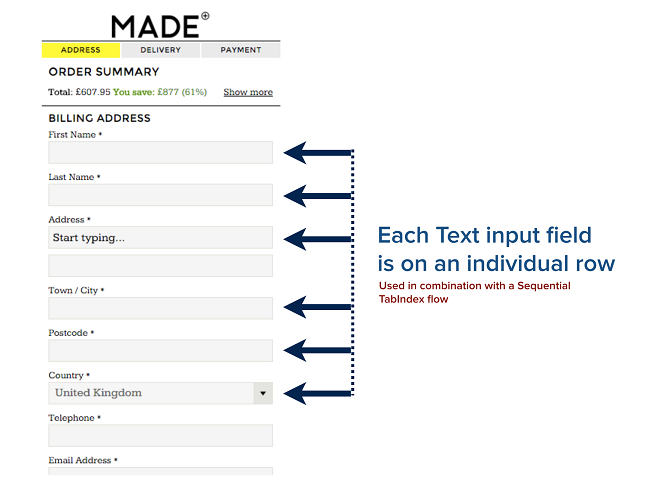
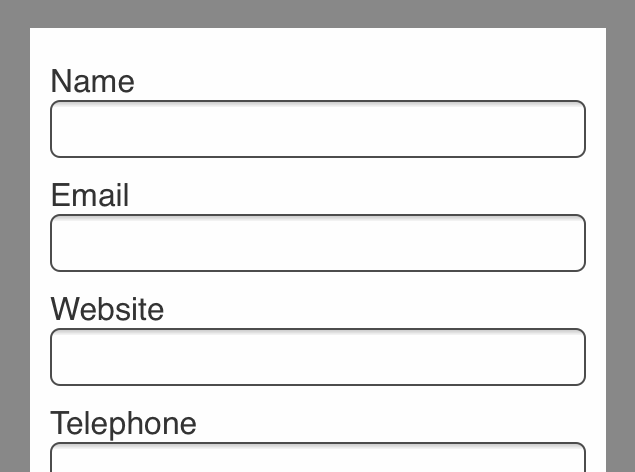
Take On A Stacked Design Approach: Place Each Text Input Field On An Individual Row
Vertically stack up each text input field on individual rows with labels above each input field. Avoid placing two or more fields in a single row. This ensures a smooth sequential transition through the checkout form.
Other Important Elements Of Shopper Transition
Other means of easing mobile checkout transition (which will be discussed in more detail below) include:
- Auto-detect / auto-fill support,
- Reducing input fields to the minimum required i.e. not asking shoppers registering new accounts to enter their email addresses and passwords twice for confirmation
- Revealing passwords in browsers to users at the point of entry or auto generate password and email passwords for new registrations
- Address finders,
- Bigger end-to-end buttons,
- Triggering numeric keyboards for phone number and credit card entries and
- Offering guest checkout
5. Buttons With Light Gradients – Not Links
Buttons are a hugely important Call to Action (CTA) at checkout.
As a rule of the thumb, ensure that there is only one colored button for the most important action on the specific page at checkout. A grey or lighter color can be used on other lower priority buttons such as the ‘back’ or ‘continue shopping’ buttons.
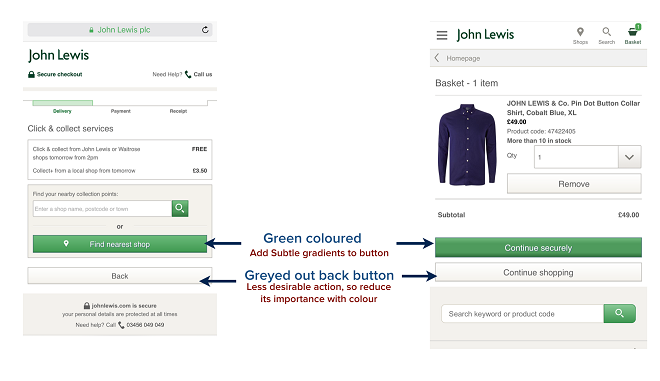

Adding some subtle gradient to CTA buttons makes them enticing to tap or press. Also applying a change in gradient color to a ‘Tap’ event on buttons makes the user experience a bit more realistic.
6. Wide End to End Buttons – Thumbs Aren’t As Precise As Mice
A fundamental mobile interface design principle is making your targets big and easy for users to tap with their fingers and thumbs (which runs contrary to desktop mouse ‘click’ conventions).

According to a study on the Mechanics of Tactile Sense by Human Fingerprints carried out by MIT Touch Lab, the average width of an adult thumb is 1 inch (2.5 cm); which converts to 72 pixels and that of the index finger is 1.6 to 2 cm (16 – 20 mm); which converts to 45 – 57 pixels.
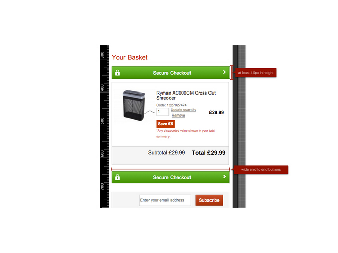
Given that the checkout, guest checkout or next buttons at checkout are the primary Call To Action (CTA) elements at specific steps in the checkout process, ensure that these buttons are full width (covering and entire row) and at least 44 pixels.


7. Text Fields And Labels: The Bigger Is Better
Prevent input Zoom by ensuring text entered by users in input fields is readable (set font size to 16px).
8. Click To Call
A significant number of online retailers have their phone numbers at the checkout pages in a bid to ease shopper anxiety, answer any last minute questions and to take orders from shoppers that do not want to necessarily checkout online.

Ensuring that your phone numbers are legibly displayed along with an iconized call-to-action will help divert mobile shoppers keen to speak to your customer services and sales team on your mobile checkout page(s).
9. Guest Checkout
A major shopper frustration at checkout is a mandatory registration to create an account before they can purchase. This is because forcing new shoppers to register an account before making their purchase can be a huge barrier to selling.
On mobile checkouts, here are a few guest checkout options worth testing:


Place your Guest Checkout button as the first option (before/or above the sign in button for existing customers).

Try reducing input fields on guest checkout forms to the absolute minimum required. Avoid asking guests to confirm their email addresses by entering it twice. Also, use features such as an address finder to cut down input entry for addresses.

10. Session Aware – Persistent Checkouts
Online shoppers are device agnostic – they could browse on their desktops at work and finally commit to purchasing on either their mobiles or tablets on their commute back home or at home. It will, in essence, take most shoppers two or more visits from different devices before finalizing a purchase. Persistent checkouts address this problem especially for existing customers.
Magento offers a persistent cart option that if used in combination with well timed triggered messaging can significantly reduce cart abandonment.
Also making guests’ mobile shopping carts persist for 30 days or more might be a good idea to help shoppers return to their purchase.
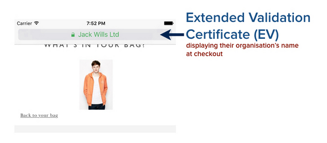
11. Extended Validation SSL Certificates – Green Bar Assurance
Basic SSL is not as convincing enough as Extended Validation Certificate (EV) in driving a sense of security to shoppers. This is because Extended Validation Certificate (EV) not only requires a more extensive entity identity verification, but also displays the green assurance bar with your organization’s name (rather than just your URL).
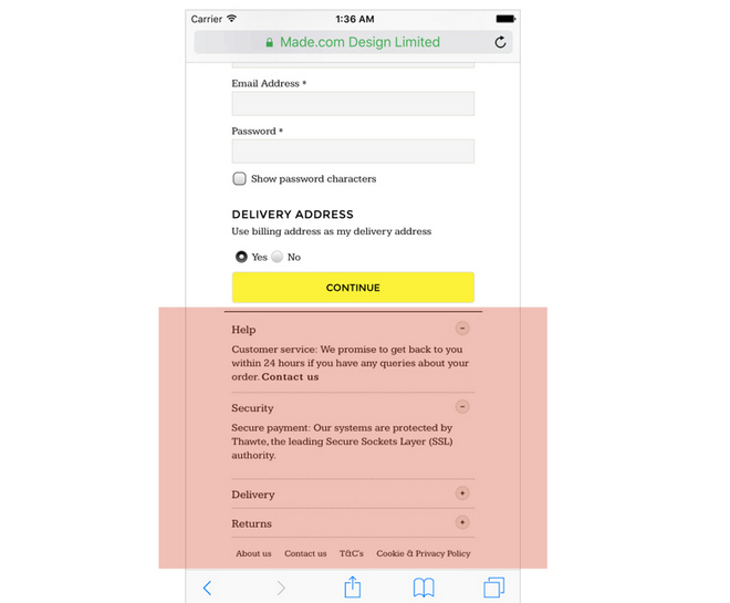
12. Use Expandable Menus For Shipping And FAQs – Not Links (keep shoppers in checkout, not out)
Minimizing the use of links at checkout can potentially help reduce distractions. Important pieces of information such as shipping, FAQs and your return policy can be placed in expandable accordion dropdowns.

Accordions condense such information on your checkout page, thereby eliminating the need to link to dedicated information pages.
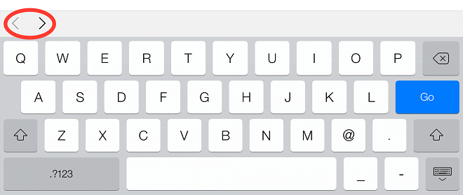
13. Triggering Numeric Keyboards (HTML5) For Credit Card And Phone Number Entries
It is quite important to ensure that the right keyboard is triggered to match the input type required. Input type should not always be set as “text” because fields at checkout vary from numeric to email, to dates and phone numbers.
As typing on mobiles can be challenging, triggering the right keyboard will help ease shoppers’ transition through checkout.
Text Input and Email Address Fields

While text input keyboards should be used for fields such as first name, last name and address, email addresses should use the email input keyboard in order to display the ‘@’ and ‘.’ characters.
Phone Numbers Number Fields
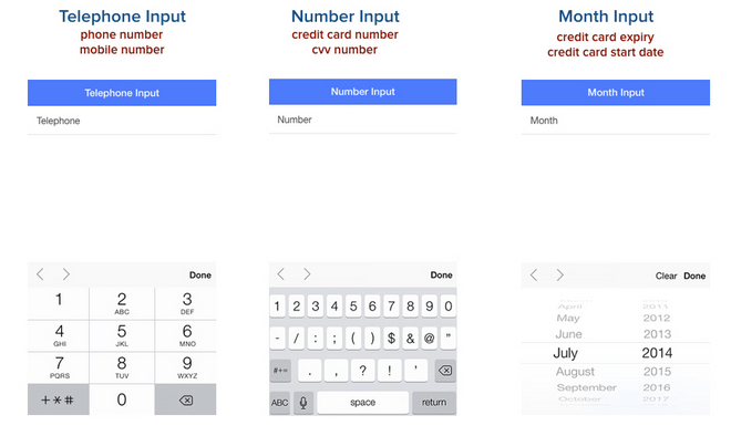
Setting the input time to “number” when shoppers are entering their credit card, CVV numbers or address numbers will ensure that they save time without having to switch from the default text keyboard to the numeric one.
Also setting the input type to “tel” gives shoppers the telephone keypad that mimics the user interface shoppers are familiar with when making phone calls.
The month input field helps when entering expiry and start dates.
14. Auto-Detect And Auto-Complete

Autofill or the auto completion of contact information on forms such as first name, last name, address, phone numbers and credit card is supported by the two major mobile web browsers: Safari Mobile and Chrome.

Chrome uses the “autocomplete” HTML attribute on form fields that labels input element fields with common data types such as ‘name’ or ‘phone number’.
Here is what marking up an email address field on a form to allow auto-completion looks like:
<input type=”email” name=”customerEmail” autocomplete=”email”/>
It is important to note that Safari mobile will not autocomplete by default unless Autofill is enabled in the user’s iPhone Safari settings.

15. Address Finders
Adding an address finder on a mobile checkout page cuts down a significant amount of time required to enter a full address that could potentially span over 3 or 4 input fields. It is also less error prone.

Made.com execute their address finder on their mobile guest checkout page quite neatly: the ‘Start typing…’ caption in the address input field nudges shoppers to enter their address from a single input field or as postcode entry – Capture+ autocompletes the rest of their address.
16. Offering Single Click Express Checkout Payment Options
A segment of shoppers are hesitant to provide their credit card details to ecommerce stores on their first purchase. They would rather use the ‘buyer protection’ security provided by a PayPal checkout than entering their payment details directly.
Others just use the convenience of entering their PayPal username and password to short circuit the checkout process.
ThinkGeek offer both PayPal and Bill Me Later express checkout buttons on their shopping cart page.

Offering other express checkout payment options such as Google Wallet and Amazon Pay will essentially cut down the time required to enter payment details.

The Holy Grail Of Checkout Is Speed And Ease
I will summarize by saying that all the tests and improvements that drive the implementation of your mobile checkout should hinge on two principles:
- How quickly can we move shoppers through our mobile checkout
- How easy can we make their experience
In regards the first option of speed: load times, input fields and auto completion each play a significant role.
The second option on ease of the mobile checkout experience: shoppers’ perception of the checkout process is key. So use guest checkouts, progress indicators and accordions all aim to communicate clarity on the length of time their mobile checkout will take. Giving shoppers a sense of security is also an important layer in easing their experience.
I’ll end by saying that every single point about the mobile checkout process in this article should be tested because design is usually driven by our biases. Testing offers an objective means of negating those biases and going with actual user shopper data.
Bonus
I’ll review three mobile checkouts to the first three e-tailers that ask in the comments area. Also, if you are interested in a checkout audit for the online store you manage, do get in touch.
About the Author: Kunle Campbell – With a 10 year background in SEO and ecommerce, Kunle is an Ecommerce growth consultant and advisor that coaches online retail teams on driving profitable revenue growth through customer acquisition, user experience, conversion optimization, optimizing their go-to market strategy, scaling word of mouth marketing, retention and advice on vendor/platform selection. He blogs on 2X eCommerce and hosts the 2X E-Commerce Podcast; a show dedicated to growing and scaling ecommerce businesses.


