Google’s mobile-first index has made it all the more important to have a mobile-responsive, mobile-friendly website.
There are things you can do now to make sure you are ranking well on the mobile-first index. We’re going to assume that you either have a dedicated mobile website or, better still, a responsive site. If not, you might want to get that sorted out before you continue with this article. Google even gives you a tool to see if you’re doing it well:
Test your site to see if it is mobile friendly.

Here are five great tactics you can implement now that will ensure you are not only mobile-first ready, but your site is set up to maximize conversions and steal a march on the competition.
Optimize your site for the mobile-first index
1. Speed up your site
There are a number of tactics to focus on in order to be ready for the mobile-first index. When it comes to conversions and overall user experience (UX), we recommend starting with your site speed, specifically focusing on mobile.
There are four ways we recommend speeding up your site on mobile:
AMP
The Accelerated Mobile Pages (AMP) Project is an open source initiative to improve the mobile ecosystem. Thanks to the pared-down HTML that is used by AMP, it allows you to load your web pages much faster than regular HTML. Google also caches your content within their own cache to speed up load time even more. All this results in a much faster, sleeker user experience and should, in turn, lead to improved visibility in the search results.
While some issues about the display URL have been widely reported (visitors see a cached Google URL when they load an AMP page), the traffic is still directed to your site. Google has since implemented an update where users sharing the URL will share the publisher’s own link rather than the cached Google URL.
Top tip: if you manage a WordPress site, there is a pretty awesome plugin that will convert your pages to AMP as well as Instant Articles for Facebook.
PWA
Progressive Web Apps (PWAs) are an alternative to moving to AMP. Their main selling points include:
- Reliable – loads instantly
- Fast – responds quickly to user interactions
- Engaging – feels like a natural app on a device with an immersive UX
You can find out more about PWAs on the Google Developers Website or watch this cool video.
PWAMP
A term first introduced by Google’s Gary Illyes at SMX Seattle, PWAMP is a combination of a PWA built on AMP HTML, JS, and CSS. While PWAMP sites may not validate as AMP pages, they are lightning fast and provide all the benefits of a PWA as listed above. They could be the future and one to keep an eye on. Read more about PWAMP here.
Do nothing
If your current mobile friendly, responsive website is performing well, delivering a great UX, and loading quickly, there may well be very little you can gain from moving to AMP or any alternative option. We would always recommend a full audit of your mobile site before deciding on any potential new path.
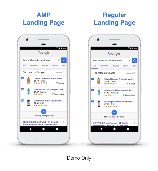
Image Source: Tulsa Marketing Online
2. Manage your content for mobile
If you are currently using a separate m. subdomain to manage your mobile experience, chances are you are serving different content on desktop and mobile (otherwise you could have just gone responsive in the first place). The move to the mobile-first index will have the biggest impact on you if that’s the case. Your current rankings are based on your desktop content. If some of that is missing on mobile, you may not rank as well in the future.
Even if you have a responsive mobile site, there are design tweaks you may want to consider in order to optimize your mobile experience for conversions. Here are some “must dos” when it comes to managing your content on mobile:
Use accordion and drop-down menus appropriately
Google has already said that sites will not be punished for “hiding” content behind an accordion or drop-down menu. They understand that real estate is limited on mobile so it makes sense not to show users everything all at once. They have also said that they will crawl all content that is contained within drop-downs, so use them wisely as part of your mobile design.

Source: Elegant Themes
Never use Flash
This should be a given but yet we still see sites that insist on using Flash. Apple killed Flash from mobile, and since a high percentage of mobile users can’t see Flash content, why continue to use it? Use HTML5 or Java to add those cool interactive elements that can be super-engaging.
Consider your use of pop-ups on mobile
There is definitely an argument for the use of pop-ups, especially if lead generation is important to you, however, consider how often they appear and their size and ease of closure. There is nothing more frustrating for a mobile user than when a pop-up blocks them from getting to their desired content. Check out this great Whiteboard Friday post that talks about the use of pop-ups, modals, and interstitials.
Consider the text size, tap target, and padding
Make sure your website is “finger friendly.” Another frustration for mobile users is clicking on something accidentally, so make sure you size your tap targets correctly and allow enough padding between those tap targets. Also, make sure your font is at least 16px as a base level for ease of reading. You can read more here about designing and developing for the mobile-first index.
3. Consider the checkout process on mobile
According to Think with Google, 85% of customers start a purchase on one device and finish it on another (or in-store). How can we move beyond that and create a better checkout process on a mobile device? Streamlining your checkout process, especially on mobile devices, is a great way to help both speed up that process and lower barriers to conversion.
Here are eight key tactics for streamlining your checkout process on mobile to increase conversions:
Speed up the process
This may seem obvious, but the recommended page speed changes above can massively help get people to complete their purchase/conversion.
Cut the amount of info required at checkout
While your marketing team may want to collect as much demographic data as possible, do you really need a customer’s date of birth? What about those three phone numbers (home, mobile, work, etc.)? Make your checkout form as streamlined as possible, which again will help to speed up the process.

Source: incomediary.com
Smooth the navigation
This comes back to the text size, tap targets, and padding recommendations above. Making the checkout process as smooth as possible means thinking about the elements people will click and need to read. Make sure this is super-smooth and watch those conversions increase.
Avoid pop-ups
You are just about to seal the deal. Do you really need to present the customer with a pop-up at this stage? Probably not. If it looks like they are going to abandon their cart, it may be worth considering a pop-up that will get them over the line, but other than that, stay clear and uncluttered at the checkout.
Give people the option to save details for next time
We know that people jump from device to device, but giving people an option to save their basket for later (without having to sign up) is a great way to get that basket checked out. Of course, this can be managed with cookies, which is another option, but making it clear to the customer that their basket will be available later is a good way to get them to come back.

Amazon’s Wish List is the perfect example. You can even make your wish list public, which can help with gift buying around Christmas and birthdays.
Send people to another device
While it may be great to see your mobile conversion rate soaring, we know people sometimes jump ship and finish their purchases on another device or in-store. Instead of fighting it, embrace it and give people the option to finish up the purchase on desktop – it may just be the nudge they need to seal the deal.
Target shoppers in-store
Many shoppers who visit a brick and mortar store to research a product will then use their mobile device (while in-store) to see if they can find a better deal elsewhere. Use push notifications to present shoppers with deals while they are in-store so that they can either buy and pick up then and there or take the deal to the counter. Either way, you get the conversion.
Use Apple Pay or Android Pay
As technology advances, those who embrace the latest developments will get ahead. Apple Pay and Android Pay are options that make it much easier for users to pay on mobile devices. Giving a customer that option could be the difference between them converting or abandoning the cart. If you haven’t already, make sure you investigate the opportunities around Apple Pay and Android Pay.

Source: Warby Parker
4. Don’t block CSS, JavaScript, or images
When mobile design first burst onto the scene, it was helpful to block certain resources including CSS, JavaScript, and images. Some of these elements could often lead to slow loading as well as display issues and it actually made more sense to hide them from GoogleBot on mobile.
Today, however, the landscape has changed. Smartphones are in many cases more powerful than the computers owned by users. They have faster processors, more memory, and more capacity to deal with anything we throw at them.
Google’s smartphone GoogleBot can also handle all of these elements. So if they can handle it, make sure you show them everything. That way, Google can categorize your content and rank it appropriately.
Make sure you’re not hiding anything.
5. Think mobile-first in order to act mobile-first
In order to optimize for the mobile-first index, companies will have to shift to mobile-first thinking in everything they do – design, development, UX – and then worry about desktop later.
Without the change in mindset, companies will still persist in designing and developing for desktop and then thinking about how that converts to mobile. Responsive web design and development is not enough. It is best-practice, but just because a site is responsive, does not mean it is optimized for mobile.
Start today. When you are considering your next development or design change, leave the desktop behind and base all your discussions around the mobile experience. In order to really embrace the mobile-first world that we are racing into, you have got to drive organizational change. It’s not easy, but it will be worth it.
Summary
By tackling the issues above (or making sure you’re already on top of them), you will be in a much stronger position on Google’s mobile-first index. We recommend speaking to your current SEO agency or development team before making any of these changes.
About the Author: Gavin Hirst is a Brit working abroad. He is a copywriter, SEO, and content marketing expert working for one of Auckland’s leading digital marketing agencies, Digital Hothouse in New Zealand. Outside of work, Gavin is a keen golfer and is passionate about the outdoors – hence the move to NZ! Connect with Digital Hothouse on Twitter and keep up to date with all the latest digital marketing news and trends in NZ and across the world.