Color is one of the most important design elements, if not the most important. Research from the Institute for Color Research reveals people make a subconscious judgment about an environment or product within 90 seconds of initial viewing, and between 62% and 90% of that assessment is based on color alone.
Whether intentional or not, colors give meaning to design. They spur emotions and express values.
There are a few things to keep in mind when developing a color strategy: psychology, culture, trends, and above all – context.
The Psychology of Color
Perceptions of color can be subjective, but some psychological effects of color are universal. Warm colors like red, orange and yellow evoke emotions ranging from feelings of warmth and comfort to feelings of anger and hostility.
Cool colors like blue, purple and green are often described as calm, but can also call to mind feelings of sadness or indifference.
Effective use of color can send a positive or negative message and even spur sales. Red is the only color that will cause a measurable physiological reaction in your body – increasing your heart rate and blood pressure.
Pink is actually thought to be the most calming of all colors. Interestingly, dangerous criminals are sometimes housed in pink cells as studies show certain hues of pink can calm aggression.

But psychological aspects of color are often generalized or oversimplified. Some will say green represents nature, red should represent love, and blue is calming. These generalizations don’t always hold true when given context. Green can mean sick, red can represent danger and blue might symbolize depression in some contexts.
The best way to make sure your color palette sends the right message is to recognize what feelings your colors might evoke and evaluate them in the context of your design and your target audience.
Color & Culture
There are many aspects of color from a cultural standpoint that should be considered. Colors representing national or political groups, colors associated with religions, colors of sports teams, schools or other prominent organizations, and holiday colors can all be considered cultural.
For example, I’ve been told that using yellow and red together looks too much like McDonald’s. An obvious color combo to avoid in many circumstances is red and green – even around the holidays many people sometimes want to avoid only representing Christmas – and that also has religious connotations.
It’s important to keep in mind the cultural context your color palette will be viewed in. For example, in Western, Japanese and Native American cultures, black can represent death; but in Hindu and Chinese cultures white often represents death.
Need help identifying the cultural associations of color? Check out this handy visual from David McCandless and AlwaysWithHonor.com.

A good rule to abide by in any circumstance: design with your audience in mind. If you’re designing for a global audience, keep in mind the context and avoid overt cultural color connotations.
Trends in Color
Pantone is widely recognized in the design world as the color authority. Pantone and other color trend trackers look to art, consumer products (cars, technology), interior design, celebrities, and fashion to determine color trends past and present.
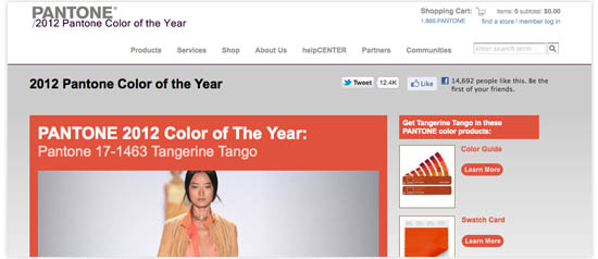
In 2012, Pantone named Tangerine Tango the color of the year, describing its choice as a spirited reddish orange which will provide the energy boost we need to recharge and move forward. This description speaks to a tumultuous economic time culturally, and the vibrancy we associate with orange psychologically.
Other vibrant colors like bright blues and greens and stark black and white will be popular in 2012 as well as ’70s appliance colors like Harvest Gold and Avocado Green.
Consumer trends like sustainability and simplicity will sometimes influence color trends as well. Products have literally been going green during the past few years to keep up with the trend of sustainability. Apple is ahead of the simplicity trend as most of their website designs and product packaging are white.
In most cases, your color palette will be largely based on the brand identity of the client your designing for. Use their existing color palette as a foundation and look to color trend resources like Pantone to build upon it and add a splash of color where appropriate.
Most importantly, when it comes to color, be intentional. Use colors that are appropriate for your audience, the message you’re trying to convey, and the overall feeling you want the user to experience.
Keep these few considerations in mind and rest assured your color palette will give meaning to your design.