It’s frustrating for users.
They try to access a website on a mobile device, and find nothing but trouble.
Smart phones and tablets aren’t going away and smart companies like Zappos are staying ahead of the curve.
Zappos has been a leading online retailer for years now, and their mobile website provides ten great insights into mobile design best practice.
Lesson 1: Clearly Provide a Search Feature
They want it. And they want it right now.
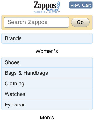
Notice how Zappos provides search capability, front and center. If you know the product you want, simply type it in and buy.
Lesson 2: Fewer Images, Faster Loading Time
This isn’t news to those in the Web-design community.
Aim to have as few images as possible. Irrelevant and ornamental images slow down and complicate the mobile experience.
As mobile evolves, opportunities to use images will increase.
For now, do as Zappos does. Images used on the Zappos mobile site are restricted to product images that customers need to make purchasing decisions.
Lesson 3: One-Column Layout
This helps accommodate the smaller screen size on mobile devices. The column should also be as wide as possible.
Zappos makes excellent use of the limited screen size with a wide, single column containing the most relevant information.
Lesson 4: Customer First
The needs of the visitor have been addressed more so than the needs of the company. If it isn’t critical for the site visitor, consider removing it.
Notice the lack of banner ads on the Zappos site, which aids in usability and speaks to the on-the-go customer who has a specific goal in mind when visiting the site.
Lesson 5: Get the most out of small screen real estate
There are some things users may never enjoy doing on a smaller screen – such as booking a flight or filing their taxes. It’s usually best to save these tasks for a desktop where multi-step processes and complex navigational structures aren’t an issue.
Zappos allows mobile customers to purchase products, which is a core business goal, while leaving other elements to the desktop version. Functions such as blog content and newsletter sign-up doesn’t make the cut to the mobile version.
Lesson 6: Use Large buttons and links
These two components shouldn’t be overlooked in the usability of your mobile site. Generally, links should be around 32px to accommodate the human fingertip. Buttons should be sized accordingly. It’s not uncommon for a business to simply scale down their existing site to fit the smaller screen, creating a terrible user experience.
Notice how thick and wide the buttons and navigation are on the Zappos mobile website.
Lesson 7: A simple information architecture
For content-heavy websites, it’s easy to get lost in information. By limiting choices, this allows mobile users to browse what’s relevant to them and discard the rest.
Zappos doesn’t try to do too much with the website. If you want to read the “Company History” of Zappos, you can do so — but not on their mobile website.
Lesson 8: Offer a Full website option
Include a link, preferably in the footer, that allows the user to visit the full website, and vice versa. Doing so gives them full control of their browsing experience and takes care of any issues arising from it.
Zappos makes it clear that you can switch to the full website version and that the full version is not optimized for the iPhone.
Lesson 9: Route traffic according to the visitor’s browsing agent or device
If a mobile device visits “yoursitename.com” from an iPhone, users can automatically be redirected to “mobile.yoursite.com,” for instance.
Zappos takes it a step further. They detects the type of device that is being used and redirects to a version of the page that is optimized for that device. In my case, “iphone.zappos.com.”
Lesson 10: Provide “other” contact information
Users may want to find a phone number or address and get off of their mobile device as soon as possible. Provide that information.
Zappos makes it easy to reach out (and place an order) via telephone in the footer of the mobile website.
Test It Out
To make sure your mobile-ready site stands up to the rigors of the mobile browsing experience, make sure to test it on multiple devices and platforms, as it’s the only way to make sure the site holds up to the demands of mobile browsing.
The prevalence of mobile browsing isn’t going away anytime soon.
What are some other best practices to use that I didn’t address here? Feel free to leave yours in the comments!


