Sometimes we look at a big brand like Apple, and we know there are behind-the-scenes decisions that make that brand what it is — but we rarely get to see what they are.
Recently, I ran across Apple’s Human Interface Guidelines, and I struck by the attention to detail that this company puts into everything it does.

The iOS Human Interface Guidelines was written for developers, sharing the six guiding principles Apple uses to create outstanding products.
But they can work equally well to create a better web experience. If you work on websites, create apps, or design digital products, apply these rules to your own work… and you could inspire the same emotional attachment around your brand as Apple does around theirs.
A more user-friendly, intuitive experience
A great user interface puts people first. Not Google. Not the functionality of your device or software. People.
We need to incorporate design principles that are based on the way people think and work. And sometimes, that forces us to invent new ways of doing things.
I like how Apple says it in the introduction to their Guidelines:
A UI that is unattractive, convoluted, or illogical can make even a great app seem like a chore to use. But a beautiful, intuitive, compelling UI enhances an app’s functionality and inspires a positive emotional attachment in users.
They go on to list six guidelines that go into a “human,” or people-oriented design. Here they are, along with some examples I found online.
1. Aesthetic Integrity
Aesthetic integrity is not a measure of how beautiful an app is. It’s a measure of how well the appearance of the app integrates with its function.
The Apple brand was built around the concept that function alone isn’t enough. A product’s appearance should support and enhance its functionality to the point that the two seem inseparable.
This same principle applies to websites. Good design does matter.
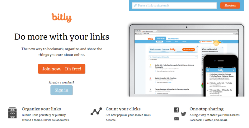
Bit.ly’s website is primarily functional, but it provides users an attractive design that’s a pleasure to use.
How do you create attractive functionality on your website? Here are some tips from Apple:
- Keep decorative elements subtle and in the background, while giving prominence to the tasks people want to perform.
- Provide standard controls and behaviors so people don’t have to figure out what to do or how to do it.
- Give users a clear, unified message about your website’s purpose and identity, and create a design that appropriate for the functionality you offer.
- As much as possible, integrate appearance and experience on your website.
2. Consistency
Consistency in the interface allows people to transfer their knowledge and skills from one app to another. A consistent app is not a slavish copy of other apps. Rather, it is an app that takes advantage of the standards and paradigms people are comfortable with.
When I read this, Adobe immediately came to mind. Learning the first software in their Creative Suite was hard because the interface wasn’t intuitive. But once I learned one Adobe product, I was able to pick up others without much trouble.
Although their interface doesn’t use standards that people have seen in other products, it at least stays consistent within its own products.
Google is another brand that maintains consistency across its products. Inside Search, you see the same icons that are in Google+.

They even give you social prompts when appropriate:
![]()
Ideally, consistency should make it easy for people to successfully interact with your brand from the first few minutes on your site.
Apple encourages developers to think about these questions:
- Is the app consistent with iOS standards?
- Is the app consistent within itself?
- Within reason, is the app consistent with its earlier versions?
Ask similar questions about your website.
- Are you being consistent with current Web standards? Is navigation easy to find and understand? Can people figure out how your website works and what they need to do?
- Are you consistent within your website? Do all your pages use the same icons, and do they all have the same meaning? Do all pages look like they belong to the same site?
- If you redesign your website, are you somewhat consistent with the previous design, so users can easily adapt to the changes you’ve made?
There’s no need to reinvent the wheel. Go easy on your visitors by using common design standards that people already understand.
3. Direct Manipulation
When people directly manipulate onscreen objects instead of using separate controls to manipulate them, they’re more engaged with the task and they more readily understand the results of their actions.
Apple’s talking about the user’s ability to touch the screen directly instead of using a mouse. But this same principle can apply whether you use your finger or a mouse.
Essentially, does your website engage people?
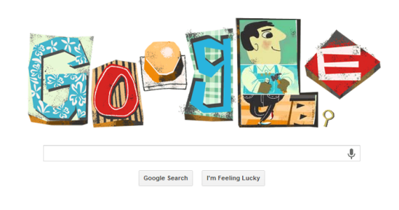
Google’s doodles surprise and delight users by adding a little creativity to the search experience. When I open Google and see something like this, I stop and play before entering my search term.
This same level of interaction can be achieved on your website.
BlueAcorn is the perfect example of an interacting home page. They’ve created a design that you can’t help but play with.

Of course, smaller brands can’t usually afford the programming this would take. But we can still create a delightful experience overall.
Guy Kawasaki has a simple, static home page, but the design is so unique, it invites a pause.
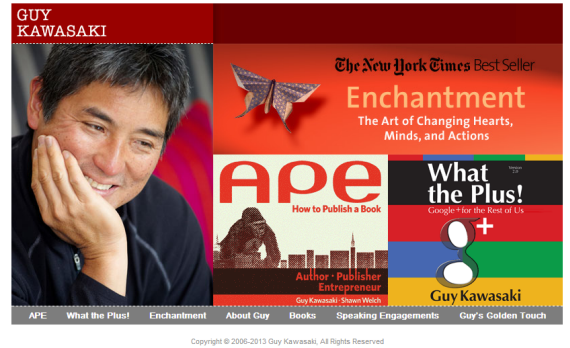
Notice that the navigation bar breaks from your normal expectations by coming below the large image. It maintains consistency, though, by looking like nav bars ought to look. In response, I spend a few minutes reviewing the image, then decide which link I want to click on.
Apple tells developers that people can experience direct manipulation when they:
- Rotate or move the device.
- Use gestures to manipulate onscreen objects.
- See that their actions have immediate, visible results.
On a web page, you can’t integrate movement or gestures into your design, but you can let people get immediate feedback from their actions. Two common ways to do this are:
- Keep your website working optimally, so slow page-loads don’t slow people down.
- Have links change color with a hover and a click.
Even if you can’t get fancier than this, keep in mind that people want to be able to interact with your website. Give them as many opportunities to do so as possible.
4. Feedback
Feedback acknowledges people’s actions and assures them that processing is occurring. People expect immediate feedback when they operate a control, and they appreciate status updates during lengthy operations.
When people interact with your brand, they need feedback. Things like:
![]()
Honestly, it can be as simple as that.
My daughter was on Groupon, and when a link didn’t work, she got a message that told her, “Like a timid ghost…” the thing she was looking for had disappeared. It told her what was going on and made her laugh in the process.
When you sign up for an email, you expect a confirmation message. This is MailChimp’s version, but something simple would work just as well:

Here are a few tips from Apple:
Subtle animation can give people meaningful feedback that helps clarify the results of their actions. For example, lists can animate the addition of a new row to help people track the change visually.
Sound can also give people useful feedback. But sound shouldn’t be the primary or sole feedback mechanism because people may use their devices in places where they can’t hear or where they must turn off the sound.
These tips could work just as well on your website too.
5. Metaphors
When virtual objects and actions in an app are metaphors for objects and actions in the real world, users quickly grasp how to use the app. The classic example of a software metaphor is the folder: People put things in folders in the real world, so they immediately understand the idea of putting files into folders on a computer.
The point is to look for ways to leverage associations that people already have for things online or in real life. Apple expresses this idea well:
The most appropriate metaphors suggest a usage or experience without enforcing the limitations of the real-world object or action on which they’re based. For example, people can fill software folders with much more content than would fit in a physical folder.
Take, for example, these icons. The store uses a shopping bag. YouTube resembles a “play” button. Gmail looks like an envelope, and Sticky Notes looks like a real pad of sticky notes.
![]()
On your website, use icons that create associations for your visitors. Give intuitive names to your navigation buttons. By using simple metaphors, you can engage people visually as well as verbally.
6. User Control
Users feel more in control of an app when behaviors and controls are familiar and predictable. And, when actions are simple and straightforward, users can easily understand and remember them.
Your website should offer the best user experience possible. To be honest, the interface should be so intuitive and work so seamlessly that it appears invisible.
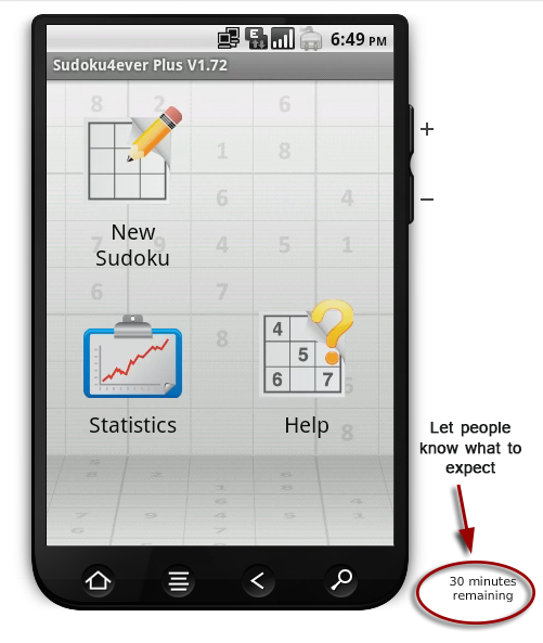
For instance, even though this app is free, Amazon let customers take a 30-minute test drive of it.

Then, by counting down the minutes, they let you know exactly how much time you have left. You know what to expect and aren’t surprised when your time is up.
The idea is to let people cancel an operation before it begins, give them a chance to confirm an action that could potentially cause problems, and to gracefully stop an operation that’s underway.
Wherever possible, give people control over their experience on your website.
Be a good host
A lot of the science behind creating a good user experience is simply good manners.
When people are on your website, make them feel at home. Treat them right. Entertain them. And give them reason to come back.
Depending on your website, you may not be able to use all the ideas presented here, but no matter what capabilities you have, if you have a customer-focused mindset, you can still offer a great experience for visitors.
Put their needs first.
Make your sight as visually appealing as it is functional.
Make it easy to understand and use your website.
And you’ll have no trouble creating the fan mentality that Apple does.