If you can improve your pricing page, you can make more sales. It’s that simple.
In other places, I’ve explained some powerful tips that will make your pricing page absolutely irresistible. Here, I want to compile some of the industry’s best tips for optimizing your pricing page.
Most of my experience with pricing pages is in the SaaS industry. Although most of the tips below deal with SaaS products, you can apply the information to other ecommerce sites as well.
1. Provide three choices.
There are two major pricing mistakes. The first is not providing any choices. The second is providing too many choices.
The reason why you need choices is because customers prefer to feel in control over the buying process. They don’t want to be pushed into a single choice. Instead, they want to select the option that works best for them. The reason why too many choices is dangerous is because of analysis paralysis — making it impossible for the buyer to choose anything at all.
Three choices is the perfect number. If you have four, fine. Five, okay. Six, meh. Seven, risky.
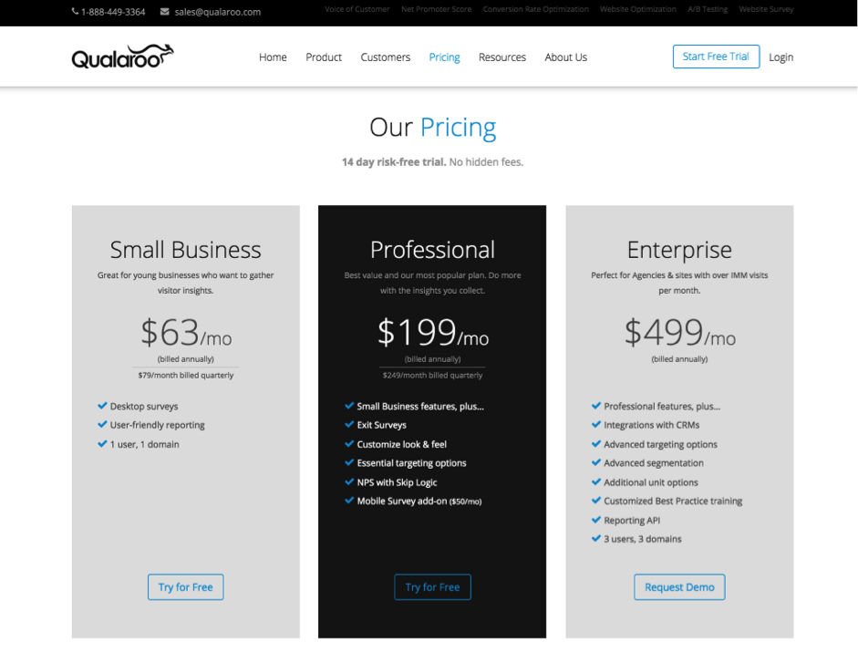
Qualaroo has a well-defined pricing plan consisting of three plans — perfect.
2. Make it as simple as possible.
Research indicates that people prefer simple pricing options. In fact, if a choice is too difficult or complicated, then people prefer not to make a choice rather than making any choice.
If your customers feel intimidated by the complex process, they won’t buy.
GrooveHQ uses a two-option approach — free and $15. The model is simple enough so that anyone can understand the approach.

If our uniqueness comes from being the simplest, easiest app, then our pricing has to reflect that, too. Well, it wasn’t that eloquent in my head at the time, but the point was clear: we needed to simplify pricing. So just as we did with our product, we stripped down pricing to its most basic, simple form.
Simple pricing works.
3. Use nice round numbers.
Round numbers are numbers like $10, $50, $300. They are simple and easy to remember.
Research in human psychology reveals that people prefer such round numbers. Round numbers are a way to apply the simple mentality explained above.
Vzaar uses round numbers on their pricing page.

4. Make the dollar sign smaller.
The dollar or another currency sign is a symbol of money — spending money. Because of this connotation, a large dollar sign can cause people to think about the fact that they are spending money.
Martin Lindstrom explains it like this:
The dollar sign is a symbol of cost, not gain.
This, in turn, may turn them off to buying.
Cornell’s research showed that removing the dollar sign from a menu caused people to spend substantially more.
GetBuzzMonitor uses this technique on their pricing page. The dollar sign is smaller than the price.

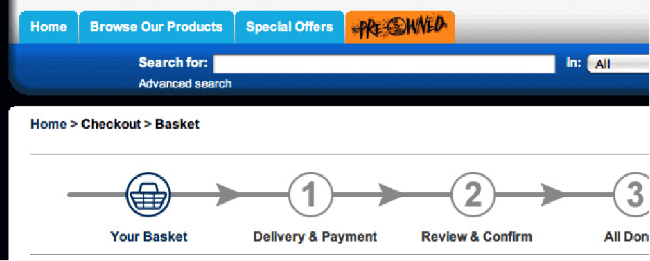
5. Show the purchase progress.
When a customer views the pricing page, it’s safe to assume that they are pretty far down the purchase funnel.
This is a good point at which to show them the purchase progress. Customers want to know what’s coming next. When purchasing, surprises of any kind are not good.
When the customer enters the pricing page, you can indicate their progress by labeling the process “selection” or something similar.
6. Create a clear call to action at the top.
The call to action is extremely important for any marketing action. It’s especially important on your pricing page. Don’t assume that the customer is automatically going to convert. Tell them what to do.

GetResponse uses a strong CTA on their pricing page.
7. Tell customers which option to choose.
Customers want guidance. Many customers simply want to be told what to do. This is why you need to provide clear signals as to which of your pricing options the customer should choose.
Put a clear indication of the preferred option directly on the pricing page. Crazy Egg calls out their preferred plan by differentiating it in blue.
![]()
8. Tell customers which option is the most popular.
The “bandwagon effect” is the tendency of people to do what they see other people doing. It’s a cognitive bias that has far-reaching implications for many industries.
The bandwagon effect explains why you should tell customers which of your pricing options is the most popular. If they know that a given plan is more popular than another, they will be more likely to select it.
Highrise points out the “most popular plan” on their pricing page.

9. Place testimonials on your pricing page.
Testimonials are one of the most powerful conversion features. I’ve discovered that potential clients who view my testimonial page are 218% more likely to convert into a lead. Existing leads who view my testimonial page are 190% more likely to convert into an actual customer.
Why would you not use testimonials on a pricing page? A single line of testimonial somewhere on the page can convert a ‘maybe’ user into a paying customer.
Segment.io used testimonials on their pricing page (at one point).

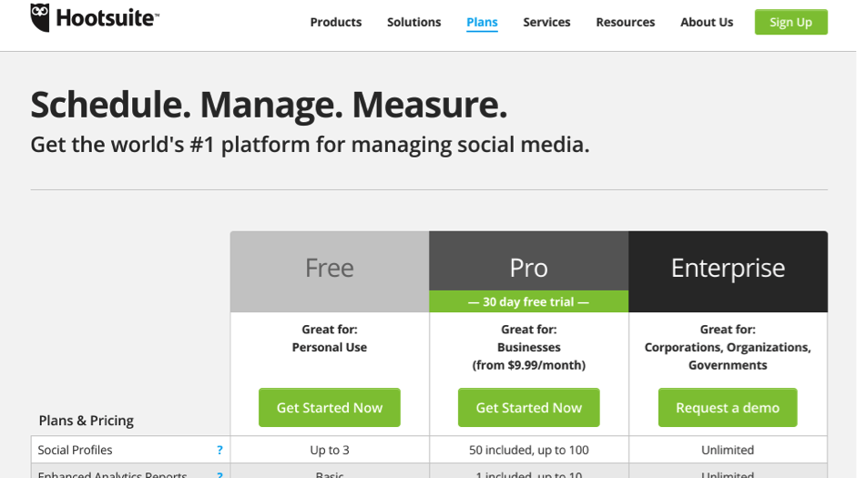
Hootsuite uses another form of testimonial — the brand symbol.
10. Promote value, not cost.
Decades of consumer psychology has showed us that customers care more about a product’s value than they do about its cost. Your customers who are truly prepared to buy won’t be put off by high prices (although they might balk at low prices).
Instead, your customers prefer to be sold on the value of the purchase.
On your pricing page, don’t make a push to brag about your price. Instead, make a big deal about your value.
Hootsuite uses this technique. They assert their value by declaring themselves “The world’s #1 platform for managing social media.” This value-add declaration makes their product appear to be valuable.
11. Remove as much text as possible.
Go easy on the copy. Your pricing page should only have as much copy as necessary to explain what the customer sees.
When a customer views a pricing page, he or she is going to skim over blocks of text to get the necessary information — 1) what is this, and 2) how much does it cost?
Codeship’s pricing page doesn’t have any complicated paragraphs — just a few bullet points and some headings. Perfect.

12. Name the options simply.
Naming your plans is fine, as long as you make the names simple and understandable.
When users see labels like “The white unicorn plan!” or “The gray armadillo plan!” it tends to be very confusing.
One of the best approaches for selecting a name is to identify the groups that will be making a given purchase, and name the plan according to who they are — ”sole proprietor,” “corporate,” “enterprise,” etc.
Treehouse makes their plan names simple — “basic” and “pro plan.”

13. Make the most expensive option outrageously expensive.
According to the “decoy effect,” a high-priced option will make your other options seem more affordable. To apply this principle, make your “expensive” option very expensive.

If a customer chooses it, you win. If they don’t choose it, you still win by nudging users towards the preferred middle option.
14. Clearly show the customer how much it costs.
Don’t hide your prices. The customer clicks on a pricing page in order to find out the cost. Show clearly and simply how much the product or service costs.
Hubspot provides a clear example, making the price points the primary focal point on this page.

15. List no more than seven benefits.
Your pricing page should tell the user what he or she is getting. It’s a mistake, however, to assume that more is better. Instead, you should limit your list of benefits to seven.
Why seven? The short term memory can hold no more than seven pieces of information at a time (on average). When you display more than seven benefits for a certain plan, it tends to disregard the limits of the customer’s processing and retention capabilities. The result is that these extra benefits are ignored.
A pricing page like this displays so many benefits it’s likely that I won’t read all of them.

The best approach is the simplest one. List a few benefits.
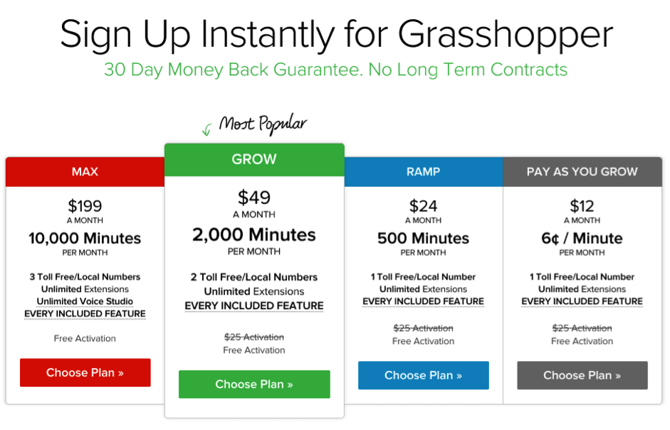
The pricing page for Grasshopper displays three benefits, which is just right.
16. Make the middle option the best option.
When faced with three choices, customers are most likely to choose the one that is positioned in the middle. It’s called the “center-stage effect” and it’s surprisingly consistent.
Bluehost has three options. Their layout puts the best price right in the middle.

The takeaway is simple. Position your preferred option in the center.
Conclusion
Many marketers stress out about how much to charge for their product. It’s a tough decision, but we sometimes make it too hard.
Regardless of how much your product costs, you need to make sure your pricing page is optimized to the hilt. You may not be able to follow every tip in this article, but you can follow some. And when you do, you’ll probably see a higher conversion rate and more revenue. Finally, don’t forget to A/B test your pricing page!
What is your favorite pricing page tip?